
How to read a spectrogram and what it tells you about a sound file
A waveform shows you when a sound is loud and when it is quiet, but it cannot show you pitch. A spectrogram can. This guide explains what the picture means, walks through every setting on the Spectrogram Viewer page, works a real example from file open to PNG download, and lists the visual patterns that reveal problems you would never catch by listening alone.
What a spectrogram is
A spectrogram is a picture of a sound. Time runs along the bottom. Pitch - or frequency, measured in hertz - runs up the side. The colour at each point shows how loud that frequency is at that moment. Bright spots mean loud. Dark spots mean quiet or absent.
The result is a kind of heat map for sound. A single steady note shows up as a bright horizontal line. A drum hit shows up as a tall vertical stripe, because it has energy at many frequencies all at once. Speech looks like a stack of curved ribbons rising and falling as the voice moves. Once you learn to read these shapes, you can spot things that are hard or impossible to hear, like a faint hum buried under music or a high-frequency cut that proves a file was re-encoded.
Opening a file and drawing the picture
Drop an audio file onto the page or press the button to browse for one. It accepts MP3, WAV, M4A, AAC, OGG, OPUS, FLAC, and WebM audio. A waveform appears first so you can see the overall shape and select a region if you want to focus on just part of the file.
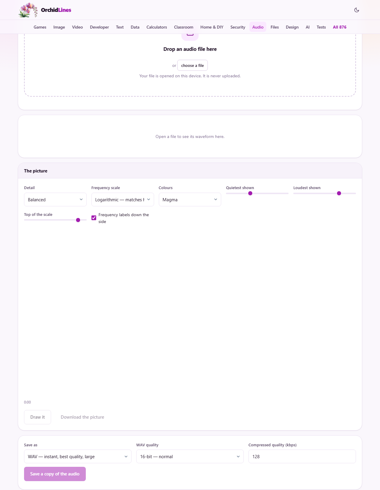
Below the waveform is the spectrogram panel, labelled The picture. Press Draw it to generate the image. A short clip of a few seconds renders almost instantly. A full song takes a moment longer because the entire file must be analysed frame by frame. The image appears on a scrollable canvas with time stamps at the bottom.
The Detail setting and the trade-off it controls
The Detail dropdown has four options: Balanced, Sharper in time, Sharper in pitch, and Very sharp in pitch. These correspond to frame sizes of 1024, 512, 2048, and 4096 samples.
This is not a quality knob where bigger is better. It is a real trade-off, and understanding it makes the picture far more useful. To measure a frequency accurately, the analysis needs to listen for a while. But while it is listening, it cannot pinpoint exactly when that frequency started. A short frame (Sharper in time) pins down the moment a drum hits but blurs the pitch of a bass note. A long frame (Very sharp in pitch) shows each note clearly but smears out fast attacks. Start with Balanced and switch only when you know what you are looking for.
Scale, colour palette and range controls
The Frequency scale dropdown has two choices. Logarithmic spreads the axis so that each octave gets equal space, which matches how your ears work. The jump from 100 to 200 Hz gets as much room as the jump from 1000 to 2000. Linear gives every hertz the same number of pixels, which puts most of the musical content in a thin band at the bottom and devotes most of the image to ultrasonic silence. Use logarithmic for music and speech. Use linear only when you need to measure exact frequencies by eye.
The Colours dropdown offers five palettes: Magma, Viridis, Greyscale, Ice, and Classic green. Pick whichever one you find easiest to read. Magma and Viridis are designed to be clear even for people with colour vision differences.
Two sliders set the dynamic range. Quietest shown runs from minus 120 to minus 40 dB, with a default of minus 90. Loudest shown runs from minus 40 to 0 dB, with a default of minus 10. Narrow the range to make faint details stand out. Widen it to see the full picture without the quiet parts glowing. A third slider, Top of the scale, sets how high the frequency axis goes, from 2000 to 22050 Hz, with a default of 20000. Drop this if the top of the picture is empty and you want to zoom in on the lower frequencies. A checkbox labelled Frequency labels down the side adds Hz markings along the left edge.
Saving the image and the audio
Press Download the picture to save the spectrogram as a PNG at the resolution shown on screen. The file goes straight to your downloads folder.
Below the spectrogram panel is a separate audio export panel. This lets you save a copy of the audio in M4A, WebM, or WAV. WAV quality can be set to 16-bit, 24-bit, or 32-bit float. Compressed quality sets the bitrate from 32 to 320 kbps. This is useful if you opened a large WAV and want a smaller version, or if you want to save just the selected region.
Reading the picture: four patterns worth knowing
Some shapes in a spectrogram answer questions that listening cannot. Knowing even a few of them turns the picture from a pretty graphic into a diagnostic tool.
- A hard ceiling near 16 kHz with nothing above it means the file was once encoded as a low-bitrate MP3, regardless of what format it is now. A genuine recording fades out gradually toward the top of the range.
- A bright horizontal line at 50 or 60 Hz, with repeats at 100, 150, 200 Hz and so on, is mains hum. It comes from electrical interference and is nearly invisible on a waveform but unmistakable on a spectrogram.
- A tall vertical stripe that covers all frequencies at once is a transient - a click, a clap, or a pop. If these appear in spots where there should be none, you may have a bad cable or a loose connector.
- Silence that is not actually black means there is a noise floor. The brighter that floor is, the more background noise the recording has, even if it sounds quiet on casual listening.
A worked example: checking a file you bought online
You bought a track labelled as lossless FLAC from an online store, but it sounds thin and you suspect it was actually an MP3 that someone wrapped in a larger container. Drop the FLAC file in. Press Draw it with the defaults.
Look at the top of the picture. The energy cuts off sharply at about 16 kHz with a flat horizontal edge. Above that line there is nothing. A true 44.1 kHz recording should have content - or at least a gradual fade - up to about 20 kHz. The flat shelf proves the file was once a 128 kbps MP3 before it was re-saved as FLAC. The bigger file format did not add any information that was thrown away during the original MP3 encoding.
Switch the Detail to Very sharp in pitch if you want to measure the exact cutoff frequency. The finer pitch resolution makes the edge easier to place. Screenshot or save the PNG as evidence for a refund request.
Common mistakes and quick answers
A few things catch people regularly.
- The picture is all one colour. The dynamic range is too narrow or the floor and ceiling are badly placed. Drag Quietest shown down to minus 110 and Loudest shown up to minus 5.
- The top half is empty. Either the recording genuinely has nothing above that frequency, or the sample rate is low. A file recorded at 8000 Hz cannot contain anything above 4000 Hz.
- The picture looks blurry. You are using the wrong Detail setting for what you want to see. For speech and vocals, try Sharper in pitch. For drums and percussion, try Sharper in time.
- I want to hear the part I am looking at. Select that region on the waveform above the spectrogram and press Play.
When a spectrogram is not the right tool
A spectrogram shows you what is in a file. It does not fix anything. If you spot hum, you need a notch filter to remove it. If you see a low-quality ceiling, no tool can bring back what was lost. And if you just need to know how loud something is, the waveform already tells you that without the extra step of drawing the full frequency picture.
Spectrograms are also not great for comparing two short sounds side by side. If you want to know whether two takes of the same note are in tune, a tuner is faster and more precise.
Nothing leaves your device
The analysis runs entirely in your browser. The file is decoded on your machine, the frequency data is calculated on your machine, and the picture is drawn on your machine. No audio is sent to any server. You can verify this by opening a file and then disconnecting from the internet - the drawing works exactly the same.
That is worth knowing if you are checking files that are under contract or not yet released. The spectrogram of an unreleased track never touches a network, so there is no leak risk from using this page.