
Signing your photographs: corner marks, proof lattices and one setting for the whole shoot
A watermark is doing one of two jobs, and the settings you want depend entirely on which. This article separates the two, explains every control in the rail by its label, then walks through two complete setups: a tiled proof set for a client and a single tidy corner mark for a blog post. It ends with the things a watermark genuinely cannot do for you.
Attribution or protection: pick one first
Attribution means putting your name on work so a viewer knows whose it is. It should be small, quiet and out of the way, because the picture is still the point. A corner mark at low opacity does this perfectly.
Protection means making a copy hard to use without permission. Proofs sent to a client before payment, sample images in a gallery, competition entries. Here the mark has to be in the way. It must sit across the middle of the picture where it cannot be cropped off or painted over easily.
Almost every complaint about watermarks comes from mixing the two up. A tiny corner logo protects nothing, and a heavy lattice across a portfolio piece just annoys people.
Text marks and their five controls
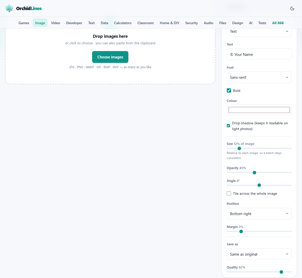
With Type set to Text, five settings shape the words. Text itself holds up to 120 characters and arrives with a copyright line already in it, ready to be replaced with your name, a studio name or the word PROOF.
Font offers Sans-serif, Serif, Monospace and Cursive. Sans-serif stays legible when small and faint, which suits most attribution. Serif looks more formal on prints. Cursive suits a signature style, though it is the hardest to read at low opacity.
Bold is on to begin with, and it earns its place: thin letters at 30 per cent opacity over a busy photograph simply disappear. Colour opens a swatch and starts at white, which works on most photographs; dark grey often reads better on pale, high-key images.
Drop shadow, also on by default, paints a soft dark edge behind the letters. This is the setting people turn off and then wonder why their white text vanished into a bright sky. Leave it on unless the mark is over an area of steady dark tone.
Using your own logo instead
Switch Type to Logo image and the text settings are replaced by a Choose logo image button. Pick a file and a small preview appears beneath it, with the file name and its pixel size beside it so you can confirm you grabbed the right one.
The file to use is a PNG with a genuinely transparent background. A JPG cannot store transparency at all, so a JPG logo brings a rectangle of white with it and lands on the photo looking like a sticker rather than a mark.
The logo is scaled by its longest side, so a wide banner-shaped logo and a square badge set to the same size come out looking similarly prominent. A logo made of white or near-white shapes is the most flexible, because it reads over almost any photograph.
Size, Opacity and Angle
Size runs from 2 to 60 and is measured as a percentage of each picture's shorter side, not in pixels. That is what lets one setting cover a mixed batch. On a photo whose short side is 4000 pixels, a size of 5 gives letters 200 pixels tall; the same 5 on a 1000 pixel web export gives 50 pixel letters, and both look the same on screen.
One thing to watch: for text, Size sets the height of the letters, never the width of the line. A long studio name at size 20 will be far wider than the picture and will run off both edges. Short text or a smaller number is the answer.
Opacity runs from 5 to 100 and starts at 45. Between 30 and 50 is the usual balance: clearly present, not shouting. Above 80 the mark competes with the photograph. Below 15 it is decoration rather than a claim.
Angle tilts the mark from minus 90 to plus 90 degrees. For a corner mark, the mark spins around its own middle and stays exactly where you placed it. Zero suits attribution. A slant of 30 or 45 degrees is the classic proof look, because a diagonal line of text crosses more of the picture than a level one.
A corner, or the entire picture
Tile across the whole image is the switch between the two jobs described at the start, and ticking it changes which controls are on display.
Left unticked, you get Position and Margin. Position is a menu of nine cells, from Top left through Centre to Bottom right, which is where it starts. Margin runs from 0 to 15 and is again a percentage of the shorter side, so 3 keeps a comfortable gap on any size of file. Set Margin to 0 and the mark sits flush against the edge, which looks deliberate on a screenshot and cramped on a photograph.
Ticked, Position and Margin disappear and Gap between tiles takes their place, running from 1 to 40 per cent of the short side. It is the space between one copy of the mark and the next. A small gap gives a dense mesh that is hard to remove but heavy to look at; a large gap leaves clean picture in between.
Tiling covers the corners properly even at an angle, because the whole grid is rotated around the middle of the picture and drawn out past the diagonal. There is no clean triangle left in the corners for someone to crop to.
Worked example: 42 proofs for a client
A photographer has shot a school sports day and wants to send 42 JPGs, each 6000 by 4000 pixels, for the family to choose from before paying. Nothing should be usable as it stands.
Drag all 42 onto the box. Leave Type on Text and replace the contents of the Text field with PROOF - Roy Photography. Keep Font on Sans-serif and leave Bold ticked. Colour stays white, Drop shadow stays on, because a sports field goes from bright grass to dark shade within one frame.
Set Size to 3, which is 120 pixel letters on these files. Bring Opacity down to 22 so the faces underneath can still be judged. Set Angle to minus 30. Tick Tile across the whole image, and set Gap between tiles to about 10.
The preview shows the picture under a pale diagonal lattice of text running edge to edge. Press Add watermark and a progress bar walks the queue. When it finishes, press Download all as ZIP and one archive arrives holding 42 files, each named after its original with -watermarked added. The originals on disk are untouched, so the clean files are still there for the paid delivery.
A different setup: one image for a blog post
Same page, opposite job. You have a single 1600 by 1000 hero image for an article and you want a discreet studio mark in the corner.
Switch Type to Logo image and pick your white PNG. Set Size to 10, which makes the logo 100 pixels along its longest side, since the short side of this picture is 1000. Push Opacity up to 60, because a small mark needs a little more presence to be noticed at all. Leave Angle at 0 and leave the tile box unticked.
Choose Bottom right in Position and set Margin to 4, giving a 40 pixel gap from both edges. Set Save as to PNG if the image is a graphic with flat colour, or leave it on Same as original for a photograph. Press Add watermark, then Save on the single row. Done in under a minute, and the setting is remembered for the next post.
Getting the files out, and what is not added
Finished pictures can be taken one at a time with the Save button on each row, or collected together with Download all as ZIP once at least two are ready. The archive is named after the tool and the number of files it holds.
Save as offers Same as original, JPG, PNG and WebP. Quality, which starts at 92, applies to JPG and WebP and disappears when PNG is chosen. For photographs, stay with JPG or WebP; saving a 24 megapixel photo as PNG produces an enormous file for no visible gain.
Nothing of ours is added to your picture. There is no badge in the corner, no signature in the file, and no paid tier that removes something we put there. The only mark on the finished image is the one you set up.
The small things that go wrong
Nearly every problem on this page is one of these.
- White text disappearing over sky or snow: turn Drop shadow back on, or pick a dark colour.
- A white box around the logo: it is a JPG. Export the logo again as a PNG with a transparent background.
- Text running off both edges: Size controls letter height, not line width. Shorten the text or lower the number.
- The preview refusing and saying text is needed: the Text field is empty.
- The preview asking for a logo: Type is on Logo image but no file has been picked yet.
- A mark that looks pasted on: opacity is too high. Come back to the 30 to 50 range.
- Wanting a different name on different photos: one batch shares one setup, so run the tool twice.
What a watermark will not do for you
It is a deterrent, not a lock. A corner mark can be cropped away in seconds by anyone. A tiled mark is much harder, because there is no undamaged copy of the picture left to work from, but harder is not impossible. Treat it as a clear statement of ownership rather than as security.
If your aim is to point at something in a screenshot, add arrows or labels, use Annotate a Screenshot instead. If you need to hide a face, an address or a number plate, Blur and Redact is the page for that. If you want a printed caption strip under the picture, the border tool has a style with room for one.
Marked on your own machine
Every one of those 42 proofs is opened, drawn on and saved by the browser in front of you. The photographs are never sent to us or to anyone else, and there is no size limit beyond what your own device can hold in memory.
That is worth pausing on, because the photos people watermark are the ones they most want to control. Unreleased client work, competition entries and pictures of other people's children have no business being uploaded to a free website to have a name written across them.