
Dressing a plain screenshot for a blog, a slide or a post
A screenshot is a rectangle of pixels with hard edges and no shape. Put it in an article and it sits there like a stray window. This piece goes through every control in the Style panel, explains how the space, corners and shadow depend on each other, and works through a set of three images for a help page.
The gap between a screenshot and a picture worth posting
You write a short guide for your team. You take a picture of the settings page, drop it in, and the article suddenly looks like a bug report. The screenshot is white, the page is white, and nobody can tell where one ends and the other begins.
The same problem turns up everywhere. A course slide with a plain grab on it looks unfinished. A product update post scrolls past without anyone stopping. A marketplace listing that shows the app's screen loses to the seller who framed theirs.
None of this is about the screenshot's content. It is about the frame. Give the picture a coloured field to sit on, a margin, softened corners and a little shadow, and it reads as a considered image instead of a paste.
Getting pictures in, and watching them change
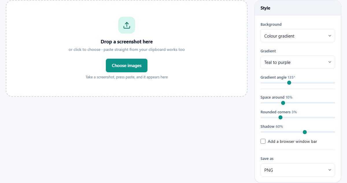
The fastest route is the clipboard. Grab your screen the usual way, click on this page, and press Ctrl and V, or Cmd and V on a Mac. The image appears with no file saved anywhere. Dragging files in works too, and you can select several at once.
Once anything is loaded a Preview panel appears above the file list. It redraws as you move the sliders, so you are choosing by eye rather than by number. A Show original tick box flips back to the bare screenshot, which is the honest way to judge whether your settings are helping. With more than one file loaded, click a name in the list to preview that one.
Add more takes another batch without losing the first. Clear all empties the list and returns you to the drop area.
The background: three quite different jobs
Background is the first menu and it decides what the other controls have to work with. Colour gradient blends two colours across the whole field, which is the look most people are after. One solid colour reveals a colour well beneath it, starting on a deep teal; pick your own and the field becomes flat. That is the choice when a brand colour has to be exact.
See-through is the odd one out. No field is painted at all, so what you get is your screenshot with rounded corners, its shadow and its margin, floating on nothing. Drop that onto a slide or a web page in your own colour and it looks native. Choosing it fixes the file type to PNG automatically, since that is the only one of the three offered here that can carry emptiness.
Eight gradients and the angle they run at
With the gradient background chosen, the Gradient menu lists eight pairs: teal to purple, orange to pink, sky to deep blue, green to dark green, pink to lilac, grey to near black, gold to red, and mint to blue. Two are worth calling out. Grey to near black is the safe one for a serious document, because it never fights the screenshot. Gold to red is the loudest and works best behind a very simple picture.
Below it, Gradient angle runs from 0 to 360 degrees and starts at 135. It swings the direction the blend travels, like turning a hand round a clock face. The starting value puts the blend on a diagonal, which is why the default looks natural. Set it near 90 and the colours run top to bottom, which suits a tall screenshot; the shift is subtle but it is what stops a whole series looking machine made.
Space around, and why it drives everything else
Space around runs from 2 to 30 per cent and starts at 10. It is measured against the shorter side of your screenshot, not a fixed number of pixels, so the margin stays in proportion whatever size you feed it.
A little arithmetic makes it concrete. A 1280 by 720 grab has a shorter side of 720, so 10 per cent gives a margin of 72 pixels. That margin goes on all four sides, so the saved picture comes out 1424 by 864. Worth knowing if you are working to a fixed size somewhere, because the finished image is always bigger than the screenshot you started with.
There is a catch that is easy to miss with a mixed batch. Because the margin is proportional, a small screenshot gets a small margin. Put a 600 by 220 notification next to a full window at the same setting and the little one looks pinched. Handle it by processing the small ones separately with the slider pushed higher.
Corners and shadow: the depth controls
Rounded corners runs from 0 to 12 per cent and starts at 3, and it is proportional in the same way. On that 720 pixel side, 3 per cent rounds the corners by about 22 pixels, which reads as a soft edge rather than a pill. Push it to 12 for a friendly, app-like look. Take it to 0 when you are showing something technical and a square corner suits the subject.
Shadow runs from 0 to 100 and starts at 60. Turn it up and the picture lifts off the background. Here is the part nobody tells you: the shadow is worked out from the margin. Its softness and its downward drop are both taken from the space around, so if you have set the margin to 2 per cent the shadow has nowhere to go and 100 will barely register. If your shadow looks weak, add space before you add shadow.
The browser window bar
The tick box marked Add a browser window bar puts a grey strip with three coloured dots along the top of your picture, inside the rounded card. It costs a little height, scaled to the picture, and it changes how the image reads. A grab of a web page starts to look like a window someone has open rather than a flat cut-out.
Use it for anything that lives in a browser, and for app screens where the window edge got cropped away. Leave it off for a phone screen, a chart, a code fragment, or a small notification, where a window bar would be telling a small lie about what the reader is looking at.
Saving, and doing a whole set at once
Save as offers PNG, JPG and WebP. A Quality slider appears for the last two, running from 40 to 100 and set to 92. At that value the difference from PNG is invisible on a gradient, and the file is a fraction of the size. Keep PNG for a see-through background, or when the screenshot is full of small text and you want every letter exact.
Press Beautify and the work begins, with a progress bar for a long list. One image downloads on its own, named after the original with -beautified added. Several arrive together in a ZIP file called orchidlines-screenshots. Your settings are remembered, so the pictures you make next week will match the ones you made today.
Worked example: three pictures for a help page
You are writing a short guide called Changing your delivery address. You have three grabs: the account menu at 1280 by 720, the address form at 1024 by 680, and a small confirmation message at 600 by 220.
Load the first two together. Set Background to Colour gradient, choose grey to near black, and leave the angle at 135. Space around goes to 12 because both have small type. Rounded corners stay at 3, Shadow goes to 70, and the window bar is ticked because both are web pages. The preview shows two matching cards. Save as JPG at 92, press Beautify, and the ZIP holds both.
Now Clear all and load the confirmation message on its own. Same gradient, same angle, but push Space around to 22 and untick the window bar, because it is a floating message and not a window. Now all three sit together on the page as a family, and no reader will guess the last one had different settings.
Mistakes that spoil the effect
- A loud gradient behind a busy screenshot. If your grab is full of colour, use grey to near black and let the picture speak.
- Shadow raised to 100 with the margin at 2. Nothing improves. Give the shadow room first.
- Corners rounded so far that a real corner of the interface gets clipped. Crop the screenshot before you bring it here.
- A see-through background saved as JPG. It cannot happen by accident, since the format switches itself, but do not switch it back or the empty area fills with black.
- Beautifying a screenshot that has a password, a real email address or a customer name in it. Hide that before you frame it, not after.
When a different page is the right one
This tool frames a picture. It does not mark one up. If you need an arrow pointing at a button, a numbered step or a caption, use Annotate a Screenshot first and bring the marked-up result back here for the frame.
If your screenshot is really several grabs of a long page that need joining end to end, the Screenshot Stitcher does that. If you want a plain coloured edge rather than a designed field, Add Border is simpler and gives you exact pixel widths. And if the only problem is that the file is too heavy for a page, the Image Compressor solves that without changing how it looks.
Your screen stays your business
Screenshots are unusually revealing. The tab strip shows what else you had open. A sidebar carries the names of your projects. A message list holds real people's names, and half the grabs on any laptop have an email address somewhere in a corner.
That is why this page does the drawing itself. Your picture is handed to the browser tab, painted onto a canvas by your own machine, and written back to your downloads folder. Pasted images never touch a disk at all until you save the finished one. Nothing is sent to a server, there is no account, and no copy exists anywhere for anyone else to find.