
Turning a pile of photos into one tidy picture
Sometimes five photos need to travel as one file. A form that accepts a single image, a message thread that would otherwise reorder them, a page in a report, a listing with one photo slot. This article walks through each setting on the panel, does the sums that decide how big the finished picture will be, and builds two very different collages step by step.
Why one file beats five
Photos sent as a group rarely arrive the way you meant them. Chat apps shuffle the order, mail clients scatter them down the message, and forms often accept only one attachment. Glue them together first and the order, the spacing and the grouping are settled before the file leaves your hands.
The usual jobs are simple ones. A repair quote with three angles of the same dent. A room before the paint and after. Six holiday shots for a printed card. A set of samples where the customer should see the whole range at a glance. None of these needs a design program, and none of them needs an account somewhere.
Loading photos and setting the order
The drop area asks for at least two pictures, and it will say so if you press on with one. Drag a selection in, or click to browse. Ordinary photo formats open, along with HEIC files from a phone. Add more brings in extra pictures later and Clear all wipes the list.
Each photo becomes a row showing its file name, its pixel size and its place in the queue, written as position 1, position 2 and so on. Two arrows on the right move a row earlier or later, and the bin icon drops it entirely.
That order is the whole layout. Pictures are placed in list order, filling left to right and then moving down to the next line. So if a before shot must sit on the left, put it at position 1 and check the numbers before you build.
Three arrangements, two very different habits
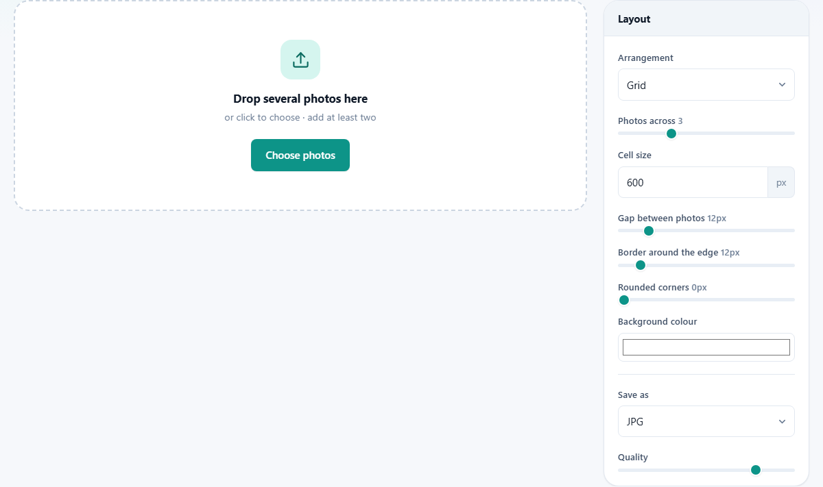
The Arrangement list sits at the top of the rail and changes what the rest of the rail means.
Grid gives you equal boxes in rows. Every photo is enlarged until it covers its box and the overflow is trimmed away from the edges, keeping the middle. Nothing is ever squashed out of proportion, but a tall photo in a square box loses its top and bottom.
Side by side lines the photos up in one long row. They are all set to a shared height and keep their own widths, so a wide shot stays wide and a tall one stays narrow. Stacked does the same trick turned ninety degrees: one shared width, natural heights, running down the page.
Watch the label under Arrangement as you switch. It renames itself to Cell size, Row height or Column width, because that single number means something different in each mode. Photos across and Rounded corners belong to Grid alone and disappear in the other two.
The sums behind the finished size
Nothing about the output size is a mystery, and it is worth being able to predict it. In Grid mode the width is the border twice over, plus the cell size times the number of columns, plus a gap for each join between them. The height follows the same pattern using however many rows your photos fill.
Take six photos, 3 for Photos across, a Cell size of 600, a Gap of 12 and a Border of 12. Across: 12 plus 12 for the border, three cells at 600 makes 1800, and two joins at 12 makes 24. That is 1848 pixels wide. Down: two rows of 600 is 1200, one join of 12, plus the border again, which is 1236 pixels tall.
Photos across is capped by reality. Ask for 8 columns with only three pictures loaded and you get three. In the strip modes the sums are easier still: one row of photos scaled to your chosen height, or one column scaled to your chosen width, with gaps and border added on.
Gap, border, corners and colour
Gap between photos runs from 0 to 80 pixels and starts at 12. It is the space at every join. Zero gives a solid mosaic where one photo runs straight into the next, which can be striking with matching shots and messy with mixed ones.
Border around the edge runs from 0 to 120 and also starts at 12. That is the margin outside the whole arrangement. Setting it a little wider than the gap, say 24 against 12, gives the finished picture a mounted look, like a print in a mat.
Rounded corners, in Grid mode only, runs from 0 to 80 pixels and starts at 0. It rounds each cell, and the clipped corners let the background show through. Keep it well under half the cell size or the boxes turn into ovals.
Background colour paints everything the photos do not cover: gaps, border and any rounded corner. White reads as clean and printed. A near-black makes bright photos glow. A colour lifted from the photos themselves ties the whole thing together.
Building, checking and saving
Press Build collage. The button shows a spinner while it draws each picture in turn, then a panel called Your collage appears with the result on a chequered backing. Beside its heading you get the exact pixel size and the weight of the file, so there is no need to guess whether it will pass an upload limit.
Change any setting and press Build collage again. Nothing is saved to your computer until you press Download collage, and even then the original photos are untouched.
Save as offers JPG, PNG and WebP. JPG suits photographs and keeps files small. PNG is worth it for screenshots and flat graphics, where hard edges matter more than size. WebP splits the difference. A Quality slider from 60 to 100 sits below, starting at 92, and it quietly disappears when PNG is chosen because that format does not use it.
Worked example: four weekend photos as a square
Four photos, all landscape, all off the same phone. Drop them in and check the positions read the way the day went. Choose Grid, set Photos across to 2, and Cell size to 900.
Set Gap to 16 and Border to 24, so the outer margin is visibly wider than the inner spacing. Push Rounded corners to about 18 for a softer feel and pick a warm grey background. Leave Save as on JPG at 92.
Press Build collage and the panel reports 1864 by 1864 pixels: twice 900 for the cells, one gap of 16, plus 24 of border on each side, and the same again downwards. A neat square, a couple of megabytes, ready to post or print at postcard size. Because Grid crops to fill, glance at each cell before you download and reorder if one photo lost something important at its edge.
Worked example: three screens in a tall strip
Now something Grid would ruin: three screenshots from a phone, each 1170 by 2532, meant to show a sign-up flow in order. Cropping them to squares would cut off the buttons, so switch Arrangement to Stacked.
The size box is now labelled Column width. Set it to 700, so each screen is scaled to 700 wide and keeps its full height in proportion. Gap 10, Border 0, background white. Rounded corners is not offered here, which is correct: the strip modes leave each picture whole.
Build it and you get a tall image 700 pixels wide and several thousand tall, with every screen complete. Save it as PNG, because screenshots are full of text and flat colour that JPG would smudge.
The mistakes worth knowing about
Most complaints about a collage come from one of these.
- Heads and edges cut off. That is Grid doing its job of filling equal boxes. Move to Side by side or Stacked, or crop the offending photo yourself first.
- Mixed shapes look untidy in a grid. Portrait and landscape photos lose different amounts. Group similar shapes together, or use a strip instead.
- A huge file that will not upload. Cell size multiplies fast. Six cells at 2000 pixels is a very big picture. Drop the cell size, or lower the quality slider a little.
- The order looks wrong. The list is the layout. Sort it with the arrows first, then build.
- Nothing happened when you pressed the button. Only one photo is loaded. Add another and it will run.
When another page does it better
If your pictures are long screenshots of the same scrolling page and you want them joined seamlessly rather than spaced, Screenshot Stitcher is built for that. If you want one photo framed rather than several combined, Add Border is the shorter route.
Going the other way, Image Splitter chops a single picture into pieces. And if you want text over the top, captions in the gaps or a heading across the whole sheet, this page does not do lettering at all: build the collage here and take it to Annotate a Screenshot or the design tools.
Drawn on your machine, by your browser
The whole arrangement is painted by the browser you are reading this in. Your photos are opened from disk, drawn onto a canvas in memory, and handed back as one new file. They are never posted to a server, so nobody has a copy and nothing sits waiting in a queue.
That is worth something for the pictures people usually combine: damage photos for an insurer, a child's school project, a flat you are advertising, samples for a customer who has not signed anything yet. The finished collage is the only new file that exists, it lands in your downloads folder, and where it goes next is entirely your decision.