
Boxes That Hold a Space: Working Faster with Dummy Images
A grey rectangle with a size stamped on it looks trivial, yet whole design teams run on them. Here is how to get the most from this maker: sensible sizes, labels that answer questions before they are asked, the pattern options, why the tiny SVG format is usually the winner, and a five minute mock up walked through end to end.
The problem a dummy picture solves
Layouts are usually built before their pictures exist. The photographer has not delivered, the client has not chosen, the product has not been shot. Waiting stalls the project; pasting in random photos causes worse trouble, because reviewers react to the photo instead of the layout, and half finished images have a way of sneaking into production.
A deliberately plain rectangle sidesteps both traps. It proves the layout at the correct dimensions, it is obviously temporary, and it carries its own specification so the eventual real image is made to fit. Web builders, slide makers, newsletter editors and app designers all lean on them daily.
Getting the size right
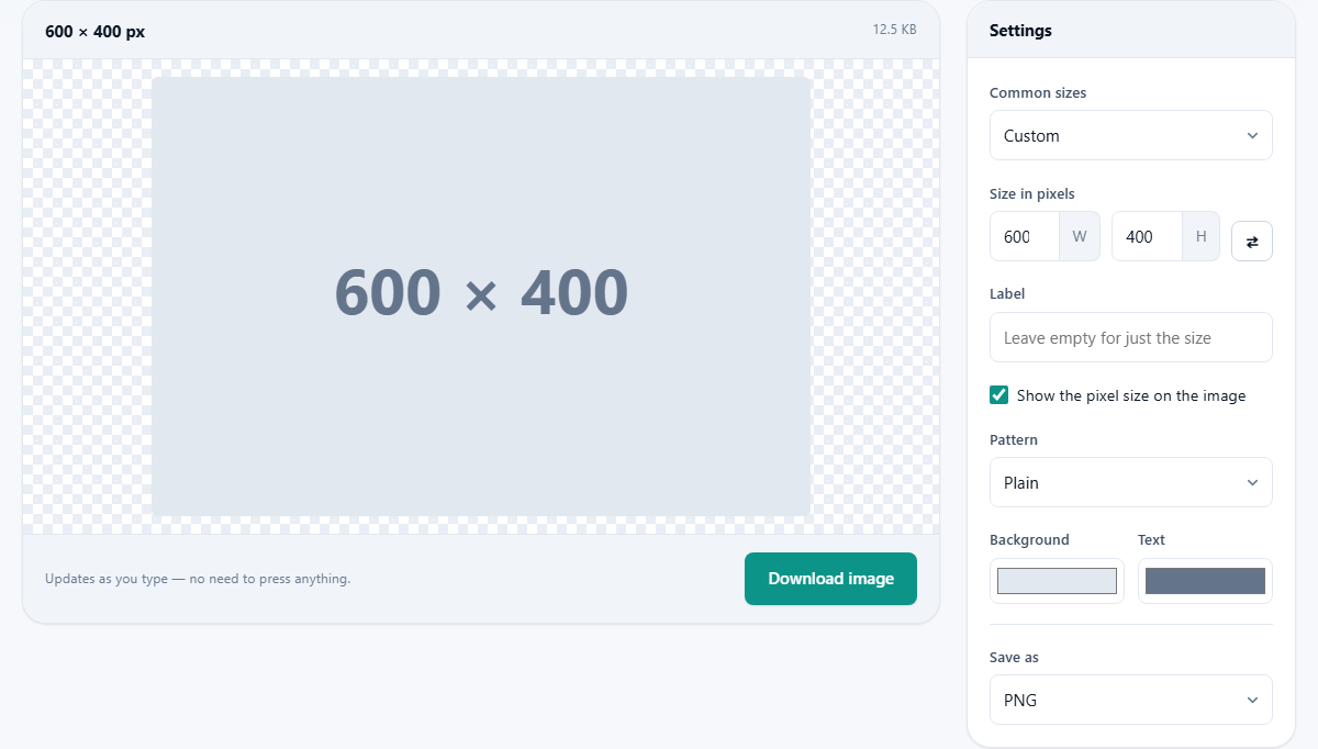
The Common sizes menu lists frequently needed dimensions, and picking one fills the width and height boxes for you. For anything custom, type directly into the two Size in pixels fields, marked W and H; each accepts from one up to eight thousand. The preview redraws as you type, with the exact dimensions echoed in the readout above it.
The small swap button between the fields trades width for height in one click. It earns its keep when you are producing portrait and landscape versions of the same slot, or when you typed the numbers the wrong way round, which everyone eventually does.
Labels are messages to your future self
The Label field takes up to sixty characters and prints them across the middle of the image. Use it to name the slot rather than describe the placeholder: Hero banner, Team photo, Chart goes here. Weeks later, when someone asks what belongs in the empty box on page four, the box itself answers.
Beneath it, the Show the pixel size box adds the dimensions to the image. Leave it ticked. When the real photograph is finally commissioned, whoever prepares it can read the required size straight off the mock up instead of measuring the layout or guessing.
Four patterns, four uses
The Pattern menu changes what fills the rectangle, and each option has a distinct job.
- Plain is the quiet default, right for client facing mock ups where nothing should draw the eye.
- Cross and frame draws a border with corner to corner diagonals, making the exact extent of the image slot unmistakable, ideal for checking alignment and spacing.
- Diagonal stripes signal work in progress loudly; they are hard to mistake for a finished asset.
- Grid overlays regular squares, handy when you want to judge scale or count proportions inside the slot.
Colours that stay out of the way, or refuse to
Two colour wells control the look: Background for the rectangle and Text for the label and size stamp. The defaults are a soft grey pair chosen to sit quietly inside any design, and for most mock ups you should leave them alone; a placeholder that competes with the layout defeats itself.
The exception is debugging. When a page is misbehaving and you need to see precisely where each image slot begins and ends, give every slot a loud colour, a different one per slot if needed. Nothing localises a layout bug faster than a screaming magenta rectangle sitting where it should not.
Why SVG wins, and when it cannot
The Save as menu offers PNG, JPG, WebP and SVG. The last one deserves the pitch. An SVG is a text description of shapes rather than a grid of pixels, and a rectangle with a label is about the simplest description possible, so the file often weighs a few hundred bytes. It also stays razor sharp at any display size, and you can open it in a plain text editor and change the colour or wording without revisiting this page.
Choose one of the pixel formats when the destination demands it: some office suites, email tools and upload forms only accept raster files. Pick JPG and a Quality slider appears, running from forty to one hundred; placeholders are flat colour, so even modest values look clean.
Worked example: a landing page in five minutes
Suppose you are sketching a product landing page and need three stand ins. First the hero: type fourteen hundred and forty into W and six hundred into H, label it Hero product shot, keep the grey defaults, choose SVG and press Download image.
Next the three feature tiles: set four hundred by three hundred, label it Feature tile, switch the pattern to cross and frame so the tile edges are obvious in review, and download once; the same file can be placed three times. Last, a portrait for the testimonial: three hundred square, label Customer photo, and use the swap button afterwards if the design flips it sideways. Total time, well under five minutes, and every slot in the mock up now states its own size.
The two small readouts above the preview
Sitting over the picture are two short pieces of text that are easy to ignore and useful once noticed. The first repeats the width and height in pixels, so you can confirm at a glance that the drawing matches the numbers you typed rather than a value you meant to change and did not.
The second reports how heavy the finished file will be, and it refreshes whenever you touch a setting. That makes it the quickest demonstration of why format choice matters here. Build a box at twelve hundred by six hundred and thirty, note the figure while the menu says PNG, then switch the menu to SVG. The picture is the same picture; the number beside it collapses to a tiny fraction of what it was.
What the SVG version quietly leaves out
The SVG is written as a short description rather than painted pixel by pixel, and the description it writes is deliberately spare: one coloured rectangle and one line of centred text. Two things therefore do not survive the switch. The Pattern menu has no bearing on an SVG, so the cross and frame or the diagonal stripes you were admiring vanish the moment you change format. And if the Label field has anything in it, the SVG prints your words on their own, without the pixel size added below.
Neither is a defect; both are the reason the file is measured in hundreds of bytes. When you want the stripes, or your label and the dimensions stacked as two lines, stay on PNG. The habit that saves confusion is to glance at the preview after choosing a format rather than before.
A second example: a printed newsletter
Different job, different numbers. You are laying out a four page newsletter that will be printed, and the photographs are still being chosen. Begin with the masthead strip: sixteen hundred into W, four hundred into H, label it Masthead, leave Show the pixel size ticked so both lines appear, and set the Pattern to Grid, which makes it easy to judge how much of that long strip a real photograph would actually fill. Download it.
Next the three story pictures, all nine hundred by six hundred, labelled Story photo. The print shop's software will not take SVG, so set Save as to JPG and pull the new Quality slider down to seventy; a flat rectangle with one word on it loses nothing there. Last, the author portrait at four hundred wide by five hundred tall. If the editor later turns that picture on its side, the swap button makes it five hundred by four hundred without retyping either number.
Small snags and their cures
Almost every complaint about these files comes down to one of five things.
- The label runs off the sides of a wide, shallow banner: the lettering is scaled from the shorter side, so a long phrase still overflows. Cut it to a word or two.
- You expected your label and the size on two lines and only got one: you are saving as SVG, which prints a single line.
- The writing is barely visible: the Background and Text colours are too close in tone. Darken the text colour and check it again on screen before downloading.
- The box behaves oddly in the layout even though it looks right: the width and height are the wrong way round. The dimension readout above the preview shows this immediately, and the swap button fixes it.
Habits that prevent later confusion
A few small practices multiply the value of these files.
- Rename downloads to match the slot, hero, tile, avatar, rather than leaving generated names.
- Keep the aspect ratio honest: a stand in at the wrong proportions validates nothing, because the real image will reflow the page.
- Make one placeholder per distinct size, not one stretched everywhere.
- Sweep them out before launch; the size stamp makes strays easy to spot in a final pass.
What this maker deliberately is not
It produces one image at a time, from settings, from nothing; there is no upload slot at all, and no batch mode, though regenerating at a new size takes seconds. It will not fetch stock photos, draw illustrations or fake a product shot, and that restraint is the point: a placeholder that looks real stops being a safe placeholder.
If what you actually need is to reshape an existing picture, the resize and crop tools elsewhere on this site are the right neighbours; this page is purely for the box that waits for them.
Local, instant, and fine without a connection
Every rectangle is drawn by your own browser at the moment you ask for it. Nothing about your project, sizes, labels or colour choices, is sent to any server, and there is no library of generated images kept anywhere but your downloads folder. Once the page has loaded, the internet is optional: on a train with no signal, the maker keeps producing files exactly as before, which is more than can be said for the placeholder services that build the image on someone else's machine.