
Big captions that fit the picture without any fiddling
Typing a caption is the easy part. Making it sit properly on a picture that might be tall, wide, dark or busy is where most attempts fall apart. This page takes two lines of text and works out the size, the line breaks and the position for you. Below is what each control changes, how the automatic fitting decides things, and a full run through one picture.
What the page is really doing for you
You give it a picture and up to two captions. It puts one at the top and one at the bottom, in heavy centred letters with a contrasting outline, and then does the awkward part: choosing a size that fits.
Nothing is dragged and nothing is positioned by hand. That is a deliberate trade. You lose free placement and you gain a caption that cannot land half off the edge, cannot overlap the other caption, and looks the same on a square photo as on a tall phone snap.
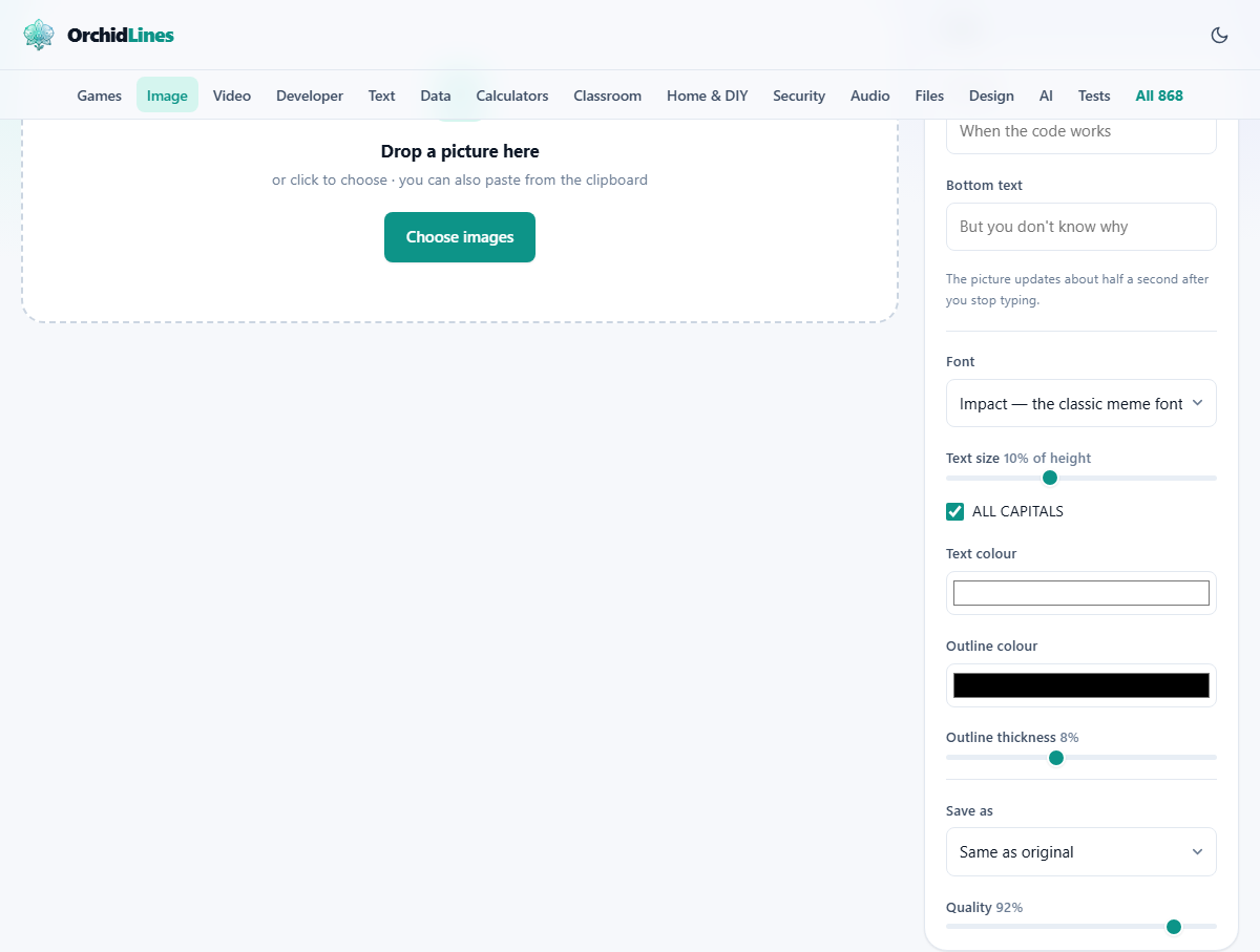
Everything you change is reflected in a live preview above the file list, with a Show original tick box so you can flick back to the bare picture and compare.
The occasions this gets used for
- A joke in a group chat, which is the obvious one.
- A slide in a talk where a single blunt line over a photograph lands better than a bullet list.
- A poster for a school fair, a club night or a lost cat, printed at A4.
- A shop announcement: a photo of the product with the offer written across it.
- A quick label on a screenshot before sending it on, such as a warning above a form.
- A set of images that all need the same caption, which is where dropping in several files at once pays off.
The two caption boxes
Top text and Bottom text each hold up to 200 characters. Either can be left empty. Filling only the bottom box is common, and a single line across the top of a photo is often stronger than two lines fighting each other.
Both boxes start with faint example wording, showing the kind of setup and punchline the layout is built for. That is only a prompt and never appears on your picture.
The preview does not redraw on every keystroke. It waits about half a second after you stop typing and then rebuilds, which is what stops the picture flickering as you write. Type a whole caption, pause, and watch it appear.
Font and ALL CAPITALS
Font offers four choices. The first is the heavy condensed face the classic caption look is built on. It is installed on most computers, and where it is missing the nearest heavy face on your machine stands in, so the result may look a shade wider or narrower than you expect. The other three are a plain sans-serif, a serif, and a fixed-width face where every character takes the same room.
The serif reads as more formal and suits a quotation over a landscape. The fixed-width one suits anything about code, since it looks like the thing it is talking about.
ALL CAPITALS starts ticked and simply shouts your caption. Untick it when the caption is a sentence rather than a punchline, when it contains a name that looks odd in capitals, or when you want the serif choice to feel like typesetting rather than a sign.
Text size is a starting point, not a promise
Text size runs from 4 to 20 and starts at 10. The number is a percentage of the picture height, not a count of pixels. On a photo 1200 pixels tall, 10 means the letters begin at about 120 pixels. On a small square graphic the same 10 gives much smaller letters, which is the point: your caption keeps the same visual weight whatever you feed it.
The word begin matters. If your caption will not fit at the size you asked for, it is stepped down until it does, by about six per cent each try. So this slider is a ceiling rather than a fixed height. Ask for 20 with a long caption and you will get whatever size actually fits, which may be well below it.
Each caption is fitted on its own. A three-word top line can end up noticeably larger than a rambling bottom line in the same picture. If that bothers you, shorten the longer caption until the two settle at the same size.
Colour and the outline
Text colour starts white and Outline colour starts black. That pairing is not decoration. White letters vanish against a bright sky and black letters vanish against a dark suit, so the outline guarantees a hard boundary whatever is behind the words.
Outline thickness runs from 0 to 20 and starts at 8. It is measured against the height of the letters, so it stays in proportion as the caption shrinks or grows. Around 8 gives the familiar heavy border. Down near 2 you get a fine keyline, which suits a serif caption. Up near 20 the outline starts eating into the letter shapes and thin strokes close up.
Sliding it to 0 does not quite remove the outline: a two-pixel line is always drawn, which on a large photo is a hairline you will barely see. If you truly want no outline, set Outline colour to the same colour as the text. Going the other way, a brand colour in the outline with white text is a tidy way to caption a set of product photos.
How the fitting actually decides
The caption is given a box to live in: about 92 per cent of the picture width, and roughly a third of its height. Words are wrapped between spaces to fill the width, and if the stack of lines is too tall for that box the size drops a notch and the whole thing is measured again.
Lines sit a little more than one letter height apart, which keeps two or three lines readable without gaps you could park a bus in. The top block starts just below the top edge and the bottom block ends just above the bottom edge, with a small margin either way so nothing touches the border.
Knowing the box is a third of the height explains most surprises. A caption that suddenly went small did not shrink for no reason. It grew to three or four lines, and four lines cannot fit in a third of the picture at the size you asked for.
Getting the finished file
Press Make meme and the caption is drawn onto the picture at full size, not at preview size. Each file in the list gains its own Save button, and with two or more done a Download all as ZIP button appears. Files keep their names with -meme added.
Save as offers the original file type, JPG, PNG or WebP. Quality runs from 40 to 100 and starts at 92; it applies to JPG and WebP and disappears when you choose PNG, which has no quality setting to make. Photographs are fine as JPG. Choose PNG for a flat graphic or a screenshot, where JPG smears fuzzy speckles around hard letter edges.
Add more brings extra pictures into the same job. Clear all empties the list.
A picture captioned, step by step
The picture is a photo of a cat asleep on a laptop keyboard, 1600 by 1200 pixels. Drop it in. The preview appears with the bare photo.
Type I FIXED YOUR CODE in the Top text box. Half a second later the caption appears across the top in white with a black border, on one line, at the starting size of about 120 pixels. In the Bottom text box type But you have no idea why it works now. It is too long for one line, so it wraps onto two and stays at the same size, sitting just above the bottom edge.
The cat is pale, so push Outline thickness from 8 up to 11 for a firmer edge. Try Text size at 14: the bottom caption now runs to three lines and the fitting steps it back down, so it ends up only a little larger than before. Drop back to 11, which suits both captions. Leave Save as on the original file type at quality 92, press Make meme, and save the result as cat-meme.jpg.
What trips people up
- The caption is smaller than you asked for. It wrapped onto more lines than fit the third of the picture it is given. Cut words, or accept the smaller size.
- A long web address or a single unbroken string runs wide. Wrapping happens between spaces, so a chunk with no spaces has nowhere to break. Add a space, or lower Text size.
- White letters disappear on a bright picture. Check the outline is not down near 0, or set the text to black and the outline to white.
- The preview seems stuck. It waits until you stop typing before rebuilding. Pause for a moment.
- Letters look wrong on one machine and right on another. The heavy caption face is not installed everywhere, and a substitute was used. Choosing the plain sans-serif gives a more predictable result across devices.
- You wanted different captions on different pictures. Everything in the list shares one pair of captions, so run them in separate batches.
When a different page is the right one
If you need text somewhere other than the top and bottom, the Watermark Adder places text or a logo in any of nine positions across a whole folder of images. That is the tool for a copyright line or a repeated brand mark.
If you are explaining rather than joking, Annotate a Screenshot gives you arrows, boxes, numbered steps and a blur brush, which is what a bug report or a set of instructions actually needs.
Your picture is never sent anywhere
The captions are drawn onto your image by your own browser, using your own processor, inside the tab. The picture is not uploaded, not stored and not seen by anyone else, and that is true whether you caption one file or thirty.
Two practical things follow. There is no upload wait, so a large photo is captioned as fast as your machine can draw it. And there is nothing to strip off afterwards: no logo, no badge, no small print in the corner.