
One logo, and every icon slot a website has to fill
The little picture beside a page title looks like a trivial detail until you try to add one properly. Browsers, phones and desktop tiles all ask for different sizes under different names, and one of them still wants a file format from the 1990s. Here is what this page builds for you, what each setting changes, and exactly where the files go afterwards.
Why one image is never enough
A favicon has to survive being sixteen pixels wide in a crowded tab, and also look right filling a rounded square on a phone home screen. Those are different jobs. A mark that is charming at 512 pixels can become four grey smudges at sixteen.
Devices also disagree about how to ask. Some look for a file at a fixed address with a fixed name. Some read a line in your page code. Some read a separate manifest file, which is a short list describing your site to a phone. Miss one and the icon quietly falls back to a blank sheet of paper.
That is the whole reason this page exists. You give it one picture, it renders every size that is genuinely used today, and it writes the supporting files and the code that ties them together.
What to feed it
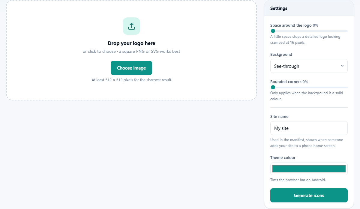
The drop area takes a normal image or an SVG, which is artwork stored as shapes rather than pixels. An SVG is the ideal source, because shapes stay crisp at any size. Failing that, a PNG of at least 512 pixels each way gives the large icons enough to work with.
Two warnings can appear once the file is read. One says your image is not square, and explains that the middle has been used with the edges trimmed away, since icons are always square. The other says the image is quite small, which shows when the shorter side is under 256 pixels and the biggest icons will look soft.
Above the results you get the file name and the pixel size of what you supplied, plus a reminder that the icons rebuild themselves whenever a setting changes. Start over clears everything and hands the drop area back.
Space around the logo
The first slider is Space around the logo, from 0 to 30 per cent. It shrinks your artwork inside the square and leaves an even margin all the way round.
Detailed marks benefit most. A crest or a monogram pressed hard against the edges looks cramped and starts to touch the tab furniture, and a few per cent of breathing room fixes that. A simple bold shape usually wants none at all, since every per cent you add makes the mark smaller in a space that is already tiny.
One thing to watch: padding with a see-through background makes the visible mark smaller without giving anything back. Padding with a solid colour behind it reads as a proper badge, which is generally what people are after.
Background and rounded corners
Background offers See-through or Solid colour. See-through keeps whatever transparency your artwork had, so the icon floats on the tab bar. That is elegant with a dark logo on a light browser and can vanish completely on a dark one, which is the main argument for a solid colour.
Choose Solid colour and a Background colour box appears below, starting on a teal. Anything you set there fills the square behind your mark in every size that is produced.
Rounded corners runs from 0 to 50 per cent and only does anything when the background is a solid colour, because there is nothing to round off a transparent square. At 0 you get a hard square, around 20 a soft badge, and at 50 the corners meet and you have a circle.
Site name and theme colour
Below the divider are two settings that go into the manifest rather than into any picture. Site name takes up to sixty characters and starts on My site. It is the name a phone shows under your icon when someone saves your site to their home screen, so short and recognisable beats a full company title with a slogan.
Theme colour sets the tint a phone browser uses for the bar around your page, and the same colour is written into the manifest as the background for the splash screen while your site loads. Matching it to your header colour is the usual choice, since a mismatch is noticeable in the half second before a page paints.
Both are pure text and colour. Change either and the pack is rebuilt straight away, so there is no separate step to remember.
What is in the pack
Press Generate icons, or simply change a setting, and the results panel fills with every file, each one previewed with its pixel size and its weight in bytes. You get:
- PNG icons at 16, 32, 48 and 96 pixels, which is what browser tabs and bookmark lists draw from.
- apple-touch-icon.png at 180 pixels, used when a phone saves your site to its home screen.
- A 192 and a 512 pixel pair, the two sizes the manifest points at for phone home screens and splash screens.
- mstile-150x150.png, the 150 pixel square for desktop start tiles.
- favicon.ico, a genuine icon file holding 16, 32 and 48 pixel versions inside one container rather than a PNG with the extension changed.
- site.webmanifest, carrying your site name, the two large icons and your theme colour.
- HOW-TO-USE.txt, a short set of instructions with the same code snippet repeated inside it.
Getting it onto your site
Download ZIP gives you the lot as favicon-pack.zip, or you can save any single row on its own with the button beside it. Underneath the file list is the block of code to paste, with a Copy button on the right.
The instructions are shorter than people expect. Put every file from the pack into the top folder of your site, the same folder as your index page, so that each one sits at the address the code points to. Then paste the copied lines inside the head section of your pages.
Those lines name the icon file, the 32 and 16 pixel PNGs, the 180 pixel home screen icon, the manifest, and your theme colour. If your site is built from a template or a layout file, paste them once in that shared head and every page picks them up.
A small bakery site, start to finish
Suppose the artwork is a wheat-sheaf mark, drawn as an SVG, dark brown on nothing. Dropped in, it renders straight away, and the pack is built before you have touched a control.
On a light tab it looks fine, but on a dark one it disappears. So Background goes to Solid colour, the colour box to a warm brown, and Rounded corners to 20 for a badge that matches the buttons on the site. The mark is fairly detailed, so Space around the logo goes to 10 and it stops crowding the edges.
Site name becomes Hearth Bakery, well within the sixty characters, and Theme colour is set to the same brown as the site header. Download ZIP, unzip it into the folder next to index.html, paste the six lines into the shared head, and reload with a hard refresh.
The usual traps
Almost every complaint about favicons is one of these five:
- Using the full logo including the wording. At sixteen pixels the words are a grey bar. Crop to the symbol, or use a single strong letter.
- Feeding it a wide banner. It is squared by taking the centre, so anything interesting at the ends is cut. Crop it square yourself first if the framing matters.
- Starting from a small image. A 64 pixel source cannot be stretched into a sharp 512 pixel icon by anyone, and the warning is telling you that in advance.
- Expecting rounded corners to show with a see-through background. That combination has nothing to round, so the setting sits there doing nothing.
- Deciding it did not work after a reload. Browsers hold on to old icons stubbornly. Force a hard refresh, or open the site in a private window, before you change anything.
When you want a different tool
If your artwork needs cropping, trimming or a background removed before it becomes an icon, do that first with an editing tool and bring the finished square here. This page fits and renders what you hand it; it is not the place to redraw a mark.
It is also aimed squarely at websites. Icons for a phone app, a desktop program or a shop listing follow their own rules and their own sizes, so a pack built for browser tabs will not satisfy them.
Your logo never leaves the room
Every icon in the pack is drawn by your own browser, on your own machine. The picture you dropped in is read from disk, redrawn at each size on a canvas, packed into a ZIP in memory and handed back to you as a download.
For unreleased branding that is worth something. A logo you are still keeping quiet about does not get uploaded to a stranger's server just so a few squares can be resized, and there is no account, no waiting and no copy left behind anywhere.