
Proving what changed between two versions of a picture
Two files, one question: what is actually different? Your eye is good at big changes and hopeless at small ones, so this page offers three ways of looking and one way of measuring. This article explains what each view is good for, what the percentage really counts, how the three difference settings pull in different directions, and two jobs worked through with real numbers.
The three questions people arrive with
The first is about an edit. You brightened a photo, or someone else did, and you want to see the change properly rather than flicking between two windows and trusting your memory.
The second is about damage. You made a smaller copy of a photo to fit an upload limit, and you want to know whether that copy still looks right, or whether the sky has gone blotchy.
The third is about identity. Two files landed with similar names and you need to know whether they are the same picture. Eyes cannot answer that one at all, but a pixel count can.
Filling the two slots
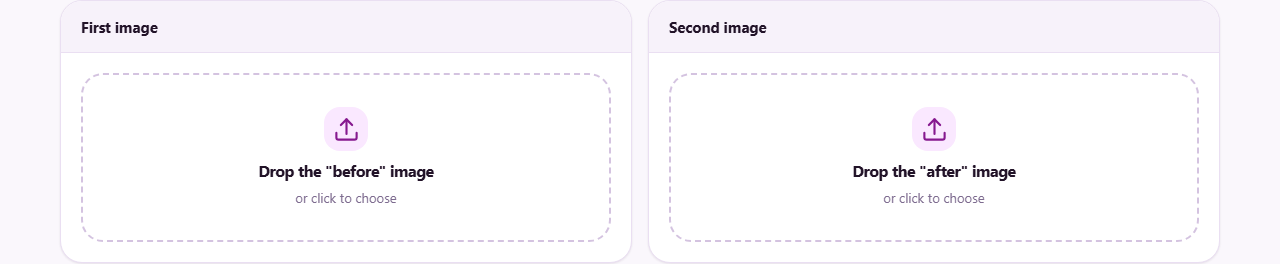
The page starts with two boxes, First image and Second image. Each holds exactly one file, dropped in or chosen by clicking. Put the earlier version on the left and the newer one on the right, and the labels used throughout will make sense.
Once a slot is filled it shows a small thumbnail, the file name, the pixel dimensions and the file size, so you can confirm you grabbed the right pair before doing anything else. The viewer below only appears when both slots are full.
Two small buttons sit at the top of the viewer. Swap exchanges the two pictures, which is quicker than reloading them when you realise the newer one is on the left. Clear empties both slots and takes you back to the start.
Slider: the view for noticing
The slider stacks one picture over the other and reveals the one underneath along a moving line. Press anywhere in the frame and drag, with a mouse or a finger, and the divider follows. Tags in the corners remind you which side is which, and the line starts in the middle every time you return to this view.
This is the view your eyes handle best. Because one spot on the screen stays still while the content beneath it swaps, a change in that spot jumps out. Park the line just to the left of something you care about, then flick it back and forth across it a few times.
Side by side: the view for talking
The second view puts the two pictures next to each other, each labelled underneath. Nothing is hidden and nothing moves, which makes it the honest view to show another person or to screenshot for a message.
It also wins whenever the pair differ in shape or crop. A slider comparing a wide photo with a square one is confusing, while two pictures side by side make the difference in framing obvious at a glance.
Difference: the view for proving
The third view stops looking and starts counting. Both pictures are drawn onto one shared grid, sized to the larger of the two, and then every position is examined in turn. The gaps in red, green and blue are averaged into a single number that says how much that spot moved.
Under the map you get two lines. The first is arithmetic: the share of positions that changed, to two decimal places, with the raw count and the total in brackets. The second is a plain reading of that number. Nothing at all changed gives a flat statement that the two are identical. Below a tenth of a per cent it calls them nearly identical. Below five per cent it says mostly the same with some clear changes. Above that, substantially different.
Save difference map writes the picture you are looking at to a PNG called difference. That file is the useful thing to attach to a bug report, a print quality complaint or a design review, because it shows exactly where the change is rather than describing it.
The three settings under the map
Style chooses how the map is drawn. Red highlights marks every changed spot in red and shows everything else as a dim grey version of the first picture, so you keep your bearings in the scene. Black and white throws the scene away: black means no change, and the brighter the pixel the bigger the change. Colour channels splits the change three ways, showing movement in red, green and blue in their own colours, which reveals whether an edit shifted the whole image or only one channel.
Amplify runs from 1 to 30 and starts at 6. It multiplies the size of each change before drawing, which turns a barely visible smudge into something obvious on screen. It is a magnifying glass for your eyes only. It never alters the percentage.
Ignore changes below runs from 0 to 60 and starts at 8, and this one does move the number. Any spot that changed by less than the figure you set is treated as unchanged. Raise it to look past compression noise and camera grain. Drop it to zero when you want every last difference counted, however invisible.
Worked example: did shrinking the file hurt?
You have coast.jpg at 4000 by 3000 and 4.2 MB, and coast-web.jpg, the same picture squeezed down to 380 KB for a web page. Load the big one on the left and the small one on the right.
Start with the slider and drag it across the sky, which is where heavy compression usually shows first as banding. If nothing catches your eye, switch to Difference. With the default settings you might see 0.04% of pixels differ, and the line under it calling the pair nearly identical. That is your answer: the smaller file is fine.
Now learn something about the settings. Drag Ignore changes below down to 0 and the figure leaps, perhaps past 60%, because compression nudges almost every pixel by a point or two. Neither number is wrong; they answer different questions. Put the threshold back to 8, push Amplify up to about 20, and the map shows you where the small losses gather: around hard edges and across smooth gradients, exactly as expected.
Worked example: proving a layout change
A colleague swears a page looks the same after their stylesheet edit. You have two screenshots, both 1440 by 900, taken at the same window size.
Load them, go to Difference, choose Red highlights and set Ignore changes below to about 4, since screenshots have no camera noise to hide. The reading comes back at maybe 2.31% of pixels differ, with the verdict that they are mostly the same with some clear changes.
The map tells you where. The header is grey, so untouched. A band of red runs across the footer, and the buttons glow red down one edge, which is the signature of something shifting by a few pixels rather than changing colour. Press Save difference map, attach the PNG to the ticket, and the conversation is over in one message.
When the two pictures are not the same size
If the dimensions differ, a notice appears above the viewer naming both sizes and explaining what happens next. For the difference view the pictures are stretched onto a single grid so that positions can be lined up at all, because pixels cannot be compared one to one when there are different numbers of them.
The practical effect is that the map then reports the change in size as well as the change in content. A photo and its half-size copy will light up everywhere, which is true but not useful. In that situation the slider and the side-by-side views are the ones to trust, or make the two files the same size first and then come back.
Traps worth avoiding
A difference map is only as sensible as the pair you feed it.
- Expecting a re-saved photo to score zero. Saving as JPG rewrites pixel values every time. A small percentage is normal and usually invisible.
- Comparing screenshots taken at different zoom levels or window widths. Everything shifts, so everything counts as changed.
- A one-pixel misalignment. A whole picture nudged sideways lights up every edge in the scene. Check the reported dimensions before you trust a large percentage.
- Treating a zero as proof that two files are identical. It proves the pixels match. Hidden data such as camera details or a copyright field can still differ.
- Judging quality by the number alone. A tenth of a per cent spread over a face matters more than five per cent scattered in the grass.
Other pages for neighbouring jobs
If your real question is whether two files are byte for byte the same, this is the wrong instrument. Checksum Verifier gives each file a fingerprint you can compare, and Binary File Compare goes further and shows where the bytes diverge.
If you are trying to make the smaller version rather than judge it, Image Compressor lets you watch quality and file size at once. If you suspect the difference is in the hidden fields rather than the picture, EXIF Viewer and Remover reads those. And for two versions of a document or some code, Text Compare is the right kind of tool entirely.
Both files stay with you
Comparison work often involves material you would not hand out casually: unreleased designs, screenshots of internal systems, photographs in a dispute, medical or legal scans where a change is the whole point. None of that is a concern here, because neither picture is transmitted anywhere.
Your browser opens both files from disk, draws them into memory, counts the differences on your own processor and shows you the result. The map you save is written straight to your downloads folder. Turn off the network after the page has loaded and every button on it still works, which is the simplest proof there is.