
Reading the colours in a photo and using them somewhere else
A picture you like already contains a colour scheme. Getting it out of the picture and into a stylesheet, a slide or a paint chart is the fiddly part. This page does two separate things to help, and it pays to know which one you need. Here is every panel explained, a full session worked through, and the traps that produce a colour that looks slightly wrong.
A scheme, or a single exact colour
The first job is summing up a whole picture. You want the handful of colours that describe it, so a page, a deck or a poster can sit beside the photo without clashing. The tool works that out for you and lists the results biggest share first.
The second job is pinpoint work. There is one pixel you care about: the blue in a client logo you only have as a screenshot, the exact green of a button somebody wants matched, the shade of a wall in a room photo. For that you hover and click, and you get that pixel and nothing else.
Both live on the same screen and feed the same export box. A common pattern: take five colours from the picture as a base, then add one or two exact values by hand.
Loading a picture
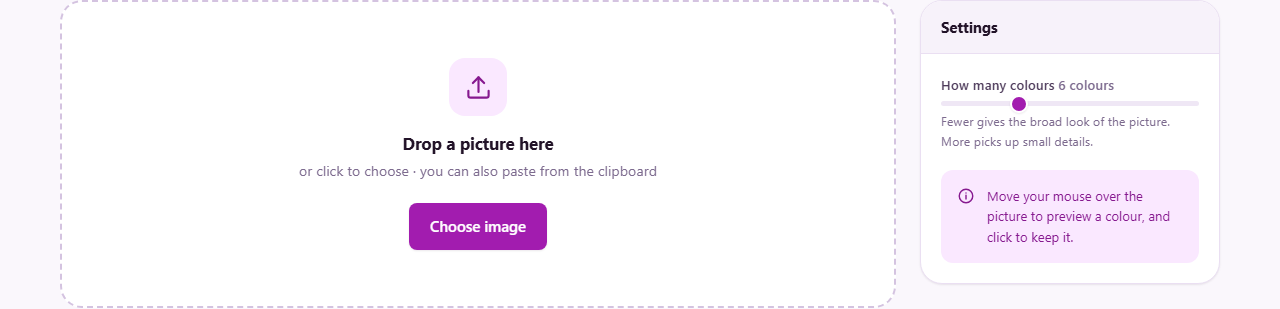
One picture at a time here, unlike the batch tools elsewhere on the site. Drag a file onto the drop area, click to browse, or paste an image straight from the clipboard, which is the quickest route when you have just grabbed a screenshot of a page you admire.
The file name appears at the top of the panel once it loads, with the picture below it and the cursor turned into a crosshair. Start over, on the right, clears everything and returns you to the drop area, ready for a different image.
How many colours, and where they come from
The only setting in the rail is How many colours, a slider from 2 to 16 that starts at 6. Move it and the palette rebuilds immediately.
The colours are not simply the most repeated pixels. If they were, a sunset would hand you six barely different oranges. Instead the full spread of colours in the picture is split in half again and again, each time along whichever of red, green or blue varies most, until there are as many groups as you asked for. Each group is then averaged into one colour. The result is a set that differs from each other, which is what makes a scheme usable.
Two consequences follow. First, a colour here is an average, so it may not match any single pixel exactly. Second, the analysis runs on a small copy of your picture, so a tiny fleck of brilliant colour in one corner may never earn a place. If that fleck is the colour you actually want, click it directly instead.
What each square tells you
Under Main colours, every result is a square filled with its own colour, with the text in black or white depending on which is easier to read. It carries four lines of information.
The top line is the hex code, the six-character form used in web pages and design apps, written in capitals. Below it comes the same colour as three numbers from 0 to 255 for red, green and blue. Then the same colour again as hue, saturation and lightness: which colour of the rainbow it is, how strong it is, and how light or dark. Designers often prefer that last form because nudging one number gives a sensible variation.
The final line is the share, for example 22.4% of image. That tells you whether a colour is the mood of the picture or just an accent. Clicking anywhere on a square copies its hex code to the clipboard, ready to paste.
Using the picture as an eyedropper
Move the pointer across the image and the small chip beside the file name fills with whatever is under the cursor, with its code written next to it. Nothing is recorded while you browse, so you can sweep around looking for the shade you want.
Click and that colour is kept. A panel called Colours you picked appears below the palette holding it, with the same hex, rgb and hsl detail as any other square. Keep clicking to build a set. A confirmation flashes up each time so you know it registered.
Two ways to undo. Hold Shift and click a picked square to delete just that one. The Clear button in that panel empties the whole picked list without touching the palette above. The hover preview needs a real pointer; on a touch screen there is no hovering, so a tap goes straight to picking.
The main colour and its contrast score
Along the bottom of the picture panel sits the largest colour on its own, with its code and a short note about text. The note names the better of black or white for writing on that colour, and gives a contrast score such as 5.8:1.
Contrast is a measure of how far apart two colours are in brightness, and it decides whether words on a coloured panel can actually be read. The widely used targets are 4.5 to 1 for normal body text and 3 to 1 for large headings. A pale gold background might score 1.9 against white, which looks pleasant on your screen and defeats a reader on a phone in sunlight.
Use it as a quick check before you commit a colour to a button or a banner. If the score is low, pick a darker or lighter member of the palette.
Getting the palette out
The Export panel at the bottom has a list of six shapes and a Copy button. The text area shows exactly what you will get, and it is read-only, so treat it as a window rather than a scratchpad. Whatever you export includes the main colours first, in their order on screen, followed by any colours you picked by hand.
- CSS variables writes a root block with names such as --colour-1. Paste it near the top of a stylesheet and refer to the names anywhere below.
- Hex codes gives a bare list, one code to a line. The simplest thing to paste into a message, a note or a spreadsheet.
- RGB values does the same with the three-number form, which some drawing and video programs prefer.
- SCSS variables produces dollar-sign names for anyone whose stylesheets are built rather than written directly.
- The framework config option builds a colours block with names counting upwards in hundreds, ready to drop into the settings file of a popular utility-class CSS framework.
- JSON returns a structured list where each colour carries all three forms. Use it when the palette is going into a program rather than a person's hands.
Saving the palette as a picture
Not everyone wants code. Save palette as image draws a wide strip with one solid block per colour, each with its hex code printed across it, and downloads it as a PNG named after the picture you loaded with -palette on the end.
This is the version to attach to an email, pin on a mood board, or hand to a printer. It is also a decent record: months later the strip still says which colours were chosen.
A worked session: a shop page from a product photo
You are building a page for a small weaving business and you want it to look like their scarves. Paste in a photo of the best one. With the slider at the default of 6, the palette might come back as a deep forest green covering a third of the picture, a soft oatmeal, two mid greens, a dark brown and a small share of red.
The two mid greens are almost twins, so pull the slider down to 4. The palette rebuilds and you keep the green, the oatmeal, the brown and the red. Now hover across the stripe on the scarf itself. The chip shows the true red of the thread, which is stronger than the averaged version, so click it to keep it.
Check the main colour readout: forest green, best text colour white, contrast around 9 to 1, which is comfortable for a header bar. Set the export list to CSS variables and press Copy. Paste the block into your stylesheet, then use those names for the header, the page background and the buttons. Finally press Save palette as image and send the strip to the shop owner so everyone is agreeing about the same five colours.
Where the colours can mislead you
A handful of situations produce a value that is technically right and practically wrong.
- Sampling a photo of a printed thing. Paper reflects the light in the room, so the code you get describes the photo, not the ink.
- Clicking a JPG near a hard edge. Compression invents halo pixels there. Click well inside a flat area instead.
- Picking from a gradient or a shadow. There is no single colour to find; the value changes with every pixel you move.
- Expecting a palette colour to match a pixel. It is an average of a group. When you need the real thing, click the picture.
- Working from a screenshot that was resized. Scaling blends neighbouring pixels, which can shift a flat colour by a few points.
When another page is the right one
If you already have a code and want to convert it, lighten it, or test a text colour against a background properly, Colour Converter and Contrast is built for that and goes much deeper than the one note here.
If you want to check a scheme works for colour blind readers, the Colour Blindness Simulator shows the picture as they would see it. To change a colour in the picture rather than read it, use Colour Replace. And to knock a flat backdrop out of a logo entirely, Colour to Transparent is the page you want.
Your picture is never sent anywhere
Reading colours needs the actual pixels, and all that reading happens in the browser tab in front of you. The file is opened from your disk, drawn once onto a hidden canvas, and measured there. No copy travels across the network, and nothing is stored after you close the tab.
It matters more often than you would think. People sample colours from unreleased packaging, from a client's brand sheet, from screenshots of internal software, from photographs of their own home. Those pictures stay on your machine. The only things that leave are the codes you copy and the palette strip you choose to save.