
Framing photos in the browser: margins, mounts and matching sets
A border seems like the simplest edit there is, yet a batch of framed photos raises real questions: why the width is measured as a percentage, which style suits which job, when corners need a particular file format, and how to keep fifty photos looking like one set. This article answers each in turn.
What a frame buys you
Breathing room, mostly. Photos placed straight against text or against each other visually bleed into their surroundings, and a margin of clean colour restores the boundary. Prints gain a white edge to handle. Product shots gain consistency across a shop page. A wide picture gains enough padding to survive a square display slot without anything being trimmed away.
There is also a small psychological effect. A framed image reads as finished, the way a mounted print reads differently from a loose one. For portfolios and market stalls that finish is half the point.
Three styles in the menu
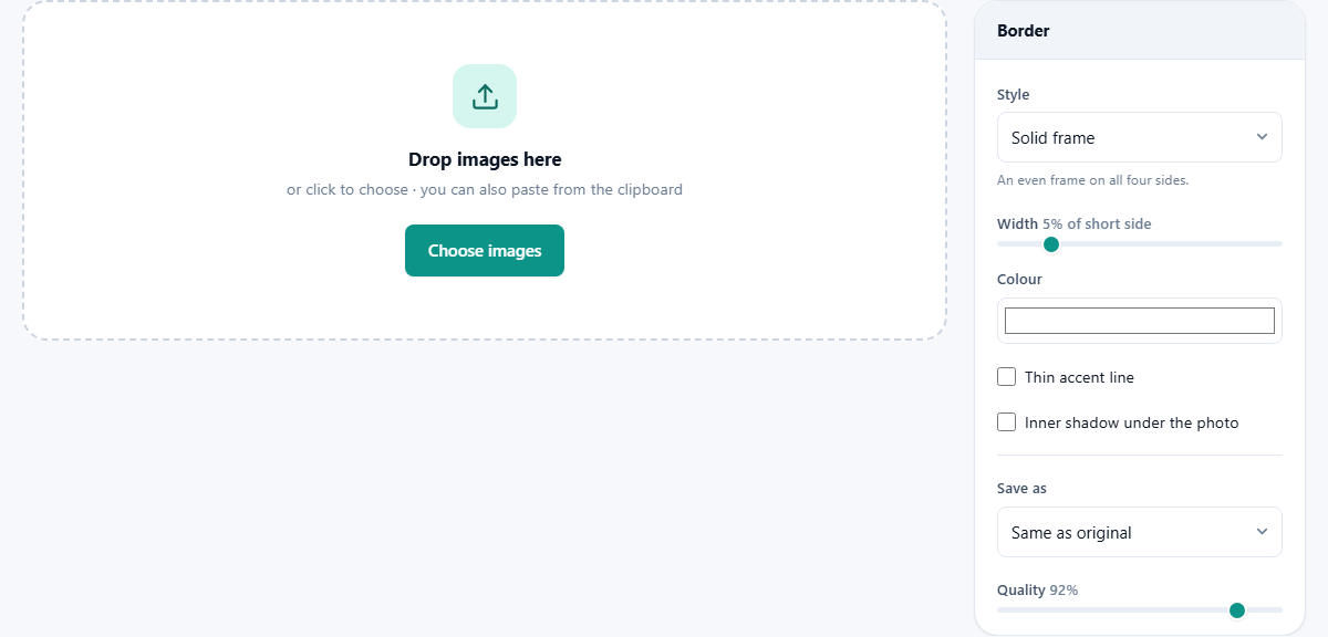
The Style selector holds three treatments. Solid frame surrounds the photo with an even band on all four sides, the everyday choice. The mount option, styled after old instant camera prints, keeps even margins on three sides but deepens the bottom strip considerably, leaving room where people traditionally scribbled a caption. Rounded corners softens the photo's own corners instead of adding much around it, with a Corner radius slider appearing to set how deep the curve cuts.
Each style answers a different brief. Even margin for galleries and prints, deep bottom for nostalgia and captions, curved corners for interface work, app screenshots and anything that should feel modern and soft.
Why width is a percentage
The Width slider runs from 1 to 25, but its unit is not pixels. It is a percentage of each photo's shortest side. This is the design decision that makes batches work.
Picture a folder holding a 800 pixel web export alongside a 5000 pixel camera file. A fixed 40 pixel band would dominate the small photo and disappear entirely on the large one. Five percent, though, means 40 pixels on the first and 250 on the second, and to the eye both frames occupy the same visual share. Every photo in the set comes out looking related. Around 3 to 5 percent resembles a classic print margin; past 15 the frame becomes a statement of its own.
Colour, the accent line, and depth
The Colour well fills the frame, and white is the default for good reason: it disappears against most page backgrounds and flatters nearly every photo. Cream feels warmer for older material, and near black suits high contrast work.
Two checkboxes add finesse. Thin accent line draws a slender keyline between photo and frame, in a second colour you choose, and that single line is often what separates homemade from professional. Inner shadow under the photo adds gentle darkness where the picture meets the mount, a hint of physical depth, as if the print sat slightly above the board. Both effects scale with the photo, so they hold up in a mixed batch.
Corners and file formats, the one trap
The rounded style creates areas outside the curve, and what fills them depends entirely on the Save as choice. PNG and WebP can store genuine transparency, so the corners stay open and the photo sits cleanly on any surface you later place it on. JPG has no concept of transparent, so those corners get filled solid instead.
If you have ever seen a nicely rounded image wearing ugly dark corner wedges on a website, this is the mechanism. The menu itself flags that PNG keeps rounded corners transparent. For the other two styles the format choice is just the usual size and quality trade, with the Quality slider covering the compressed formats, preset at 92.
Batches, and getting the files back
Add one photo or two hundred; the list shows each with its numbers updating as you adjust settings. One configuration applies to the whole batch, which is a feature rather than a limit, since a uniform treatment is usually why you batch at all. Different treatments simply mean two runs.
Press Add border and a progress bar walks the queue. Finished photos can be saved individually from the list, or collected with Download all as ZIP, which lands one archive containing the complete framed set. Same as original in the format menu keeps each file's existing type, letting a mixed JPG and PNG folder pass through without conversion.
Worked example: nine prints for a stall
A potter is preparing nine photos of bowls for a market display board. The pictures came from two cameras at different resolutions, and they need to hang together as one grid.
She drops all nine in, picks Solid frame, sets Width to 4, and keeps white. She ticks Thin accent line and gives it a deep teal to echo the glaze, then ticks Inner shadow for a touch of depth. Format stays Same as original. After clicking Add border she grabs the ZIP, and every bowl now floats in an identical white mount with a fine teal keyline, big files and small alike. Total effort: about ninety seconds, most of it deciding the accent colour.
The preview, and the numbers beside each file
A preview panel appears above the list as soon as the first photo lands, and it redraws every time you move a slider. Beside its heading is a tick box marked Show original. Turning it on and off is the fastest way to judge whether an accent line is helping or fussing, because your eye compares two states far better than it remembers one.
The panel is drawn at a modest size for speed, and a note under it says so plainly: the file you save is made at full resolution. Do not judge the fineness of the keyline from the preview alone on a very large photo.
The list underneath carries the hard numbers. Before you process, each row shows the photo's pixel size and its weight on disk. After processing, both turn into a before and after pair, so you can see at a glance that a 2.1 MB photo has become 2.4 MB and grown by a couple of hundred pixels each way.
How much bigger the picture gets
A border is added around the photo, never taken out of it, so the output is always larger than the input. The arithmetic is easy and worth doing once.
Take a 4000 by 3000 photo. The short side is 3000, so one percent is 30 pixels. At a width of 5 the band is 150 pixels, and it appears on all four sides, giving a finished file of 4300 by 3300. A square 1080 by 1080 post at the same setting gains 54 pixels a side and comes out at 1188 by 1188.
The mount style is the exception to the even maths. Its bottom strip is a little over three times the width of the side bands, which is what gives it that heavy chin. On the same 4000 by 3000 photo at width 5, the sides gain 150 pixels each while the bottom gains around 480. That extra space is the caption strip, and it is the reason a mounted photo needs a lower width setting than a plain frame to feel balanced.
A second run: a screenshot for a blog post
Different job, different numbers. You have one screenshot of an app, 1600 by 1000, going into an article on a pale grey page. A white frame would vanish, and hard corners would look dated next to the rest of the layout.
Choose Rounded corners. Set Width to 2, which is only 20 pixels here, because the goal is soft edges rather than a visible mount. Push Corner radius up to about 12. Leave both checkboxes off; a keyline fights with a screenshot's own interface lines. Set Save as to PNG so the four corners stay see through, and the article's background shows through them instead of a white wedge.
One press of Add border and the file is ready. Because the tool adds -bordered to the name, the framed copy sits next to your original rather than replacing it, which makes a second attempt at a different radius completely safe.
Small things that go wrong
The classic errors here are all recoverable in seconds once named.
- Dark corner wedges on a rounded photo mean it was saved as JPG. Re-run with PNG selected.
- A frame that overwhelms the picture usually means double digits on the width slider. Drop back toward 4 or 5.
- White frame invisible on a white page? Add the accent line, or shift the frame colour a few steps off pure white.
- Wanting different colours per photo is a two-run job, since one batch shares one setup.
Neighbouring tools for neighbouring jobs
A frame adds to the outside; it never trims. If the photo needs its edges cut or its shape changed, crop first and frame second. Round avatar cutouts with transparent outsides are the circle crop page's specialty. Combining several framed photos into a single sheet is collage territory. And if file size matters for the web, run the framed output through the compressor afterwards, since a border adds pixels and therefore bytes.
Processed at home, so to speak
Every frame here is drawn by your own browser onto your own copy of the photo, and the result is saved directly back to your device. The photos are never transmitted, no server takes part, and batch size costs nothing but your machine's memory. Family pictures and unpublished product shots keep exactly the audience they had before you framed them: you.