
Two photos, one frame: a working guide to blend modes
Blending is the rare effect where the maths and the mood meet. This piece explains what each mode in the menu actually computes, how to choose which photo goes underneath, what the fit and opacity controls change, and a complete double exposure build with real settings.
What blending means here
Lay one photo over another and you have to decide what happens where they meet. A blend mode is that decision written as a rule, applied to every pair of overlapping pixels. One rule keeps whichever pixel is brighter. Another multiplies them together and darkens. Another exaggerates their disagreement.
Those little rules produce most of the layered looks you see in posters, album covers and title cards: scenery ghosted inside a silhouette, paper grain aging a flat graphic, glowing light leaks over a night shot. This page gives you the rules without the rest of an editing suite around them.
Base first, overlay second
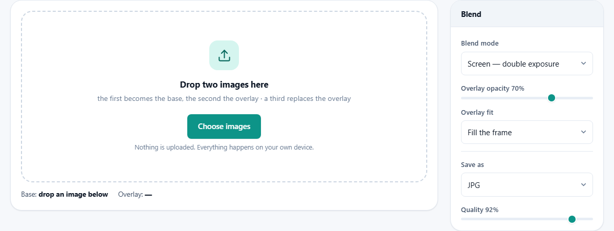
Drop two images into the zone. Order matters: the first becomes the base and the second the overlay. The finished picture always has exactly the base's width and height, so lead with the photo whose framing you want to survive. A third drop replaces the overlay, which makes auditioning textures quick.
Their names appear under the drop zone so you always know which is which, and the Swap the two button reverses the roles instantly. Swapping is not cosmetic. Multiply gives the same result either way, but screen over a portrait and a portrait over screen can look completely different, so when a blend feels almost right, try it inverted.
The mode menu, translated
Every entry in the Blend mode list earns its place. Here is what each one favours.
- Screen keeps the lighter of each pixel pair. The double exposure classic, because bright areas of the base dissolve into the overlay.
- Lighten also prefers brightness but picks one winner per pixel rather than combining, giving a harder edge.
- Multiply keeps darkness, which is why paper textures, grunge and shadows live here.
- Overlay boosts contrast by darkening darks and lightening lights at once.
- Soft light is the same idea with the volume turned well down.
- Darken picks the darker pixel outright, a blunt but useful sibling of multiply.
- Difference shows where the two images disagree, mostly used for comparing versions.
- Normal applies no rule at all, just the overlay faded by the opacity slider.
Opacity is the volume knob
The Overlay opacity slider runs from 0 to 100 percent and starts at 70. It controls how much of the blended result shows over the untouched base, so at zero the overlay might as well not exist, and at full strength you see the mode with nothing held back.
Almost every blend improves somewhere in between. Full-strength screen can bleach a portrait into fog; at 60 or 70 the scene sits inside the figure while the face stays readable. Treat the extremes as tests and the middle as the finish.
Making the sizes agree
Two photos rarely share dimensions, so the Overlay fit menu decides how the second image occupies the base's frame. Fill the frame scales it up until every pixel is covered, cropping whatever spills over, and is right nearly always. Fit inside shrinks it until the whole overlay is visible, which can leave uncovered margins where the base shows plain. Stretch to match distorts the overlay to the exact frame, useful for abstract textures where warping is invisible, ruinous for anything with faces or straight lines.
Worked example: a forest inside a portrait
The look on every festival poster takes about two minutes here. First find a portrait against a pale sky or bright wall, the brighter the better. Second, a photo of dark pine trees. Drop the portrait first, the trees second.
Leave the mode on Screen. The bright background burns out to white at once, and the forest appears only inside the darker head and shoulders. Set Overlay fit to Fill the frame so the trees cover fully. Now ride the opacity: at 100 the effect is total, at 75 some facial detail returns. Around 80 tends to feel like a print rather than an accident. Download as JPG at the default 92 quality and you are done.
If the trees appear over the face instead of inside the silhouette, your portrait background was too dark. Swap the two, or choose a brighter base photo.
A second run: aging a flat label
Screen and a portrait is only one of the two big recipes. Here is the other, with its own numbers. You have designed a clean label for a jar of honey and it looks too new. You also have a photograph of creased brown paper.
Drop the label first so the output keeps its exact frame, then the paper. Choose Multiply from the mode list. At full strength the label goes dingy and the text loses its grip, so pull Overlay opacity down to about 45. Now the creases sit in the artwork rather than on top of it.
Set Overlay fit to Stretch to match. On a photograph that would be vandalism, but paper grain has no faces and no straight lines, so nobody can tell it has been pulled about. Save as PNG, because the label has hard edges and flat colour that a compressed format would fray. The download arrives named after the label file with -blend added, so the original design is untouched.
Picking two photos that will actually work
Most disappointing blends are a casting problem, not a settings problem. The modes here reward pairs where one picture is simple and the other is busy.
For the ghosted look, the base wants a clear shape against a plain bright field: a head against a white wall, a bottle on a lit backdrop. The overlay wants plenty going on, since it is the one supplying the interest. If both photos are busy, the eye finds nowhere to rest and the result reads as a smudge.
There is also a brightness rule of thumb. Screen and lighten need a base with bright areas to give away. Multiply and darken need a base with light areas to be stained. Two dark photos blended with multiply produce something close to a black rectangle, and no slider rescues it.
Reading the page while you work
Two small pieces of feedback stop you guessing. The line under the drop zone always names the current base and overlay, which matters because a third drop quietly replaces the overlay and it is easy to lose track of what is loaded.
The note under the canvas gives the finished pixel size and reminds you it comes from the base. Before the second picture arrives it simply asks for one. Until then, Swap the two and Download stay greyed out, which is the page telling you it has nothing to blend yet rather than a fault.
Common disappointments and their cures
When a blend refuses to look right, the fault is usually one of these five.
- Almost everything went white. Screen with two bright pictures. Lower the opacity, or choose a darker overlay.
- Almost everything went black. Multiply with two dark pictures. Try overlay or soft light instead.
- Bands of the base show along two edges. Overlay fit is on Fit inside and the overlay is a different shape. Switch to Fill the frame.
- Faces in the overlay look squashed or stretched. That is the Stretch setting doing its job. Keep it for textures only.
- The interesting part of the overlay is off the edge. Filling the frame crops from the centre outwards, so crop the overlay to its subject first, then blend.
Stacking more than two
The page blends one pair at a time, but nothing stops you looping the result back through. Download the first blend, drop it in as the new base, and add a third image over it. Each pass welds one more layer in permanently.
Work in PNG between passes so repeated saving does not stack up compression marks, and only switch to JPG for the final export. And keep the strongest effect for the last pass, since everything beneath it gets pushed further back with each round.
Difference mode, the odd one out
One mode in the list is a measuring instrument wearing an effect's clothes. Difference turns every matching pixel black and lights up every mismatch. Blend a design export against last week's version and the changes glow against darkness.
For a casual did-anything-move check it is perfect. When you need numbers, thresholds and a saved report, the dedicated comparison tool on this site does the same job with proper controls.
Saving: which format and when
The Save as menu offers JPG, PNG and WebP, with a Quality slider for the lossy formats that starts at 92. Photographic blends compress beautifully as JPG, and quality above 90 is safe for printing. Choose PNG when the result will be edited again, or when the blend contains hard graphic edges that JPG would fringe. WebP lands smaller than JPG at similar quality and suits web publishing.
Remember the output size equals the base image's size. If you need a specific canvas, resize the base before blending rather than after, so no scaling pass softens the finished art.
Where the mixing happens
All of this compositing is performed by the graphics engine your browser already contains, running on your own hardware. The two photos are opened locally, combined locally, and written back locally. No copy of either image, or of the blend, ever leaves the machine. Portraits of your family and unreleased campaign art are treated to the same silence: the site cannot see them, because they are never sent.