
Making pictures out of letters, and getting them to hold their shape
Here is a deeper look at turning a photo into character art: how a grid of squares becomes rows of symbols, what each setting truly changes, a start-to-finish banner example, and why the result sometimes falls apart the moment you paste it somewhere.
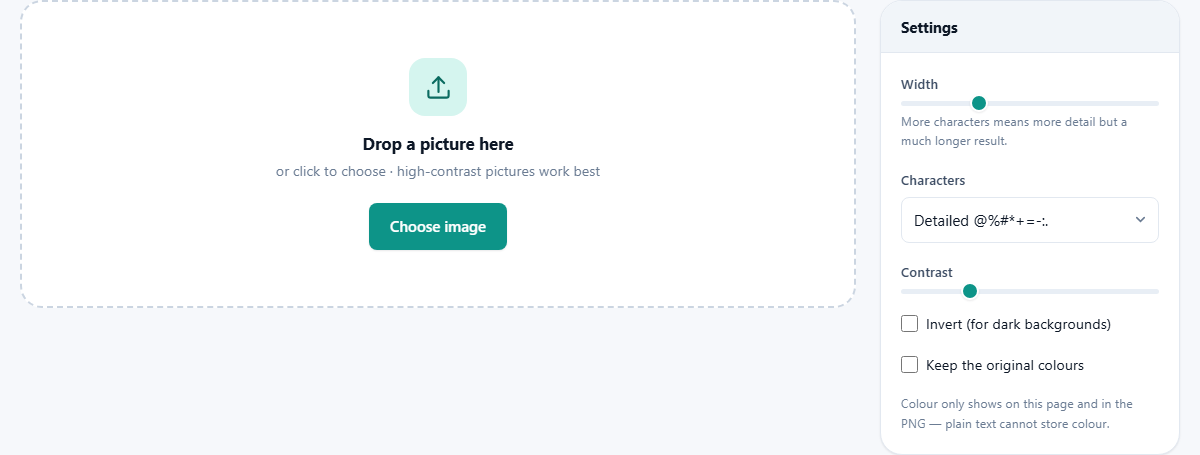
An old trick that refuses to die
Long before screens could show photos, printers could only produce letters, so people drew with them. The habit stuck. Today you still find character art at the top of source files, in terminal welcome screens, in chat signatures and in readme files, partly for nostalgia and partly because plain text travels absolutely anywhere.
This converter exists for those moments. Give it a picture and it hands back the same scene rebuilt from typed symbols, ready to copy. Programmers decorate their projects with it, streamers drop it into chat, and plenty of people just want their dog rendered in punctuation.
How a photo becomes typed symbols
Under the hood the idea is simple. The image is chopped into cells, one cell per output character. The tool measures how bright each cell is on average, then substitutes a symbol of matching visual weight. Heavy glyphs full of strokes stand in for shadow, thin ones for midtones, and blank space for light.
This explains the single most useful rule: subjects with bold light and dark regions convert beautifully, while flat evenly lit scenes turn to porridge. A silhouette, a logo, a face lit from one side, all strong candidates. A misty grey landscape, not so much.
Width is really a resolution dial
The Width slider, from 20 to 300 characters, decides how many columns the art gets, and therefore how much detail survives. Think of it as choosing megapixels for a text file.
At 40 characters you get something charming and chunky that fits a phone screen. The default of 100 suits a code comment viewed in an editor. At 250 or 300 you are making a poster, and the counter under the preview will show tens of thousands of characters. Message apps often truncate past a few thousand, so check the Length stat before committing to a paste.
Choosing your alphabet
The Characters menu swaps the palette of symbols. The detailed set uses many glyphs across the brightness range, giving smooth gradients and the most photographic feel. Blocks builds the art from solid block characters, bold and poster-like even from across a room. Binary restricts everything to 1 and 0, which reads as deliberately digital and suits anything computer themed.
There is no single best set. The same portrait can feel gentle in the detailed set and aggressive in blocks. Switching costs one click and re-renders instantly, so audition all of them.
Crop before you convert
The grid covers the whole frame, empty corners included. So a person standing small in a wide photo might be given only eight characters to exist in, and eight characters cannot hold a face.
The cure is to trim the picture first, using the cropper on this site, then bring the tight version here. Cut in close, leave a little room around the subject, and let the grid spend all its cells on the part that matters. The same photo can go from unrecognisable to obvious with no change to any setting on this page.
All six sets, and what each is for
The menu lists every set with a sample of its own symbols beside the name, so you can see the alphabet before you pick it. Six are offered and they are not interchangeable.
- Detailed uses ten steps from a heavy at sign down to a plain space. The smoothest of the six and the best default for faces.
- Classic adds a few more mid weight symbols. It is the look most people picture when they think of text art.
- Blocks uses solid shaded squares instead of letters. Bold, poster like, and the only set that fills its cell completely.
- Simple has four steps and nothing else. Crude on a photo, excellent on a logo or a silhouette where you want a hard edge.
- Binary is only 1, 0 and a space. It reads as machine output and suits anything about code.
- Letters is built from capitals, so the art is made of real words that are not words. Good for headers where you want the text to look typed.
Why there are fewer rows than columns
Look at the Art size figure and you will notice the two numbers do not match the shape of your photo. A typed character is roughly twice as tall as it is wide, so the tool squashes the row count to compensate. Without that step every picture would come out looking stretched downward.
The arithmetic is worth knowing before you set the width. A square photo at 100 characters across produces about 50 lines. A wide landscape at the same setting gives around 33. A phone photo held upright gives about 67.
That is why the Length figure grows so fast. Doubling the width doubles the columns and the rows at once, so 100 across is roughly 5,000 characters while 200 across is closer to 20,000. Check both numbers before you paste anywhere with a limit.
A smaller run: a pet in a chat message
The terminal banner needed a narrow, inverted result. A message to a friend is a different shape of job, and the numbers change with it.
Drop in a photo of a cat sitting against a pale wall. Set Width to 45. That sounds tiny, but a chat window on a phone is narrow, and anything wider will wrap and fall to pieces. Choose the Simple set, because at this size a subtle ten step gradient just turns into visual mush.
Push Contrast to about 170 so the cat separates cleanly from the wall behind it. Leave Invert alone, since most chat apps show dark text on a light bubble. The Length figure should read somewhere around a thousand characters, which almost any message box will accept.
Press Copy text and paste. If it arrives crooked, the app is using a proportional font, and the fix is to send the PNG instead.
Contrast, and the invert switch
The Contrast slider stretches the difference between light and dark before symbols are assigned, from 50 up to 250 percent. Photos of people usually benefit from a nudge upward, around 130 to 160, because faces carry subtle tones that otherwise map to the same few characters.
Invert flips the whole brightness mapping, and it exists because the tool assumes dark symbols on a light page. Paste that assumption into a dark terminal and your subject becomes a ghost hole in a field of characters. Ticking Invert before copying fixes it. If your art looks like a photographic negative wherever you put it, this switch is almost always the answer.
The colour option, honestly
Keep the original colours tints each character with the hue from its patch of the photo. On this page, and in a saved PNG, the effect is lovely.
But understand its limit before relying on it. A .txt file stores characters and nothing else, so the colour information is discarded the moment you save as text or paste into a plain editor. Colour survives only where the picture format carries it. Treat the option as a PNG feature, not a text feature, and you will never be surprised.
Three ways to take it with you
Copy text puts the raw characters on your clipboard for pasting into chats, comments and terminals. Save as .txt writes the same characters to a file, which is safer for very long results. Save as PNG renders the art as an actual image that can never be reflowed or mangled.
The PNG route has its own checkbox, Dark background when saving, ticked by default. It gives the classic terminal look of pale characters on near black. Untick it for a light image that sits better in printed documents.
Worked example: a start-up banner
Suppose you want a coffee cup above the version number when your little command line program launches. Find a photo of a mug against a bright wall and drop it in.
Set Width to 60, since terminal windows are commonly 80 columns and you want margin. Choose the detailed character set, push Contrast to 140 so the cup separates from the wall, and tick Invert because terminals are usually dark. The Art size stat confirms 60 across. Click Copy text, paste it between quotes in your print statement, and run the program. If the handle smears, nudge the width to 80 and try again.
Why pasted art goes crooked
The most common complaint has one cause. Character art aligns only when every symbol occupies identical width, which is true in a monospaced font and false nearly everywhere else. Word processors, social feeds and email bodies use proportional fonts, so each row ends at a different place and the picture shears sideways.
You cannot fix that from this end with settings. Either paste where code fonts live, wrap it in a code block if the destination supports one, or sidestep the whole problem by exporting the PNG instead.
Jobs this tool should not do
If you need the photo smaller rather than symbolic, the compressor and resizer on this site are the right tools. If you want a stylised but still photographic look, try the effects pages instead, since character art throws away far more detail than any filter.
Nothing sent, by the way, applies here as everywhere on the site. The grid sampling and symbol matching run in your browser on your machine, the picture never crosses the network, and the only outputs are the clipboard and files you choose to save.