
Nine ways to change how a photograph looks, and when each one is right
An effect is easy to apply and easy to overdo, and the difference between a photograph that looks styled and one that looks processed is usually two sliders rather than twenty. This page carries nine effects that were previously nine separate tools — adjustments, sharpen and blur, glitch, duotone, film, sketch, halftone, pixelate and tilt-shift. Here is what each one actually does to the pixels, which control matters most in each, the mistakes that come up again and again, and how to run any of them across a whole folder at once.
Nine effects, one machine
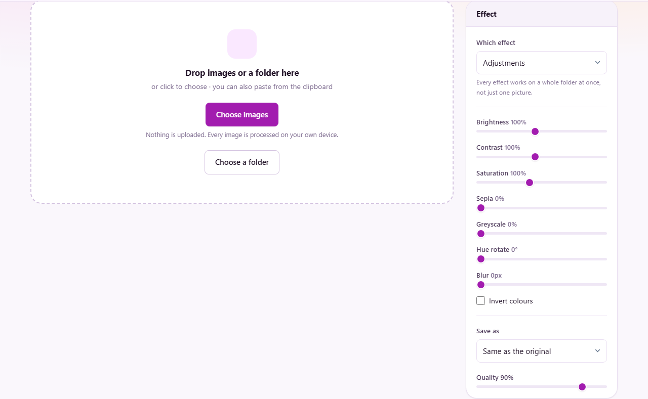
This page used to be nine separate pages: adjustments, sharpen and blur, glitch, duotone, film, sketch, halftone, pixelate and tilt-shift. They were always the same machine underneath — drop in pictures, set a few options, get the same change applied to every one of them — and the only real difference was which function ran over the pixels. Now the Which effect menu chooses that, and the panel below shows only the controls that effect actually uses.
The practical gain is that you can try a photo through several looks without loading a new page each time, and that everything the nine pages could do with a folder, this one does too: drag in a directory, watch the batch run, stop it part-way if you change your mind, and download the results singly or as a ZIP.
Every effect works on a small preview first so you can judge it before committing, and the preview is drawn by the same code that writes the file. What you see really is what you save.
Adjustments: the ordinary controls, done properly
The first effect is the plain one: brightness, contrast, saturation, sepia, greyscale, hue rotation, blur and invert. It is where to start when a set of photographs simply do not match — shots from two cameras, or one room lit by a window and a lamp.
Brightness and contrast are not the same lever. Brightness moves every value up or down together, which lifts the shadows and the highlights equally and can flatten a picture. Contrast pushes values away from the middle, so darks get darker while lights get lighter. A washed-out photo usually wants contrast, not brightness, and reaching for the wrong one is the commonest mistake on this effect.
Saturation controls how strong the colours are, with zero giving a grey image by a different route than the greyscale slider. Hue rotation turns the whole colour wheel, which is a blunt instrument on a photograph and a useful one on a graphic. Sepia and greyscale are partial: at forty per cent you get a hint rather than a conversion, which is usually what people want.
The preset list is a starting position rather than an answer. Choosing one moves every slider to a recipe you can then argue with, and the menu tells you honestly whether what is on screen is still that preset or has become something of your own.
Sharpen and blur: what sharpening actually is
Nothing can add detail a photograph never recorded. What sharpening does is exaggerate the edges that are already there, which the eye reads as crispness. The method is unsharp masking, and the name gives the trick away: the picture is blurred, the blur is subtracted from the original to find where the two differ — which is precisely the edges — and that difference is added back.
Strength is how much of that difference goes back in. Radius is how far the blur reached, which decides what counts as an edge in the first place. They interact, and getting them backwards is the usual failure. A small radius with high strength sharpens fine texture and makes noise worse; a large radius with modest strength adds apparent contrast to big shapes without touching grain.
The same slider set runs in reverse for blurring, using the same separable blur, so a radius means the same thing whichever direction you are going. Blur is useful for backgrounds behind text, and for softening a photograph that is going to be printed small.
Two warnings from the old page are worth keeping. Halos — a pale outline along a hard edge — mean the strength is too high for the radius. And sharpening a JPEG that was already saved at low quality sharpens the compression blocks along with the picture.
Glitch: five separate faults, not one slider
The glitch look is a collection of specific failures, and the effect offers them separately because they land very differently. Set them one at a time rather than pushing everything up at once.
Colour split is the one to set first, and often the only one needed. The red channel is pushed one way and the blue the other, which is what a mis-synchronised video signal did, and a few pixels of it reads as damage immediately.
Sliced bands take horizontal strips and shove them sideways. Corrupted blocks pick small rectangles and abuse them — swapping channels, inverting, or crushing them to neon. Those two are different kinds of damage: bands read as a transmission fault, blocks as data corruption.
Scanlines and noise sit on top of everything else as surface texture rather than structural damage. They are what makes the result look photographed off a screen rather than merely broken.
The randomness is seeded, so the same settings give the same picture. Running it again with the same numbers is not a way to get a different result — change a slider if you want a different arrangement of damage.
Duotone: brightness in, colour out
Duotone throws the original colours away entirely. It keeps only how bright each pixel was, and maps that brightness onto a gradient you choose. A dark pixel becomes your shadow colour, a bright one your highlight colour, and everything between is interpolated.
That is why the source photograph matters less than people expect and its tonal range matters more. A picture with real blacks and real whites gives you the full sweep of your gradient. A flat, evenly-lit snapshot uses only the middle of it and comes out muddy, which is what the contrast slider is there to rescue.
Two colours give the classic effect. Adding a third — a midtone — bends the ramp and is what separates a considered duotone from an obvious one. The preset list offers pairs that are known to work, and they are a starting point rather than a limit.
Blend with the original brings some of the true colour back. At twenty or thirty per cent you get a photograph that has been graded rather than recoloured, which is often what a client actually wanted.
Film effects: the specific things that give film away
Film does not look like digital for a list of reasons, and this effect offers them individually rather than as one nostalgia slider.
Lifting the blacks is the quiet one that does the most work. Film base is never truly black, so the darkest part of a film frame sits slightly above zero. Raising it very slightly is more convincing than any amount of grain.
Halation is the one almost everybody forgets: light bleeding around a bright edge, caused by light passing through the emulsion and reflecting back. It is why a window in a film photograph glows and a digital one just clips.
Grain has both an amount and a size, and size is the setting that matters. Fine grain at high amount reads as digital noise; coarser grain at a lower amount reads as film. Vignette darkens the corners the way a lens does. Light leak adds a streak of colour from the edge, as though the back of the camera opened. Warmth shifts the whole picture towards amber, and the mono switch drops colour entirely for black-and-white stock.
The stock presets set all of these together to imitate particular films. As with every preset here, they move the sliders rather than hiding them.
Sketch: five ways to look hand-drawn
The sketch effect finds edges and draws them, then decides what to do with everything that is not an edge. The five styles differ in that second decision: pencil keeps soft shading, ink drops it for hard lines, and the others sit between.
Line strength and Detail are not the same knob, and confusing them is the usual complaint. Detail decides how small a change counts as an edge worth drawing — turn it up and you get eyelashes and fabric weave. Line strength decides how dark those lines are once found. A portrait usually wants low detail and firm lines; a building wants the opposite.
Contrast adjusts the source before any of that happens, which matters because edge-finding works on differences. The paper option puts a texture behind the drawing, and the tick boxes control whether any colour survives.
Photograph choice does more than any slider. A subject that is clearly separated from its background works; a busy scene with everything at the same distance turns into a tangle of lines no setting will rescue.
Halftone and dither: pictures made of dots
Printing presses cannot print grey. They can print ink or not print ink, so a photograph is broken into dots of varying size — bigger dots where the picture is darker — and the eye blends them at normal viewing distance. That is halftone, and it is why old newspaper photographs look the way they do.
Dot size is the main control and the one that decides whether the result reads as a technique or as a mistake. The screen angle matters more than it sounds: dots on a grid look mechanical, and the traditional angles exist because they are least visible to the eye.
Contrast and levels shape the picture before it is screened, which matters more here than almost anywhere else — a flat photograph screens into a flat grey field of identical dots. The invert switch swaps ink for paper.
Ink and paper are real colour pickers, not labels. A dark blue ink on warm cream is a different object from black on white, and it is how you get a two-colour poster out of a photograph. The dither modes take a different route to the same problem, scattering pixels rather than sizing dots, which suits pixel art and small sizes.
Pixelate: censoring, and its limits
Pixelation replaces each block of pixels with their average colour. Applied to a face or a number plate, it removes the detail that identified them — and how much it removes depends entirely on the block size, which is the safety dial rather than an aesthetic one.
There are three answers to where. The whole image, a rectangle you place with the sliders, or everything except that rectangle — the last being how you keep one person sharp and obscure the rest of a room.
Block size deserves care when this is being used for privacy rather than style. Large blocks over a small face leave nothing; small blocks over a large one can leave enough structure that the original is recoverable. Pixelation of text is particularly weak: a short, predictable string can sometimes be reconstructed by pixelating candidate texts and comparing.
Two things this cannot do. It does not remove the information that was never visible — location, camera and timestamps live in the file's metadata, and the EXIF tool is what strips those. And the round shapes leave gaps between blocks, so for censoring the area gets a solid base coat first, because a gap is a hole you can see through.
Tilt-shift: why a blurred photograph looks small
When you look at something close up, only a narrow band is in focus. Your eye has learned that a shallow band of sharpness means a small subject seen from near by. Blur the top and bottom of a wide scene and the brain draws the obvious conclusion: it must be a model.
Focus position sets where the sharp band sits and Sharp band height how thick it is. Blur ramp controls how quickly sharpness falls away, and it is the setting that separates convincing from obviously edited — a sudden edge between sharp and blurred reads as a mistake, a gradual one reads as a lens.
Blur strength is how blurred the far parts become. The colour boost is the part that surprises people: model villages are painted in brighter colours than the real world, so lifting saturation is part of the illusion rather than a separate decision.
The band can run vertically instead, which suits a street photographed along its length rather than across it.
The photograph matters more than the sliders. This wants a scene shot from above at a distance, with small separated subjects — a market square from a balcony works, a street photographed at eye level never will, because the geometry contradicts the illusion.
Running a whole folder
Every effect here is a batch tool. Drop a folder onto the page, or use Choose a folder, and every image inside is picked up including those in sub-folders. Anything that is not an image is ignored rather than complained about.
The settings apply to all of them, which is the point: a shoot processed with one look is what makes a set of photographs look deliberate rather than accumulated. The progress bar reports as it goes, and a Stop button appears on any run long enough to regret starting — it finishes the image it is on, so nothing is left half-written, and everything already done stays available.
Results download singly from each row, or together as a ZIP. Filenames keep the suffix each effect always used, so a glitched file is still named -glitch and a sketch still -sketch.
Saving, formats and quality
Same as the original keeps whatever the file already was, which is usually right. JPG is for photographs and cannot carry transparency. PNG keeps transparency and is much larger for photographic content. WebP is smaller than both at matching quality and is understood everywhere that matters now.
The quality slider only affects the lossy formats. Ninety is a sensible default; below about seventy the compression starts arguing with whatever effect you just applied, which is particularly visible on halftone dots and film grain, where the codec treats deliberate texture as noise to be smoothed away.
If an effect produced transparency and you save as JPG, the transparent areas fill with a background colour, because JPG has no way to store them.
The mistakes that come up most
Stacking every slider. Each effect is designed so one or two controls do the work; pushing all of them produces something that looks processed rather than styled.
Judging from the small preview. It is drawn at a reduced size, and radius-based effects — sharpen, blur, tilt-shift, grain size — are scaled to match so the preview does not overstate them. Export one file and look at it properly before running two hundred.
Expecting an effect to rescue a bad photograph. Sketch needs separation, tilt-shift needs the right viewpoint, duotone needs tonal range. No setting supplies what the picture never had.
Using pixelation as security without thinking about block size, and assuming it removes metadata. It does neither by default.
Running the same effect twice. Grain on grain, sharpening on sharpening, halftone on halftone — the second pass works on the first pass's artefacts, not on the photograph.
When a different page is the right one
To change one specific colour rather than the whole picture, Colour Replace targets a hue and leaves everything else alone. To knock a flat background out, Colour to Transparent does that with an edge that holds up.
To apply a look saved from elsewhere, the LUT Applier takes .cube files. To strip the hidden data out of a photograph, the EXIF tool does what pixelation cannot. For layered work — masks, selections, several effects on different parts of one picture — the Image Studio is the page for that.
And for resizing, converting or compressing rather than styling, those are their own tools and do the job better than any effect here would.
Everything happens on your own device
Every one of these effects runs in your browser, on your machine. The pictures are read from your disk, worked on in the page, and handed back. None of them is uploaded, stored or logged anywhere.
That is worth stating plainly for this page in particular, because the reasons people reach for it are often private. Pixelation is used on documents, house listings, screenshots of internal systems and photographs of children. Sending those to a server to have squares drawn on them would defeat the purpose entirely.
You can check rather than trust: load the page, disconnect from the internet, and use it. Everything still works, because there was never a network call in it. Close the tab and nothing remains.