
Filling in the overlaps: a practical guide to the circles
Below the short help you will find the fiddly parts: which of the seven text boxes feeds which patch of the picture, how the two shape numbers work against each other, why black text vanishes on a dark background, and what to do when your words spill over the edge of a circle. One full example is built from scratch near the end.
Where two rings beat a list
Some comparisons are just a list with two columns. Others have a middle, and the middle is the interesting bit. That is where these circles earn their keep.
A teacher comparing two animals wants the shared traits in the lens between them. A team arguing about a feature wants what is cheap, what is quick and what is genuinely wanted, plus the small patch where all three agree. Someone weighing two flats wants what each has that the other lacks, laid out where a housemate can see it.
If your middle would be empty, stop and use a table. If it is full, this is the right shape and the rest of this guide is about getting the words to fit inside it.
Press the example button first
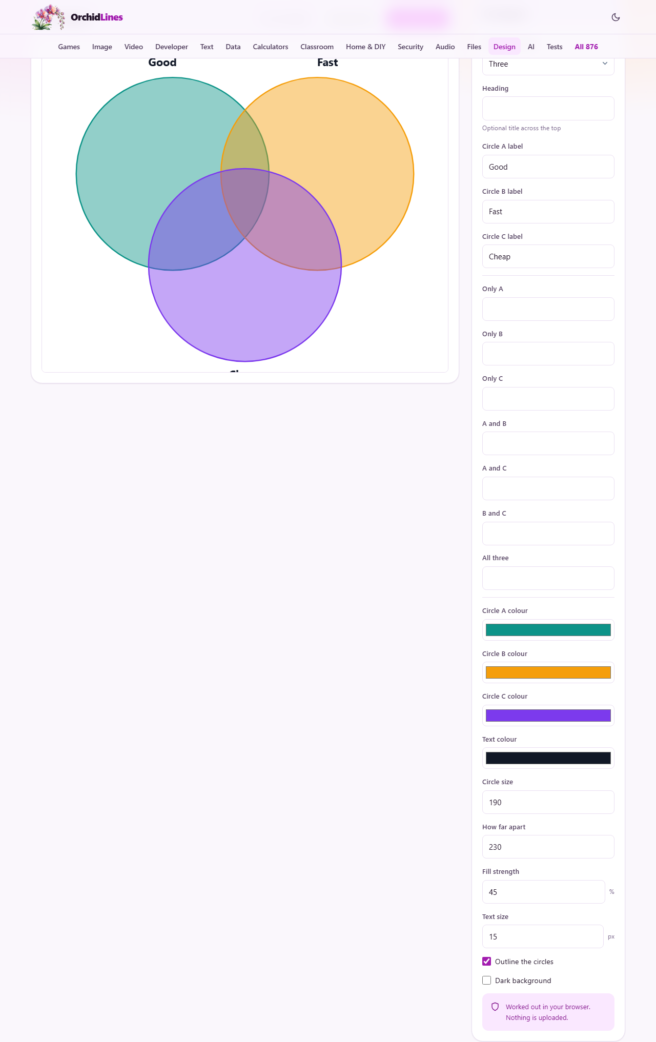
Try an example fills every box at once with a three-circle set about picking a project: circles labelled Good, Fast and Cheap, a heading, six outer regions, and the middle reading Pick two. It is the quickest way to see which box controls which patch of the picture.
Press it before you type, not after. It overwrites every field, so a diagram you were halfway through disappears. Once it is on screen, replace the words one box at a time and watch which part of the drawing changes.
Two circles or three
How many circles is the first choice, and it does more than change the drawing. Choose Two and six fields quietly fold away: Circle C label, Only C, A and C, B and C, All three, and Circle C colour. Choose Three and they come back, with anything you had already typed still in them.
There is no four. Four circles cannot produce all fifteen regions a true four-set diagram needs, whatever you do with their positions, which is why the option is not offered.
Seven boxes for seven patches
The rail is in three blocks. At the top, Heading is an optional line across the very top of the picture, drawn large and bold. Under it, Circle A label, Circle B label and Circle C label name the sets themselves; those are drawn outside the circles, above the top two and below the bottom one, so they never sit on the contents.
The middle block holds the contents. Only A, Only B and Only C fill the parts of each circle nobody else touches. A and B, A and C and B and C fill the three lens shapes where two circles meet. All three fills the small patch in the centre. Leave any of them blank and that patch simply stays empty.
Text wraps by itself, but the rules are worth knowing. Region text breaks to a new line at about eighteen characters, and at about fourteen once you push the text size past 20. The circle labels are always drawn at a fixed larger size, so they also break at around fourteen characters, which is why a long set name suddenly becomes two lines. Whatever the box, only the first five lines are drawn. Anything beyond that is dropped without a warning, so a pasted paragraph will lose its tail.
Circle size and how far apart
These two numbers fight each other, and that is the point. Circle size runs from 80 to 280 and sets the radius of each ring. How far apart runs from 60 to 400 and pushes the centres away from one another.
The overlaps are what is left when the circles are pulled apart. So if the lens between two circles is too cramped for your words, lower How far apart before you touch Circle size. Sliding the circles together grows every overlap without making the whole picture heavier.
Two failure points are worth watching for. Push them so far apart that the gap between the centres is more than twice the radius and the circles stop touching at all, at which point there is nowhere for the shared text to go. Push the size up near its ceiling instead and the drawing runs past the edge of the canvas: the first thing to disappear is usually a set label, because those sit outside the rings. Both are obvious in the preview if you look at it after each change.
Colour, strength and the dark trap
Circle A colour, Circle B colour and Circle C colour are ordinary colour pickers, starting on a teal, an amber and a purple. Because the fills blend rather than stack, the overlaps become mixed colours you did not choose directly. Three strong colours can turn the middle muddy, so pick colours that stay distinguishable when combined.
Fill strength is a percentage from 5 to 100 and controls how solid those fills are. It starts at 45. Lower it when you have a lot of text to read through; raise it when the picture is going on a projector at the back of a hall. Outline the circles draws a firm edge in each circle's own colour and is on to begin with; turning it off gives a softer, cloudier look that still works because the overlaps stay visible through the blending.
Text colour applies to everything written: the heading, the set labels and every region. It starts on a near-black. Dark background swaps the white sheet for a very dark one, and this is where people get caught. The near-black text does not change with it, so the whole diagram appears to empty itself. Set Text colour to white or a pale shade at the same time and it comes straight back.
The two downloads
Download SVG saves venn-diagram.svg. That is a drawing described by lines and shapes rather than dots, so it stays sharp printed on A3, and any vector editor can open it later to nudge a word or restyle a circle. It is the one to keep if the diagram might be reused.
Download PNG saves venn-diagram.png as an ordinary picture, rendered at twice the size of the preview so it still looks crisp when a slide stretches it. Use it for documents, chat messages and anything that refuses to accept a vector file.
The preview is not a rough sketch. It is the same drawing both downloads are made from, so what you see there is what you get.
A lesson sheet, built step by step
Say a science lesson compares frogs and toads. Set How many circles to Two, and the six three-circle fields vanish. Put Frogs in Circle A label and Toads in Circle B label. Both are short, so neither wraps.
In Only A type Smooth wet skin. In Only B type Dry bumpy skin. In A and B type Both are amphibians. Each fits on a line or two. Now type Frogs and toads into Heading and it appears in bold across the top.
The default sizes already overlap generously, but the shared box has three short lines to hold, so drop How far apart from 230 to about 190. The lens widens and the text settles inside it. The teal and amber fills at 45 per cent are a little strong under all that text, so take Fill strength down to 30 and leave Outline the circles ticked, which keeps the edges clear even with pale fills.
Press Download PNG for the slide deck and Download SVG for the folder where next year's version will start.
Common problems and their cures
Almost every complaint about a diagram like this comes down to one of these.
- Words cross the edge of a circle: too many words for the space. Cut them to three or four, or move the circles closer together.
- The last part of an entry is missing: you exceeded five lines. Shorten it, or split the idea across two regions.
- A set name broke onto two lines: the labels are drawn large, so about fourteen characters is the practical limit for one line.
- The whole picture went blank after ticking Dark background: the text is still near-black. Change Text colour to something pale.
- The circles no longer touch: How far apart is greater than twice Circle size. Reduce the spread.
- Nothing is shown for the middle in a two-circle diagram: All three only exists when three circles are selected.
- A colour looks nothing like the swatch you picked: that region is a blend of two or three fills, not one. Lower Fill strength or choose colours further apart.
When the circles are the wrong answer
Four or more sets, anything with numbers attached to each region, or a comparison of eight features across three products: none of those belong here. A plain table beats a diagram every time once the regions carry data rather than words.
If what you actually have is a sequence of steps, a decision with branches, or a set of boxes joined by arrows, the flowchart and diagram makers in this same section are built for it. For a spray of ideas hanging off one central topic, the mind map maker fits better than any set of rings.
Nothing you type is sent anywhere
The drawing is assembled by the page itself, in your browser, from the words in those boxes. The picture that appears in the preview and the two files you download are made on your machine. No server sees the set names, the region text, or the finished diagram.
That matters more than it sounds for the way this tool gets used. Comparison diagrams are often drawn from a candidate shortlist, a supplier review, or a lesson about a child in the room. Because the words never travel, the only place they exist is the file you choose to save. Nothing is stored for you either, so download before you close the tab.