
Turning one body size into a whole stylesheet
The block above explains the idea in a few lines. This guide takes every field in the Settings rail in turn, shows what lands in the table and in the code box, walks one scale from first click to pasted CSS with real figures, and lists the errors that only show up weeks later.
The mess this replaces
Most stylesheets grow one size at a time. A heading looks small, so somebody types 22px. A card title looks big, so somebody types 19px. A year on, the file holds nineteen font sizes and no two pages agree with each other.
A scale swaps all of that for one rule. You pick one size for reading text and one multiplier. Every other size is that first number multiplied or divided again and again. Six sizes then look like a family, because they are one.
People arrive here at the start of a site, midway through cleaning up an old one, or while writing a short style guide for a team.
Body text size, then the ratio
Body text size is the field to settle first. It takes 8 to 48 px in half-pixel steps, and it carries nearly every word a reader will read. Choose it for comfort at arm's length, then let the headings fall out of it.
Ratio between steps is the menu that gives the scale its character. Its options are Minor second at 1.067, Major second at 1.125, Minor third at 1.2, Major third at 1.25, Perfect fourth at 1.333, Augmented fourth at 1.414, Perfect fifth at 1.5, and Golden at 1.618. Small numbers keep the sizes close and calm. Big ones climb fast: 1.5 taken five steps above a 16 px body already reaches 121 px.
The last menu entry is My own number. Pick it and a second field called My ratio appears, taking anything from 1.01 to 3 in thousandths. That field is for matching a site that already exists. Measure two headings that sit next to each other in the scale, divide the bigger by the smaller, and type the answer.
How many steps to ask for
Steps above sets how far the scale climbs, from 1 to 8. Steps below sets how far it drops, from 0 to 3. The start is five up and two down, which produces eight rows.
The names come from the Named menu. Left as it starts, the rows above the base run lg, xl, 2xl, 3xl, 4xl and on to 7xl, and the rows below run sm, xs and 2xs. Switch the menu and the same rows become step-0, step-1 and step-2 upward, with step-n1 and step-n2 below. Numbered names suit a design file; the short names read better in CSS.
Generating eight sizes is not a reason to use eight. Four is a normal working set: reading text, a caption, a heading and a bigger heading.
The baseline unit, and why lines round up
Baseline unit takes 2 to 16 px and is the quiet centre of the whole page. Every line height is pushed up to a whole multiple of it. That is what stops a column of captions drifting out of step with the paragraph beside it.
Four is the usual answer for screen work. Eight snaps harder. Two rounds less, so lines sit nearer their ideal height, at the cost of a looser rhythm. The unit also feeds the spacing scale, so changing it moves your margins too.
Two line-height fields, one sliding target
Line height, body accepts 1 to 2.4 and starts at 1.5. Line height, headings accepts 0.9 to 2 and starts at 1.15. Neither is used directly. They are the two ends of a target that slides as text gets bigger.
At the base size the target is your body figure. At three times the base it is your heading figure. In between it moves smoothly from one to the other, and past that point it stays at the heading figure. Only then is the result rounded up to the grid.
This is why the Unitless column rarely matches either field. It reports what a size and its line really work out to after rounding.
Rem, rounding and the extras
Root size for rem takes 10 to 24 px and starts at 16. It is only the divider that turns pixels into rem, the unit that follows a reader who has changed their own text size. Leave it unless your page sets a different size on the html element.
The Sizes menu decides how tidy the numbers are. Left exact keeps figures such as 48.828. The other two round to the nearest half pixel or to whole pixels. Rounding happens before line heights are worked out, so a change here can move the whole table.
Two checkboxes finish the rail. Add a matching spacing scale writes out nine gaps at 1, 2, 3, 4, 6, 8, 12, 16 and 24 baseline units, so margins land on the same rhythm as the text. Show the baseline grid on the sample paints faint horizontal lines behind the specimen, which is the fastest way to see the snapping happen. Reset puts every field back to its starting value, and the page keeps your settings in this browser between visits until you press it.
Sizes that grow with the window
Tick this and four more fields appear. Body size on a narrow screen sets the small end. Ratio on a narrow screen can stay the same as your main one or drop to 1.125, 1.2 or 1.25, which is a neat way to compress the headings on a phone without touching the body. Narrow screen and Wide screen are the two window widths the growth happens between.
Each size then leaves as a clamp rule with three parts: a floor, a middle that follows the window, and a ceiling. With a 15 px small base and the default settings, the second step up comes out as clamp(1.125rem, 1.0761rem + 0.2174vw, 1.25rem). A Small screen column also joins the table so you can see both ends.
One thing to check by hand: the line heights come from the full-size figures, so on a narrow window the spacing is a little more generous than the text needs.
The sample, the table and the code box
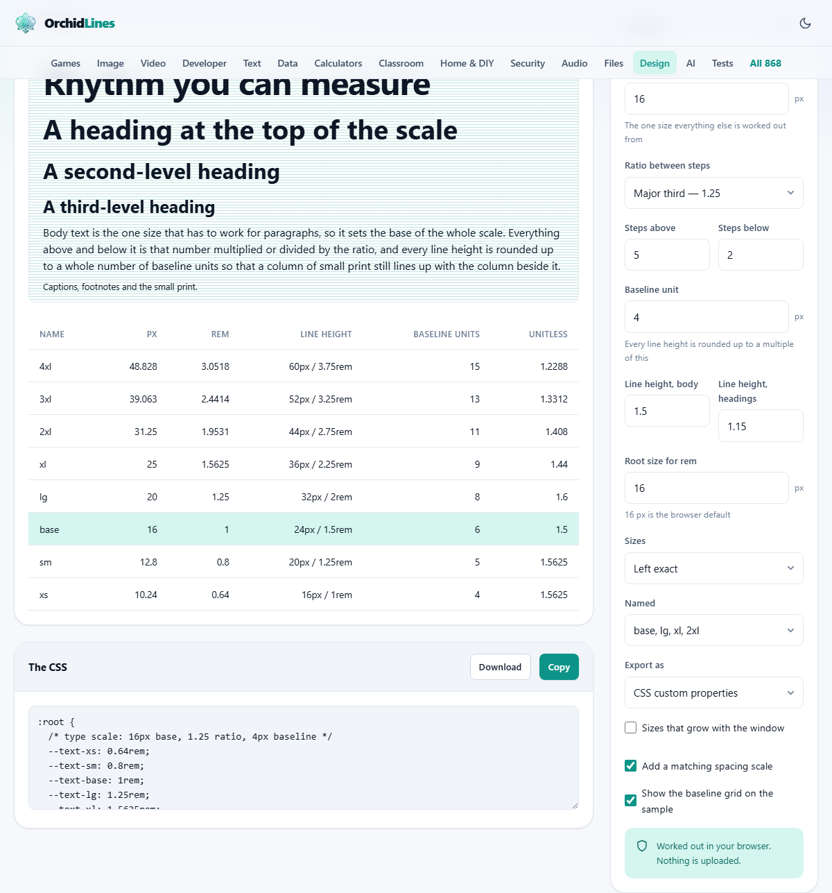
The left panel shows a specimen made of your own numbers: a display line, three headings, a paragraph and a line of small print. Its heading carries a one-line summary of the scale, ending with the largest size and the line it sits on.
The table underneath is the reference. Name, px, rem, Line height in both units, Baseline units, and Unitless. When the growing sizes are on, Small screen joins the end.
The lower panel holds the code, and Export as decides its shape. CSS custom properties gives a :root block with a --text- and a --leading- entry per step. Custom properties and classes adds a ready-made .text-lg style of class for each one. SCSS variables gives dollar-sign variables. Design tokens gives JSON with a value and a type per entry, which is what a token pipeline expects. A plain table gives a lined-up text listing to keep in a notes file. Copy takes the text; Download saves it as type-scale.css, _type-scale.scss, type-scale.json or type-scale.txt to match.
One scale, start to finish
Leave everything as it arrives: 16 px body, the 1.25 ratio, five steps up, two down, a 4 px unit, 1.5 and 1.15 for the line heights, 16 for the root. The table now reads, from the top: 48.828, 39.063, 31.25, 25, 20, 16, 12.8 and 10.24 px.
Look at the base row. 16 px multiplied by 1.5 is 24, which is already six whole units, so it stays at 24 px, or 1.5rem. Now look at the lg row. The target for 20 px has slid down to about 1.456, giving 29.1 px, which is not a multiple of 4. It is pushed up to 32 px, so that heading sits on a 1.6 line and eight units. If that feels loose, set the Baseline unit to 2 and the same row lands on 30 px instead.
The code box shows a :root block that starts at --text-xs, climbs to --text-4xl, then lists the matching --leading- values and --space-1 at 0.25rem through --space-24 at 6rem. Press Copy, paste it at the top of your stylesheet, and give a heading font-size: var(--text-2xl) with line-height: var(--leading-2xl). If the long figures bother you, switch Sizes to Rounded to whole pixels: the top row becomes a flat 49 px on the same 60 px line.
Errors that surface later
None of these break anything on the day. They all cost an afternoon a month afterwards.
- Setting the body size to match a heading you liked. The base carries paragraphs. Fix the reading size first and let the top of the scale be whatever it turns out to be.
- Pasting the sizes but not the line heights. The rhythm is the point, and half the output is the leading values.
- Asking for eight steps up because the field allows it. The top of a long scale is unusable on a phone, and it tempts people into using sizes nobody needed.
- Changing the ratio later, then editing sizes by hand anyway. Regenerate and replace the whole block instead. That is what the custom properties were for.
- Forgetting the spacing scale. Text on a grid with margins off it still looks uneven, and nobody can ever say why.
When a scale is the wrong tool
A page with exactly two text sizes does not need one. Neither does a one-off poster, where sizes are chosen against the artwork rather than against each other. A scale also says nothing about which typefaces to use or how wide a column should be; the font pairing tool elsewhere on this site handles the first of those.
It will not rescue a page whose real problem is weak contrast or an over-long line. If text is hard to read at 16 px, more sizes will not help.
Your numbers never leave the machine
Every figure here is worked out by the page in front of you. The multiplications, the rounding and the code box all run inside your browser, and nothing about your scale is sent anywhere. No copy of your settings exists beyond the one your own browser saved.
So the site cannot hand your scale back on another computer. When one feels right, press Download and keep the file with the project.