
Turn a plain list of tasks into a dated chart
This guide shows how to build a schedule chart from a simple list you type, with no project software behind it. You will learn the shape each line takes, which dates the tool understands, what every setting in the side panel does, how to read the finished picture, and how to save it. A full worked example with real task lines sits near the end.
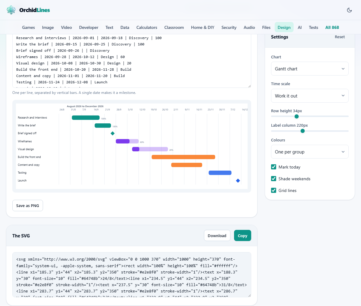
A schedule you can type in a minute
Sometimes you just need to see a plan laid out against dates. Which task runs when, what overlaps, where the crunch falls. Heavy project tools can do this, but they ask for an account and an afternoon of setup first.
This page asks for a list. You write each task on its own line, and a chart is drawn as you type. A team lead sketching a launch, a student mapping a dissertation, a freelancer showing a client the shape of a job: all of them can have a clear picture in the time it takes to list the steps.
How to write each line
Every task is one line, and each line has up to five parts split by a vertical bar, the upright stroke usually typed with shift and the backslash key. In order, the parts are the name, the start date, the end date, a group, and how far along it is as a percentage.
Only the name and the start date are required. Leave the end date blank and the task becomes a milestone, a single dated point rather than a stretch of work. The group is a label like Design or Build that ties related tasks together. The percentage, from 0 to 100, fills part of the bar to show progress. So a full line might read: Write the brief, then a start date, then an end date, then Discovery, then 100.
Dates it can read
The safest way to write a date is year, then month, then day, with dashes between, such as 2026-09-01. Written that way, there is never any doubt about which number is which.
The everyday day-month-year forms are read too, whether you separate the parts with slashes, dots or dashes. A two-digit year is taken as this century, so 26 means 2026. If a date is left out where one is needed, or typed in a way that makes no sense, that line is quietly skipped rather than drawn wrong, so a half-finished line never breaks the chart.
The settings panel
The side panel shapes the picture. Chart names the three forms the tool is built around: a Gantt chart, a horizontal timeline, and a roadmap by quarter. Time scale sets how the dates along the top are grouped: leave it on Work it out and the tool picks days, weeks, months or quarters to suit the span, or force one yourself.
Row height is a slider that sets how tall each task row is, handy when there are many rows to fit or only a few to spread out. Label column sets how much width the task names get on the left, so long names are not cut short. Colours offers three schemes, covered in the next section.
Colours and the three tick boxes
The Colours menu decides how bars are painted. One per group gives each group its own colour, so the phases stand apart at a glance. One colour paints everything the same, for a calmer look. By how complete shades a bar by its progress: green when it is finished, a teal while it is under way, and grey when it has not started.
Three tick boxes finish the look. Mark today draws a dashed red line down the chart at the current date, but only when today falls inside the span shown. Shade weekends tints Saturday and Sunday columns, which shows up when the scale is set to days. Grid lines adds faint vertical rules at each date mark, making it easier to trace a bar back to the top.
Reading the finished chart
Each task is a row. Its name is on the left, and a bar spans from its start date to its end date across the dated grid. A task with only a start date is drawn as a small diamond instead, marking a single moment such as a sign-off or a launch.
When a task has a progress figure, its bar shows a filled portion with the percentage written beside it, so a glance tells you how much is done. A band above the grid names the months or the range on show. A small note under the heading counts the rows, the milestones and the groups, and says which time scale was chosen, which is a quick way to confirm the tool read your list the way you meant.
Saving and reusing the chart
The chart is offered in two ways. It is drawn on screen, and its underlying code is shown in a box below as an SVG. That word stands for a vector image, one described by lines and shapes rather than a grid of dots, which means it stays perfectly sharp at any size, from a slide to a printed wall poster.
Copy places that SVG on your clipboard, and Download saves it as a file named chart. A separate Save as PNG button writes an ordinary picture at twice the on-screen size, for places that will not take a vector. Because the SVG is plain text, you can also open it in a drawing program later to add a note or an arrow by hand.
A worked example: a small website build
Say you are planning a website over autumn. You type a handful of lines, each with a name, a start, an end, a group and a progress figure. Research and interviews runs from the first of September to the eighteenth, in a Discovery group, marked 100 for done. Write the brief follows, also in Discovery.
Brief signed off has only a single date and no end, so it draws as a diamond, a clean milestone. Wireframes and Visual design go into a Design group with partial progress figures. Build the front end and Content and copy sit in a Build group. Testing and Launch close it out, with Launch again left as a single dated milestone.
You leave the scale on Work it out, and the tool spreads the dates across weeks. You set Colours to One per group, so Discovery, Design, Build and Launch each take a distinct shade. The note reports nine rows, two milestones, four groups. You press Save as PNG and drop the picture straight into a slide for the client.
Your list stays put between visits
There is no save button for the list itself, and none is needed. The text you type is kept in this browser, so closing the tab and coming back finds your tasks exactly as you left them. That turns the chart into a living plan rather than a one-off drawing.
Each week you can open the page, nudge a progress figure up, push a date that slipped, and save a fresh picture in seconds. A plan redrawn often, tracking what really happened, is worth far more than one drawn once and never touched. Because the list lives only in this browser, clearing your browsing data will wipe it, so keep a copy of anything you cannot afford to lose in a note of your own.
Common mistakes
Most trouble comes from the shape of the list, and each is easy to mend.
- A task did not appear. Its line was missing a start date, or the date could not be read. Write the date as year-month-day and it will show.
- A bar became a diamond. The end date was left off, so the tool treated it as a milestone. Add the end date to make it a bar again.
- The parts landed in the wrong slots. A bar was missing between two fields. Check that every task has its bars in the order name, start, end, group, percent.
- The chart is a wall of tiny rows. There are too many tasks to read. Split the plan by phase and chart each phase on its own.
- Long names are clipped with three dots. Widen the label column, or shorten the task names.
When another page fits, and where the work happens
This page is for a schedule against dates. If you want to show how ideas branch rather than when tasks run, a mind map tool suits better. For steps that flow one into the next, a flow diagram is the clearer picture. And a real project tool earns its keep once many people are updating the same plan every day.
For a quick, private chart, though, this is hard to beat, and it all runs on your own machine. Your task list, which may name clients, staff or unreleased plans, is turned into a chart inside this browser. Nothing is uploaded and nothing is stored on a server, so the plan stays as private as a note on your desk.