
A cover image built to survive being shrunk
This guide is about making a video cover image that still works when it is tiny. You will see what each box and slider on the page does, why the little previews matter more than the big one, and how to end up with a file a video site will accept. A full walkthrough with real values comes near the end.
The size problem nobody plans for
A cover image is built big and seen small. You make it on a wide canvas, but a viewer meets it as a stamp in a list, a strip on a phone, or a box beside another video. At that size, clever detail turns to mush and long titles vanish.
This page is built around that fact. It draws your image at the full large size, and right beside it shows the same image at the sizes people truly see. Anyone posting videos of lessons, repairs, reviews or hobbies reaches for this when they want the cover to pull its weight in a crowded list.
Choosing what sits behind the words
The Background menu offers three starts. A photo you choose, a gradient, or a solid colour. Drop a picture onto the panel, or click to pick one, and it fills the frame. It is scaled to cover the whole area, never squashed, so a face keeps its shape even if the edges are trimmed.
A gradient runs from your accent colour into a deep near-black, which gives plain type something to sit on. A solid colour is the calmest choice of all. Whatever you pick, the Darken the photo slider lays a shade over it, from none up to heavy. Nudging it up is the surest way to make pale text readable over a busy picture.
When the words should do the work
Not every cover needs a photo. A talk, a ranking, a how-to with no single strong image is often clearer on a plain background, where the title carries the whole message on its own. Pick Gradient and the canvas runs from your accent colour down into a deep charcoal, a look that flatters a short bold headline.
Pick Solid colour for the quietest option of all, one flat shade behind large type. With no photograph to fight against, you can pull the darken slider back to nothing and let the words ring out. These two backgrounds also keep the file small, so the size limit is never in question.
The two lines of text
There are two boxes for words. Big text is the headline, set large and bold. Small text is a short second line, printed in your accent colour underneath. Keep the headline to three or four words. A short counter warns you once it passes five, because more than that cannot be read at stamp size.
Long headlines wrap onto a second line on their own. That is fine for a few words, but a headline that needs three lines is a sign to cut it down rather than shrink it.
Placing and colouring the text
The Layout menu decides where the words land. Text on the left keeps the right side clear for a face. Along the bottom sits the words on a band at the foot. Centred puts them in the middle. Split panel darkens the left half and stands the text on it, which is the safe choice over a fussy photo.
Text size is a slider running from small to very large, so you can push the headline as big as it will go. Text colour sets the headline shade, usually white. Accent colour tints the second line and feeds the gradient background. Each colour is typed as a hex code, the short code beginning with a hash mark that the box already shows.
Outline and shadow, the two that save you
Two tick boxes guard readability. Outline the text draws a dark edge around every letter. This is the one trick that keeps white words clear over any photograph, light or dark, so it is best left on. Drop shadow adds a soft grey shade behind the text, which lifts it off the picture a little more.
You rarely need to fuss with these. Outline on, shadow on, and a touch of darkening under the photo covers almost every case.
The small previews are the real test
Under the big image sit three shrunk copies, labelled by where they show up: about 210 pixels wide in a list, 168 in a sidebar, and 120 on a phone. These are the sizes that decide whether anyone clicks. If your headline is a grey smear at 120 pixels, it is a grey smear to most of your audience.
A dark box marked 12:34 is painted into the bottom right of the preview. That stands in for the running-time label every video site drops there. Keep faces and words away from that corner, or they end up half hidden behind it.
What the little note tells you
Beside the word Thumbnail at the top of the preview sits a short note. It counts the words in your headline and tells you whether they will hold up at list size. Under about five words it reassures you. Over that, it warns you to check the smallest copy for yourself.
Treat it as a gentle nudge toward a shorter headline. Trimming the words is the single change that helps the most, and this note is there to keep reminding you of it.
Saving the image
Press Save the thumbnail to write a PNG file to your downloads. It comes out at the full 1280 by 720, the standard cover size, and a PNG at that size sits well under the two megabyte ceiling most sites set. If a heavy photo ever pushes it over, a message tells you, and a simpler background brings it back down.
A second panel shows a plain-text summary of your settings, which the Copy button places on your clipboard. That is handy for noting down what worked, but the picture itself comes from the Save the thumbnail button.
Once the file is in your downloads, it is ready to upload wherever the video lives. Nothing needs converting or resizing first. The cover is already the right shape and the right size, so it goes straight up as it is.
A worked example
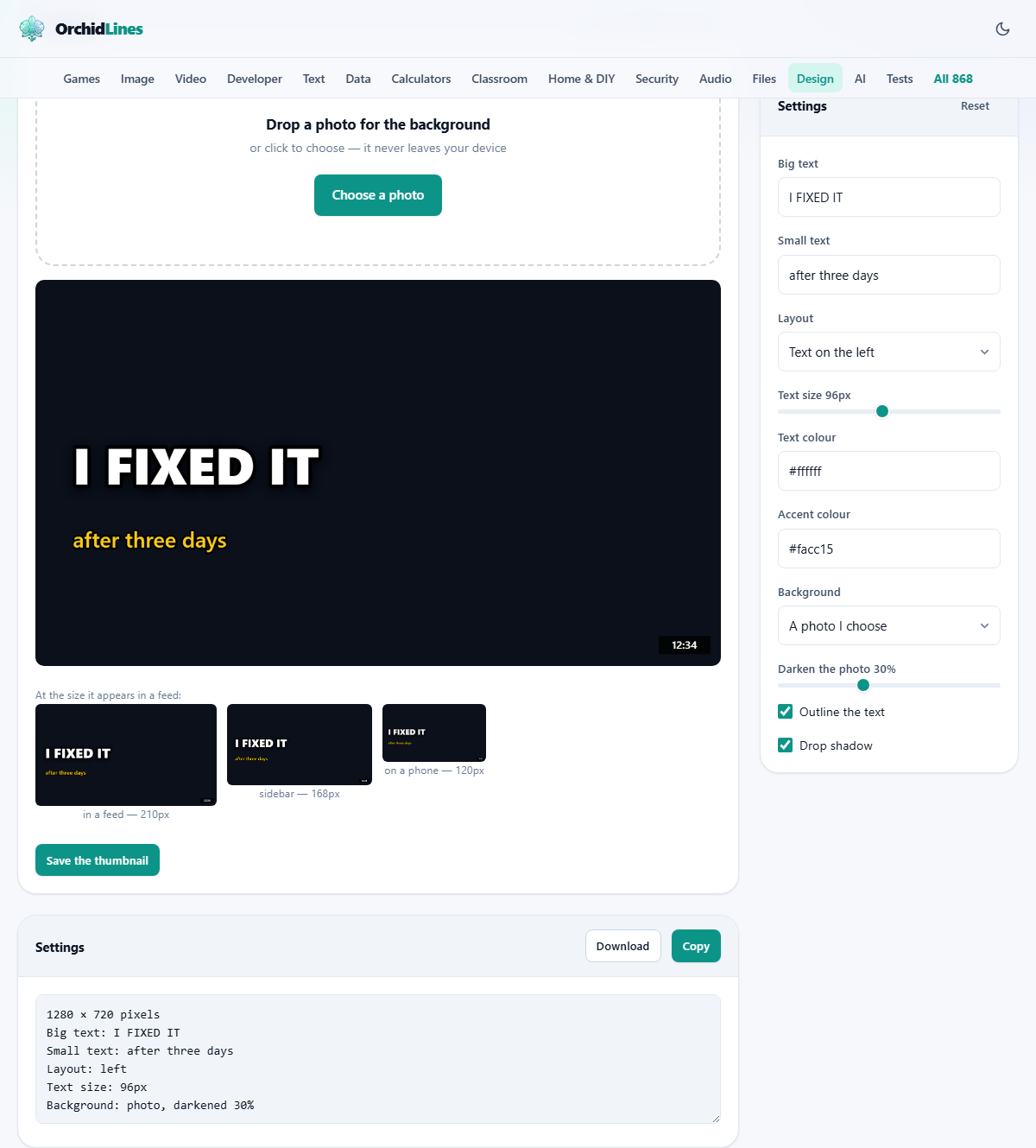
Suppose you filmed yourself mending a leaking tap after days of trying. In Big text you type I FIXED IT. In Small text you add after three days. You drop in a photo of the tap and set Background to the photo.
You pick Text on the left as the layout, so your face on the right stays clear. You push Text size up until the headline nearly fills its half. Text colour stays white, and you set the accent to a bright yellow for the second line. You drag Darken the photo to about a third, so the white type reads cleanly.
Outline and Drop shadow are both left ticked. You glance at the 120 pixel preview: the two words are still sharp, and nothing sits under the corner label. You press Save the thumbnail and upload the file. Total time, a couple of minutes.
If the 120 pixel copy had let you down, the fixes would be small and quick. A shorter headline. A larger text size. A heavier darken. You would change one thing, look at the smallest preview again, and stop the moment the words read clean. That short loop, change and check the tiny copy, is the whole method behind a cover that works.
Common mistakes
Most weak covers come from a short list of habits.
- Too many words. Five or more turn to a blur when shrunk. Cut to three or four and test at 120 pixels.
- Pale text on a bright photo. Turn the outline on and drag the darken slider up until the words stand clear.
- Something important in the bottom right. The time label covers it. Slide the subject left or up.
- A photo squashed out of shape. It is not; the frame crops to fill. Crop the picture to the part that matters before you drop it in.
- A busy background fighting the words. Switch the layout to Split panel, which gives the text a solid patch to sit on.
- The whole thing looks flat and grey. The darken slider is too high for a plain background. Ease it back down until the colour returns.
When another page suits better, and where this runs
This tool makes one fixed shape, the wide cover a video needs. For a square post, a tall story, or a banner, the full design editor on this site gives you any canvas and far more control. If your problem is the photo rather than the layout, tidy it first: crop the face, or lift a cluttered background away, then bring the clean picture back here.
Everything you do stays on your machine. The photo you drop in is read by the browser and painted onto the canvas in front of you. It is never sent anywhere, and no copy of it exists beyond your computer. That is worth knowing when the picture is of you, or of work you have not shared yet.