
Growing a set of colours out of one you already like
You have one colour. You need four or five more that belong with it, and you need to know whether words will show up on any of them. That is the whole job of this page. Below you will find what each harmony rule is doing behind the scenes, which sliders affect which rules, how to read the two warnings under the swatches, what the six export formats give you, and a full run through starting from a single teal.
Three numbers behind every colour
It helps to know how the page thinks about colour. Every colour you type is broken into three numbers. Hue is the position on a colour wheel, in degrees from 0 to 360, so red, yellow, green and blue are just different angles. Saturation is how pure it is, from grey at zero to vivid at a hundred. Lightness runs from black at zero to white at a hundred.
Harmony rules are recipes for choosing new angles on that wheel. The colour stays as strong and as bright as the one you started with; only the angle moves. That is why the lightness controls matter so much.
The colour you already have
Base colour is a plain text box. It takes a hex code, the six-digit code that describes a colour by its red, green and blue amounts. The leading hash is optional and a three-digit short form works too, so f0c and ff00cc mean the same thing.
Type something that is not a hex code, such as a colour name in words, and the export box empties while a short message appears beside the Palette heading. Fix the code and everything comes back. When the palette is valid, that same spot reports how many colours are showing and which base they grew from.
Seven rules, seven results
The Harmony menu is the heart of the page. Each entry is a different way of picking angles.
- Analogous, neighbours. Colours taken from just either side of your base, so they blend into one another. Calm, low risk, and right when you want a mood rather than a contrast.
- Complementary, opposite. Half the set clusters near your base, the other half near the point directly across the wheel. Strong and a little loud.
- Split complementary. Your base is kept, and the others sit on either side of the opposite point rather than on it. Most of the punch, less of the clash.
- Triadic, evenly spaced. Three angles a third of the wheel apart, repeating with small brightness steps. Lively, and hard to use without one colour shouting.
- Tetradic, two pairs. Four angles a quarter of the wheel apart. Rich, but four strong hues need discipline about which one leads.
- One hue, many shades. The angle never moves. Only lightness does, sweeping from pale down to deep. People should try this far more often than they do.
- A full tint and shade scale. Also one hue, but swept further, from near white to near black, with the purity eased off at both ends so the end steps do not look artificial. This is the shape a design system wants.
How many, and the two shift sliders
Colours sets the size of the set, from 3 to 10. It changes more than the count. In the two single-hue options it decides how finely the range is sliced, so nine steps give a smooth ramp where four give big jumps.
Saturation shift and Lightness shift both run from minus 40 to plus 40, and both are added to every colour at once, after the harmony rule has done its work. Push saturation up for something poster-like, or down towards grey for something quieter.
Both sliders stop at the edges of what a colour can be. Saturation cannot pass a hundred, and lightness is held just short of pure black and pure white. So if you drag a slider and nothing changes, the set has hit that wall, and you need a different base rather than a bigger push.
The slider that only works sometimes
Spread is measured in degrees and covers 5 to 90. It sets how far apart the chosen angles sit. A narrow spread on an analogous set gives colours you can barely tell apart. A wide one starts to look like a rainbow.
The catch is worth knowing. Spread is only consulted by three of the rules: analogous, complementary and split complementary. The triadic and tetradic rules use fixed angles by definition, and the two single-hue options never move the angle at all. Dragging Spread while one of those four is selected changes nothing, and that is not a fault.
Reading the row under the swatches
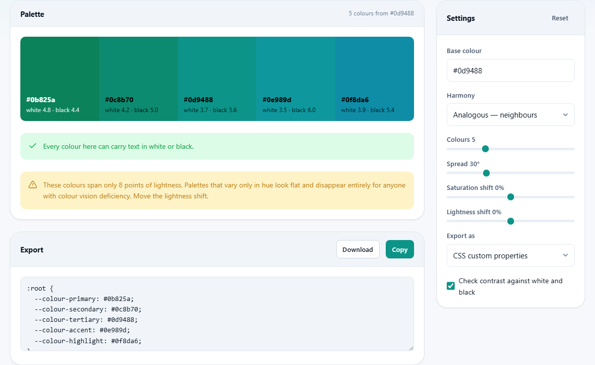
With Check contrast against white and black ticked, every swatch carries two figures. The first is how well white text would show on it, the second how well black text would. A contrast ratio compares the brightness of two colours; higher is easier to read, and each swatch label is set to whichever of the two wins.
Underneath, the page gives a verdict. If every colour can carry text at the accepted readable level in one shade or the other, you get a short green confirmation. If some cannot manage it in either, an amber note counts them and reminds you they are decoration, not a background for words.
A second amber note appears when the set spans too little lightness, and it tells you how many points separate your darkest and lightest colour. When that gap is small the colours fight each other on screen, and they collapse into one another for anyone whose eyes do not separate those hues. The cure is the Lightness shift, a different rule, or fewer colours.
Six ways to take it away
The Export as menu fills the box under the swatches, with Copy and Download above it. Plain hex list is one code per line, all you need for a note or a spreadsheet. CSS custom properties gives a block of named variables, and SCSS variables gives the same names in a different syntax. Design tokens gives structured data with a type on each entry, which design system tooling expects. Tailwind config gives a ready block for that framework's settings file. An SVG swatch sheet gives a drawing of the colours with their codes printed underneath, handy to attach to an email.
There is a naming rule worth knowing. With six colours or fewer, the exports name them primary, secondary, tertiary, accent, highlight and muted in that order. Ask for seven or more and the names switch to numbers counting up in hundreds, the way a ramp is usually labelled.
Download always writes a file with a css ending, whichever format is showing. If you exported the token, framework or drawing version, rename the file after saving it.
Worked example: from one teal to a usable ramp
Start with a brand teal in Base colour. Leave Harmony on Analogous, Colours on 5 and Spread on 30. Five swatches appear, all clearly related, and the note beside the heading confirms five colours grown from your code.
Now look below them. The amber warning is there: the set spans only about eight points of lightness. That is the analogous rule doing what it promises, moving the angle and almost nothing else. Drag Lightness shift to plus 20. Every swatch gets paler together, and the warning stays, because moving them all changes nothing about the gap between them.
So change approach. Set Harmony to A full tint and shade scale and push Colours to 9. The row now runs from near white on the left to near black on the right. The lightness warning disappears, and the green confirmation says every colour can carry text. Because you asked for more than six, the exported names are numbers.
Leave Export as on CSS custom properties, press Copy, and paste the block at the top of your stylesheet. The palest two steps make page backgrounds, the middle one is your accent, and the darkest is body text. That is a working scheme from one colour and two menu changes.
Where people go wrong
A short list of the traps, and what to do about each.
- The Spread slider seems broken. The selected rule does not use it. Switch to analogous, complementary or split to feel it work.
- Five colours, all equally bright. That is normal for a hue-based rule. Use a single-hue option, or accept that only one or two will ever sit behind text.
- A slider stops responding at the end of its travel. The colours have hit the limits of saturation or lightness. Start from a different base.
- The palette vanished and a message appeared. The base colour is not a valid hex code.
- The exported file has the wrong ending. Downloads are always named for the stylesheet format. Rename after saving.
- Ten colours were chosen and none get used. Interfaces need one lead colour and a light-to-dark ramp far more than ten hues.
- The set looks fine on screen and fails in print. Screen figures say nothing about ink. Print a test page first.
Jobs for other pages
This page starts from a code you type. If your starting point is a photograph or a product shot, use the Colour Picker and Palette tool, which pulls codes out of an image. Bring the result back here as a base colour if you want a set built around it.
To pull a set out of a photo you already have, rather than build one from a base colour, Colour Picker & Palette does that. To make sure your set still works for someone with a colour vision difference, check that each pair differs clearly in lightness as well as hue, because lightness survives when hue does not. And if what you are missing is a matching set of text sizes, that is the Type Scale tool.
Sums done in front of you
Everything on this page is arithmetic, and all of it happens in your browser. Your base colour is converted, the new angles are calculated, the contrast figures are worked out, and the export text is assembled without a single request leaving the page. Nothing about your brand colours is recorded anywhere.
Your settings are remembered locally so the page opens as you left it, and Reset clears that memory. Since a palette is a handful of codes, the safest keepsake is the exported text itself, saved into your project where the rest of your work lives.