
Making the card that shows up when someone shares your link
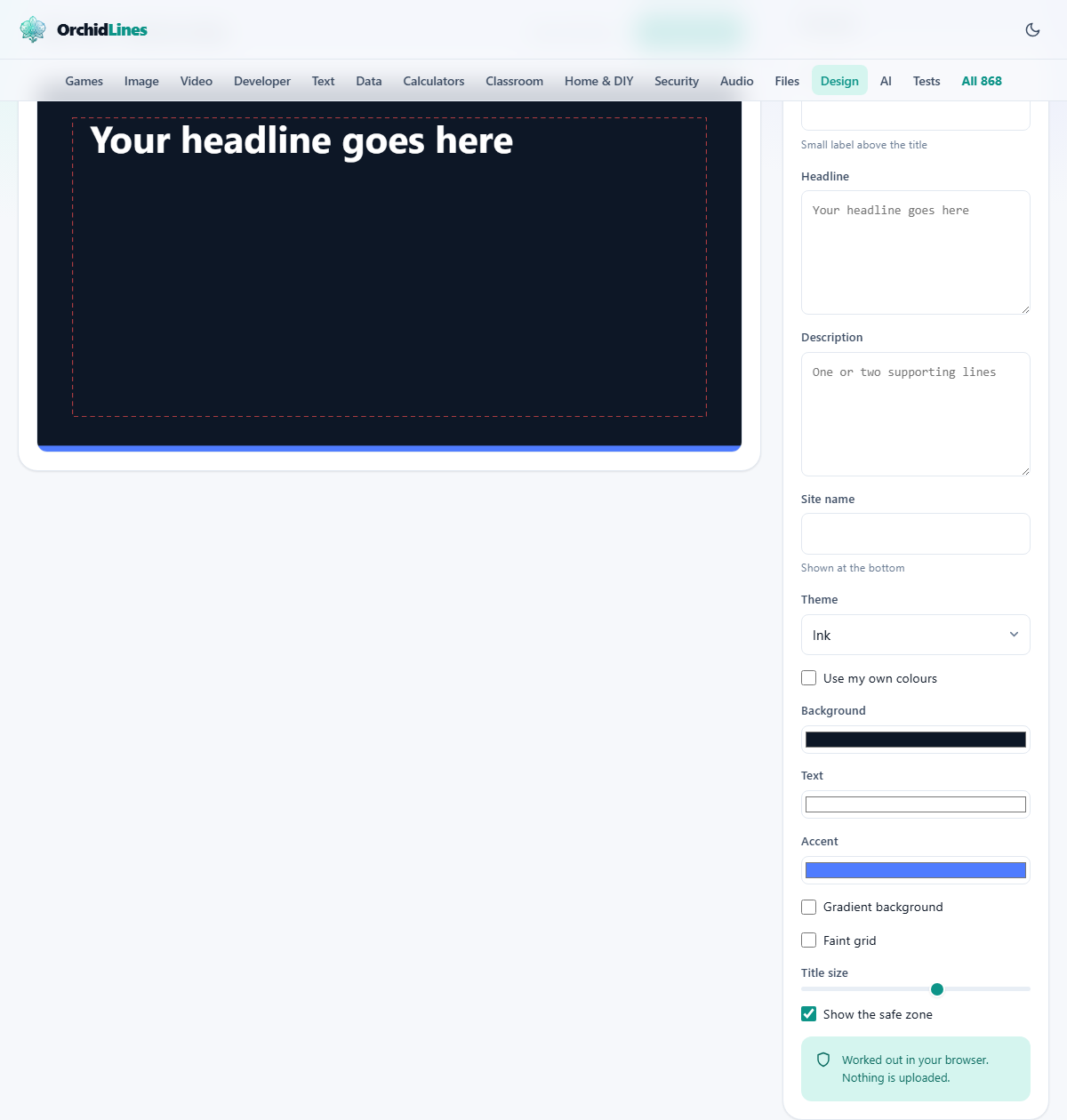
Paste a link into a chat app or a social post and a picture with a headline usually appears. That picture is a file you make and point at. This guide covers what each box in the rail draws on the card, how the headline resizes itself, what the dashed rectangle is warning you about, what the two buttons at the top actually produce, and a full example from blank card to pasted code.
One picture, many small windows
A shared link is shown differently everywhere. A chat app gives it a small square. A social feed gives it a wide strip. A search preview may give it a thumbnail the size of a stamp. All of them read the same instructions from your page and fetch the same file.
So the card has one job: be readable when small. People reach for this page when a blog post goes out, a product launches, a job advert opens, or an event needs a link that does not look broken in a group chat.
Why the shape is fixed
The canvas is 1200 pixels wide and 630 tall, and there is no control to change it. That is deliberate. It is very close to a ratio of 1.91 to 1, which is what the major platforms crop towards. Hand them a square and they will trim it themselves, usually through the middle of your words.
Working at a fixed size has a pleasant side effect. Everything on the card is measured in real pixels, so the preview you see is the file you get, at full resolution, with no guessing about scaling.
The four boxes that hold your words
At the top of the rail, four fields carry all the text on the card.
- Eyebrow. A short label above the headline, printed in capitals in the accent colour. It is where a category, a series name or a single word like Guide belongs. Leave it empty and the headline moves up.
- Headline. The main line, in bold. Leave it blank and a placeholder sentence is drawn instead, so the card is never empty while you think.
- Description. One or two supporting lines under the headline, in lighter type. Only the first three lines that fit are drawn, and anything beyond that is dropped without warning.
- Site name. Printed small at the bottom left, slightly faded. A domain or a publication name works well here.
Colour, and the switch people miss
The Theme menu offers six ready-made pairings: Ink, Paper, Forest, Plum, Ember and Ocean. Ink and Ocean are dark and cool, Forest is dark and green, Plum is dark and purple, Ember is dark and warm, and Paper is the one light option.
Under the menu sits a tick box marked Use my own colours, then three colour swatches. This is where people get stuck. The Background and Text swatches do nothing until that box is ticked, because until then the theme is supplying both. Tick it and they take over immediately.
The Accent swatch is different. It applies no matter which theme is showing. It paints the eyebrow, the solid bar across the very bottom of the card, and the far end of the gradient. If a theme looks right but the bottom bar clashes, change the accent by hand.
Two switches that change the surface
Gradient background replaces the flat fill with a diagonal fade, running from the background colour in the top left corner to the accent colour in the bottom right. It gives depth, but it also means the far corner is now accent coloured, so check that the site name still reads there.
Faint grid lays a very light square grid over the background. It is drawn in white at low strength, which means it shows up nicely on the dark themes and is more or less invisible on the light one. At small preview sizes it reads as texture rather than as lines, which is the point.
A headline that shrinks rather than spills
Title size sets a starting point between 34 and 84 pixels. It is a starting point rather than a fixed size, because the card measures your actual words against the actual space. If the wrapped headline is too tall, the size drops in small steps and the wrapping is worked out again, until it fits or it reaches the smallest size allowed.
The strip above the canvas reports the result: the card dimensions, how many lines the headline took, and the size it settled at. That last number is the useful one. If you asked for 64 and it says 40, the headline is fighting the space and will be hard to read in a small preview.
There is a second signal. Type more than 90 characters and a warning appears above the card, telling you exactly how many characters you have used. Treat it as a late alarm rather than a target. Headlines that survive a small preview are usually much shorter than that.
The dashed rectangle
Show the safe zone draws a dashed red rectangle inset from every edge. It marks the region that survives cropping everywhere, including the squarer previews some chat apps use. Anything outside it risks being trimmed off.
The tool already lays out your text inside that region, so the guide is there to check the result rather than to position anything. It matters most with a gradient or a strong accent, because it shows how much of the card is decoration nobody may see. The guide is a screen aid only, and it is switched off while the file is written, so it can never reach the picture you publish.
The two buttons at the top
Download PNG saves the card as an image file, 1200 by 630, exactly as drawn. The file name is built from your headline: lower case, with anything that is not a letter or digit turned into a dash, cut off at 40 characters. A card with no headline is saved as og-image instead.
Copy meta tags puts seven short lines of code on your clipboard. Meta tags are instructions in the hidden part of a web page that tell other services what to show. The seven cover the title, the description, the address of the image, its width and height, the page type, and the setting that asks for the large card rather than a thumbnail.
The title and description come from your Headline and Description boxes. The image address does not, because the tool has no idea where you will put the file. It is filled with an obvious example address, and a message reminds you to replace it. That replacement must be a full web address, and the file must be reachable by anyone, not just by you when signed in.
Worked example: a post about deleting a server
Start with the Eyebrow set to Engineering. In Headline type: why we deleted our staging server and what happened to our release times over the following six months. The moment you stop typing, the warning strip appears and reports 102 characters, and the summary shows the headline squeezed smaller to fit.
Cut it back to why we deleted our staging server. The warning disappears and the summary reports a larger size. In Description write: six months without one, what broke, and what got faster. Put your domain in Site name.
Leave Theme on Ink, since dark cards stand out in most feeds. Set the Accent swatch to a green so the eyebrow and the bottom bar match your brand. Tick Gradient background and look at the bottom right corner, where the site name now sits over green; if it is hard to read, untick it. Leave Title size at 64.
Press Download PNG and you get a file named after the headline. Upload it, then press Copy meta tags, paste the seven lines into the head of the page, and swap the example image address for the real one.
What usually goes wrong
The card itself is hard to break. The trouble is nearly always in the last step.
- The colour swatches seem dead. Use my own colours is not ticked, so the theme is still in charge of the background and lettering.
- Half the description vanished. Only the first three fitted lines are drawn. Shorten it or move the detail into the page itself.
- Your own colours look muddy. Nothing here checks whether the lettering stands out from the background. Judge it at a small size, or test the pair on a contrast tool before you commit.
- The bottom corner is unreadable. That is the gradient meeting the site name. Switch the gradient off or pick a darker accent.
- The grid does nothing. On the light theme the grid lines are effectively invisible, because they are drawn in white.
- Nothing changed after sharing. The other service is showing a cached copy. Each platform has its own tool for forcing a fresh look once your tags are live.
- The picture never loads. The address in the tag is wrong, is not a full address, or points at a file that needs a login.
When another page suits better
There is no way to bring in a photograph here, and no way to drag an element around. The layout is fixed on purpose, because flat text cards survive being shrunk far better than busy ones. If you need a photo behind the words, build the card in the Design Editor at 1200 by 630 instead.
A video preview picture is a different size and a different craft, so use the Thumbnail Maker for that. If you want a soft colourful background to place behind something else, the Mesh Gradient Generator makes those. And if the colours are the hard part, work them out first on the Colour Palette Generator.
Drawn on your own machine
The card is painted by your browser onto a drawing surface in the page. The measuring, the wrapping, the shrinking and the final image file all happen there. Your headline, description and site name are never sent anywhere, and no copy of the card exists outside your downloads folder.
That also explains the one job left to you. Because nothing was uploaded, there is no address to point the tag at until you put the file on a host of your own. The tool hands you a finished picture and the code that goes with it, but where the picture lives is yours to decide.