
Turning an indented list into a drawn map
The short help above tells you to type an outline and pick a layout. This longer piece explains the rules the indentation follows, what the three layouts are each good at, what every setting in the rail changes about the drawing, and what the two export buttons really produce. It ends with a full example, a list of the ways an outline confuses the drawing, and a note on where your text is kept.
Why typing wins over dragging
Think about how a map gets used. Somebody is planning a talk, breaking a project into pieces, revising before an exam, or writing down what a meeting decided. The thinking is fast and messy. Ideas arrive out of order and get moved twice before they settle.
Dragging boxes cannot keep up with that. Every move costs a grab, a drag and a nudge. Typing costs a key press. Here you write a list, and the picture is redrawn between one keystroke and the next. Moving a branch means moving one line of text, and its children come along without being asked.
The rules that indentation follows
The very first line with anything on it becomes the centre of the map. There is only one centre, and everything else hangs off it.
After that, one rule decides the shape. A line belongs to the closest line above it that has less indentation than it does. Push a line further right and it becomes a child of the line above. Pull it back to match an earlier line and it becomes that line's sibling.
You may indent with spaces or with tabs. A tab is treated as two spaces, so a line indented with one tab sits at the same level as a line indented with two spaces. The exact number does not matter, only whether it is more or less than the line above. Empty lines are thrown away, so you can use them to space out your text without breaking anything. There is no limit on depth.
What is in the box when you arrive
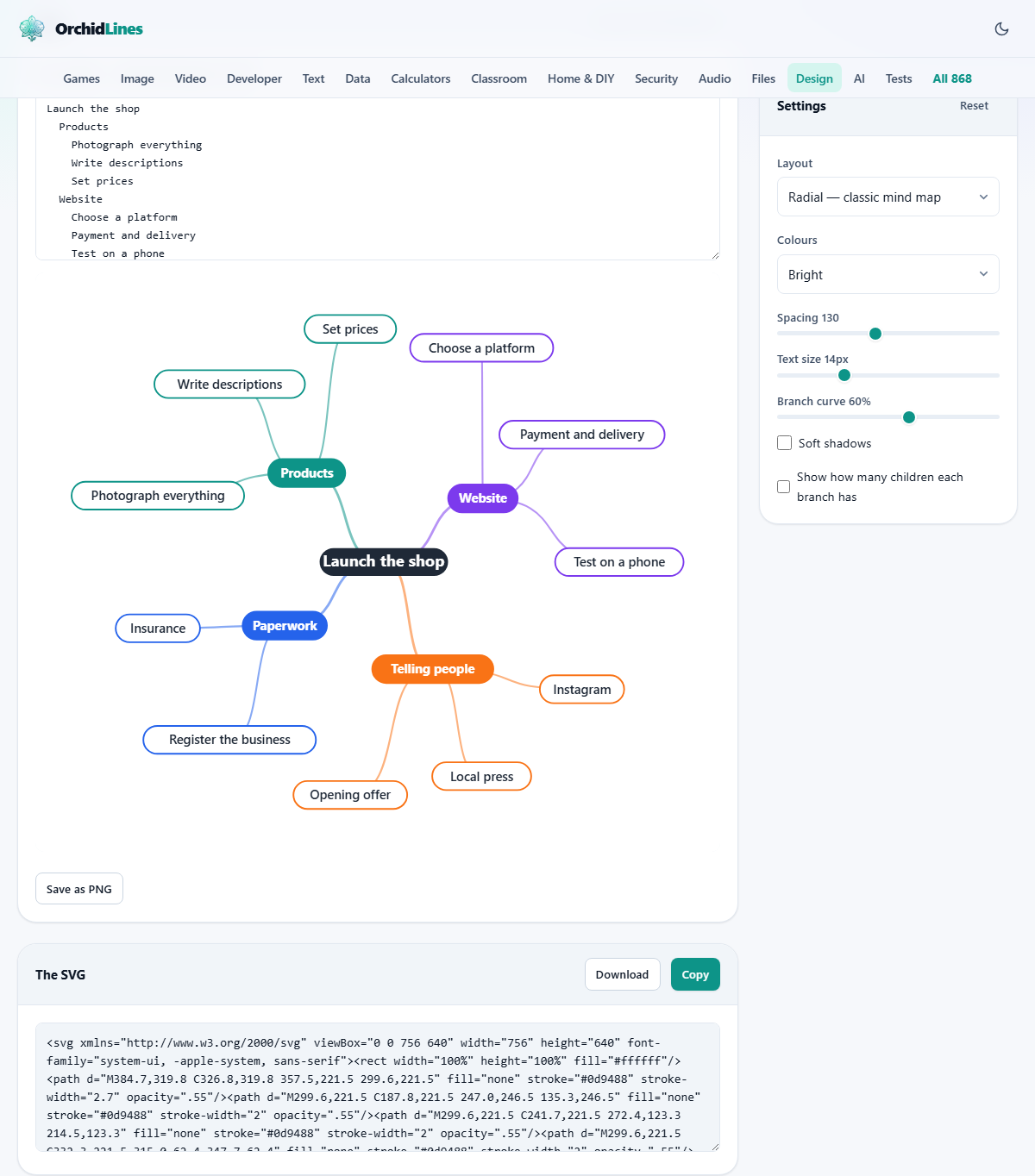
The outline box is not empty on a first visit. It holds a sample about launching a small shop, with branches for products, the website, telling people, and paperwork. It is there so the map has something to draw while you look around.
Select it all and type over it when you are ready. From then on your own text is what comes back, because the outline is remembered separately from the design settings. That separation matters: the Reset button in the settings panel restores the sliders and menus, and leaves your writing alone.
Three layouts, three jobs
The Layout menu is the biggest single change you can make, because it decides how the same list is arranged in space.
Radial is the classic mind map. The centre sits in the middle and branches fan out around it, each given a slice of the circle sized by how much it contains. A branch with six ideas under it gets more room than one with two. It suits a page where every branch is roughly equal.
Branching to the right reads like a document. The centre sits on the left, level one runs down the next column, and each level steps further right. It is the friendliest layout for a long list, because it grows downward rather than outward. Top-down tree is the same thing rotated: the centre sits at the top and levels stack beneath it, which is the shape people expect for reporting lines or a table of contents.
Colour is not decoration here
The Colours menu offers Bright, Cool, Warm, One colour and Pastel. The choice does more than set a mood, because colour is how the map groups things. Each first-level branch takes the next colour from the set, and every idea underneath that branch keeps it. Follow a colour and you are following one line of thought.
The centre is always a dark grey pill with white lettering, so it never competes with the branches. First-level pills are filled solid and lettered in white. Anything deeper is drawn white with a coloured outline and dark lettering, which keeps the deep parts quiet. The joining lines take the colour of the pill they lead to, and get thinner at every level, so the trunk reads heavier than the twigs.
One colour is worth remembering for anything that will be photocopied. Pastel suits a map that will sit behind text on a slide.
The five settings that shape the drawing
Below the two menus sit three sliders and two tick boxes.
- Spacing, 60 to 220. In the radial layout this is the distance from one ring to the next, so it controls how far the map spreads. In the other two layouts it is the gap between one level and the next.
- Text size, 10 to 24 pixels. It sets the lettering, and because each pill is sized to fit its words, it also makes every pill wider or narrower. In the right-branching layout it sets the row spacing as well.
- Branch curve, 0 to 100 per cent. At zero the joins are straight lines. Raise it and they bend into soft S shapes. High curve looks organic; low curve looks technical.
- Soft shadows. Adds a small drop shadow under every pill, which lifts them off the page. Leave it off for a flat, printable look.
- Show how many children each branch has. Puts a number in brackets after a label, counting only the ideas directly under it, not the whole branch. Handy when you are checking that a plan is balanced.
The two files it hands over
Under the picture, a panel headed The SVG holds the drawing as text. SVG means scalable vector graphics: a description of shapes and lettering rather than a grid of pixels. Because it is a description, it prints poster size without going soft, and it opens in drawing programs where every pill and line stays a separate object you can nudge or recolour.
Copy puts that text on your clipboard, which is what you want if you are pasting a map into a web page. Download saves it as mind-map.svg. Beside the picture there is also Save as PNG, which turns the drawing into an ordinary image at twice its screen size on a white background. Use that one for a slide, a document, or a chat message.
A grey note beside the Map heading reports how many pills the outline produced and how many pixels wide and tall the drawing is. On screen the map is scaled to the width of its panel, so a very wide one looks small. Both exports are written at the full size in that note, whatever the screen is doing.
Worked example: planning a twenty minute talk
Clear the box and type a title line, Talk on shipping faster, with no indentation. Under it, indented by two spaces, put four branches: Why we were slow, What we changed, Results, and What next. Under the first branch, indented by four spaces, add Long review queues and Manual releases. Under the second add Smaller changes, One click deploy and Feature flags. Under Results add Lead time and Incidents. Leave What next with nothing under it.
The note now reports twelve pills. Set Layout to Radial and Colours to Bright, so the four branches come out in four colours. Push Spacing to 150, raise Text size to 15, and set Branch curve to 70 for a softer look. Tick Show how many children each branch has, and the second branch label gains a three in brackets, while What next shows nothing because it has none.
Something useful appears at once: the picture is lopsided, because one branch owns three ideas and another owns none. That is the plan telling you the talk is unbalanced, which is easier to see in a map than in a list. Add a couple of lines under What next, press Save as PNG for the slide, and press Download to keep the vector copy.
When the drawing does not match the plan
Nearly every problem is in the text rather than the settings.
- A line landed at the wrong level. Its indentation is larger or smaller than you thought. Line up the leading spaces of siblings exactly.
- Tabs and spaces are mixed. A tab counts as two spaces, so a tab and a four space indent are not the same level. Pick one and stay with it.
- The whole outline hangs off the second line. The first line is always the centre, so a stray first line puts everything under it.
- Pills overlap in the radial layout. Long labels make wide pills. Shorten the wording, raise Spacing, or move to one of the two linear layouts.
- The map is unreadable past the third ring. Radial arrangement runs out of room quickly. Top-down tree copes with depth much better.
- Nothing is drawn and a short message sits beside the Map heading. The box is empty; type a first line.
- The lettering has gone tiny on screen. A wide map is shrunk to fit the panel. Raise Text size, or export the file and open it at full size.
Other shapes need other pages
An outline can only describe a branching structure. The moment two branches need to point at the same box, or an arrow has to loop back, a map is the wrong picture. Diagram Studio on this site lets you place boxes freely and draw connectors that stay attached when things move.
For a flowchart with decisions and yes or no paths written as text, use the Diagram and Flowchart tool. For generations and partners drawn from an indented list, the Family Tree Maker knows those conventions. For tasks with dates and durations, use the Gantt Chart Maker. If the map has to carry photographs, build it in the Design Editor.
Your outline stays where you typed it
Every part of this happens inside the page. The text is read, the positions are worked out, and the drawing is assembled by your own browser. Nothing you type is sent over the network, which matters more than usual here, because outlines tend to contain unreleased plans, staff names and half-formed opinions.
The outline is saved in your browser's own storage so it is waiting for you next time. That copy lives on one device in one browser. If the plan matters, keep the text itself somewhere you control. It is only a list, so it fits happily in a notes app, and pasting it back here rebuilds the picture exactly.