
Soft colour blends, written as a few lines of style code
This page builds the blurred multi-colour backgrounds you see behind hero sections and app screens. The help block above sums up the idea. Here we go slower: what the shape actually is, what each slider in the rail moves, why the last colour you type matters more than the rest, how the three output choices differ, and a complete run through with real numbers. There is also a list of the ways a gradient turns to mud.
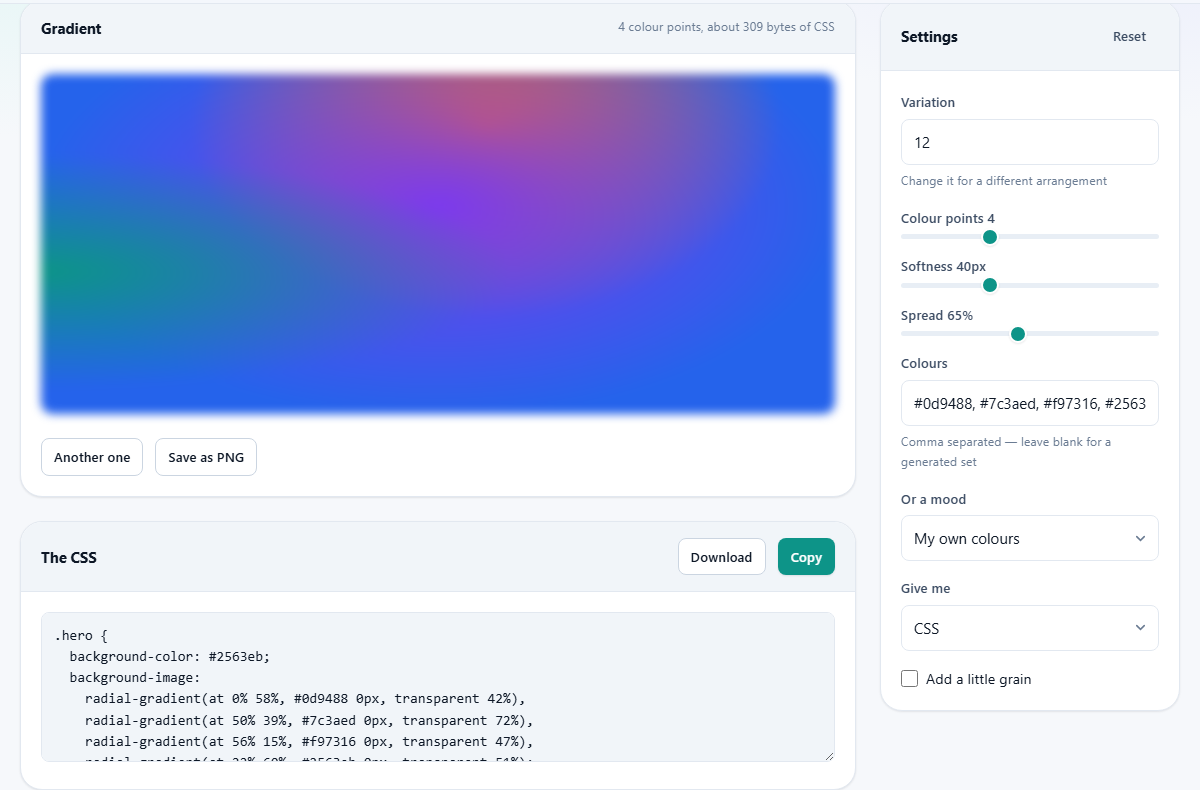
What is being stacked
A radial gradient is a circle of colour that fades outward. Picture a soft spotlight on a wall. Put four of those spotlights on the same wall, in different colours and different places, each fading to nothing at its rim. Where two overlap you get a new colour. That overlapping wash is the whole trick, and it is what this page writes for you.
Nothing here is a picture. The result is a short block of style code that a browser paints on the fly. Because the browser draws it rather than downloading it, the same few lines fill a phone screen and a large monitor equally sharply.
Where these actually get used
The common home is the top band of a landing page, behind a product name and a sign-up button. They also work as the backing for a pricing card, an app splash screen, a slide, a cover square for a podcast episode, or a stand-in while you wait for the real photograph.
They share one weakness. Because the brightness moves around, words placed straight on top can vanish in patches. Plan for a solid panel, a dark strip, or a corner where the colours are quiet.
Variation: the number that makes it repeatable
Variation takes a whole number from 1 to 999. It does not change the colours. It decides where each spotlight sits and how big it is. That is the only source of randomness on the page, and it is fed through a formula rather than a coin toss, which is why typing 12 always brings back the same arrangement.
The Another one button under the preview simply throws a new number into that box and redraws. Press it as often as you like. The moment something looks right, read the number in the Variation field and write it down. That single number, plus your colour list, is the whole recipe.
The three sliders
Under Variation sit three sliders. Each one is doing something quite specific.
- Colour points, 2 to 8. This is how many spotlights are placed. Two gives a simple wash. Four is the usual sweet spot. Seven or eight almost always ends up brownish where everything overlaps.
- Softness, 0 to 120. An extra blur laid over the top. It smooths any hard rim left by a small point. This blur is what you see in the preview panel, and a stronger version of it is baked into the saved picture. The code in the box below holds the colour layers only, so a page built from that code alone will look slightly crisper than the preview.
- Spread, 20 to 120 per cent. How far each spotlight reaches before it fades away. Low numbers give small separate blobs of colour on a plain field. High numbers give one broad soft wash. Each point also gets its own size within that range, so no two are identical.
Choosing the colours
There are two ways in, and they are joined. The Colours box takes hex codes separated by commas, such as 0d9488, 7c3aed, f97316 with a hash in front of each. The hash is optional and spaces are ignored. Anything that is not a valid hex code is quietly dropped, so a colour name typed in words is thrown out. If nothing survives, a blue and teal set is used instead.
The menu below it, labelled Or a mood, holds six ready-made sets: Sunset, Ocean, Forest, Candy, Monochrome and Midnight. Pick one and your Colours box disappears from the rail, because the mood is now supplying the colours. Switch back to My own colours and the box returns with your list untouched.
Each mood carries four colours. If Colour points is set higher than the number of colours available, the list starts again from the beginning, so a fifth point reuses the first colour.
Why the last colour is special
One detail catches people out. The spotlights are painted onto a flat backing colour, and that backing is the last colour in your list. It is the colour you see in the far corners, where none of the points reach. In the code it appears on its own line as the background colour, before the stack of gradients.
So the order you type matters. Put your calmest or darkest colour at the end of the list and the whole panel settles down. Put a hot orange at the end and every gap glows orange. If a gradient feels shouty and you cannot work out why, move the loudest colour away from the last position.
Three things it can hand you
The menu called Give me decides what appears in the code box under the preview. With CSS chosen you get a single rule, named hero, holding the backing colour and the stack of layers. Rename it to whatever your page calls that block and paste it into your stylesheet.
Choose An SVG and the box fills with drawing markup instead: one rectangle for the backing, then a gradient and a rectangle for each point. That suits a vector drawing program or a place that wants a file rather than a rule. Choose A PNG image and the box shows a short note reminding you to press the Save as PNG button, with the same style rule underneath.
Two extra fields, Image width and Image height, appear as soon as you leave CSS behind. They run from 200 to 4000 pixels and start at 1600 by 900, and they set the size of the saved picture and of the vector drawing. Copy takes whatever is in the box. Download saves it with a css ending, so after saving the vector version, change the file ending to svg.
The saved picture is not the code
Save as PNG does not photograph the preview. It repaints the same points onto a fresh canvas at your chosen width and height, applies a blur of half the Softness value, and then adds speckle if Add a little grain is ticked.
That grain option exists only for the picture. It never appears in the style code, because there is no way to sprinkle noise with a gradient rule. A little grain is worth trying on a large flat background, where perfectly smooth colour can look like a printing fault on some screens.
A run through, with numbers
Suppose you want a hero band for a small recording studio, dark and slightly electric. Leave the mood on My own colours and type this into Colours: 38bdf8, 6366f1, f472b6, 0b1120, each with a hash. The near black is last on purpose, so it becomes the backing.
Set Colour points to 4, Spread to 55 and Softness to 30. Press Another one a few times. Say the eleventh press lands on a version you like and the Variation field now reads 407. Write 407 down. The grey note beside the panel heading tells you how many points are in play and roughly how many bytes of code they came to.
Leave Give me on CSS, press Copy, and paste the rule into your stylesheet. Rename hero to whatever your top band is called. Then set Give me to A PNG image, put 1600 in Image width and 400 in Image height, tick Add a little grain, and press Save as PNG. You now have a rule for the site and a flat picture for the slide deck, both from the same 407.
The usual disappointments
Most complaints about mesh gradients come down to five or six causes.
- Everything went brown. Too many points, or colours from opposite sides of the colour wheel. Drop to three points, or pick colours that are neighbours.
- The Colours box does nothing. A mood is selected, so your list is being ignored. Set the menu back to My own colours.
- A colour was skipped. It was not written as a valid hex code, so it was discarded before the drawing started.
- The saved picture looks blurrier than the screen. The blur used for the file is stronger than the one shown live, and grain may be on.
- Text on top is unreadable in one corner. That is normal for this style. Put a solid panel behind the words, or lower Spread so more of the field stays plain.
- The picture size fields have gone. They are hidden while the output is set to CSS, because a style rule has no fixed size.
- A great gradient was lost. Only the variation number and the colours define it. Save those two things anywhere and it comes straight back.
Neighbouring jobs, other pages
If all you want is a plain fade from one colour to another across a button or a banner, this is more machinery than you need. The CSS Gradient Generator on this site builds those straight fades and gives you the shorter rule.
If you want to push a photograph through a colour ramp, that is the Gradient Map tool, which reads an image and recolours it. If you want the gradient with a headline, a logo and a shape sitting on it, build the whole thing in the Design Editor. And if the target is the picture that shows up when a link is shared, the Open Graph Image Maker already knows the right size and margins.
Arithmetic on your own machine
There is nothing to upload here, because there is nothing to send. You type numbers and colour codes, and the page turns them into text and pixels using your own browser. No image is fetched, no request goes out, and no version of your gradient is stored anywhere but in front of you.
Your settings are kept in the browser's own small store, so the page opens where you left it. Reset empties that store and puts every control back to its starting value. Since the whole design is a handful of hex codes and one number, the safest backup is a line in your notes, not a file.