
Writing on paper that says who you are
This page does two jobs at once: it designs the stationery and it holds the letter. The help block covers the run-through. Here we look at what each of the four header styles actually prints, which details appear where, how the letter fields turn into a laid-out page, and what a formal letter should contain. A complete example follows, then the faults that catch people out.
The letters small organisations still have to send
Email carries almost everything now, which is exactly why the remaining letters matter. They tend to be the serious ones.
A residents association writing to a contractor. A shop owner answering a complaint. A club secretary calling a meeting. In each case the reader is judging you before reading a word, and a bare page says nothing at all.
A head on the page fixes that in one step. It shows the name of the body sending the letter, how to reach it, and often that it is registered somewhere. None of that needs a designer or a print run.
The organisation panel, line by line
Name is the headline of the whole sheet. Tagline is the short line under it that says what you do, and it can be left empty. Anything you leave empty is simply left out rather than printed as a blank space.
Address is a text area, and every line you type is kept as its own line in the header. Phone, Email and Website are separate boxes, and they are joined together into one contact line wherever they appear. Registration line is for a company number, a society number or a tax number, and it prints in the footer.
Logo takes an image file from your disk. It is fitted into a modest space, so a wide banner and a square mark both behave. Use a picture with a see-through background if you have one, because an image saved with a solid white background brings that white rectangle onto the page with it.
Four header styles, four different pages
The Header style menu changes the character of the sheet more than any other control.
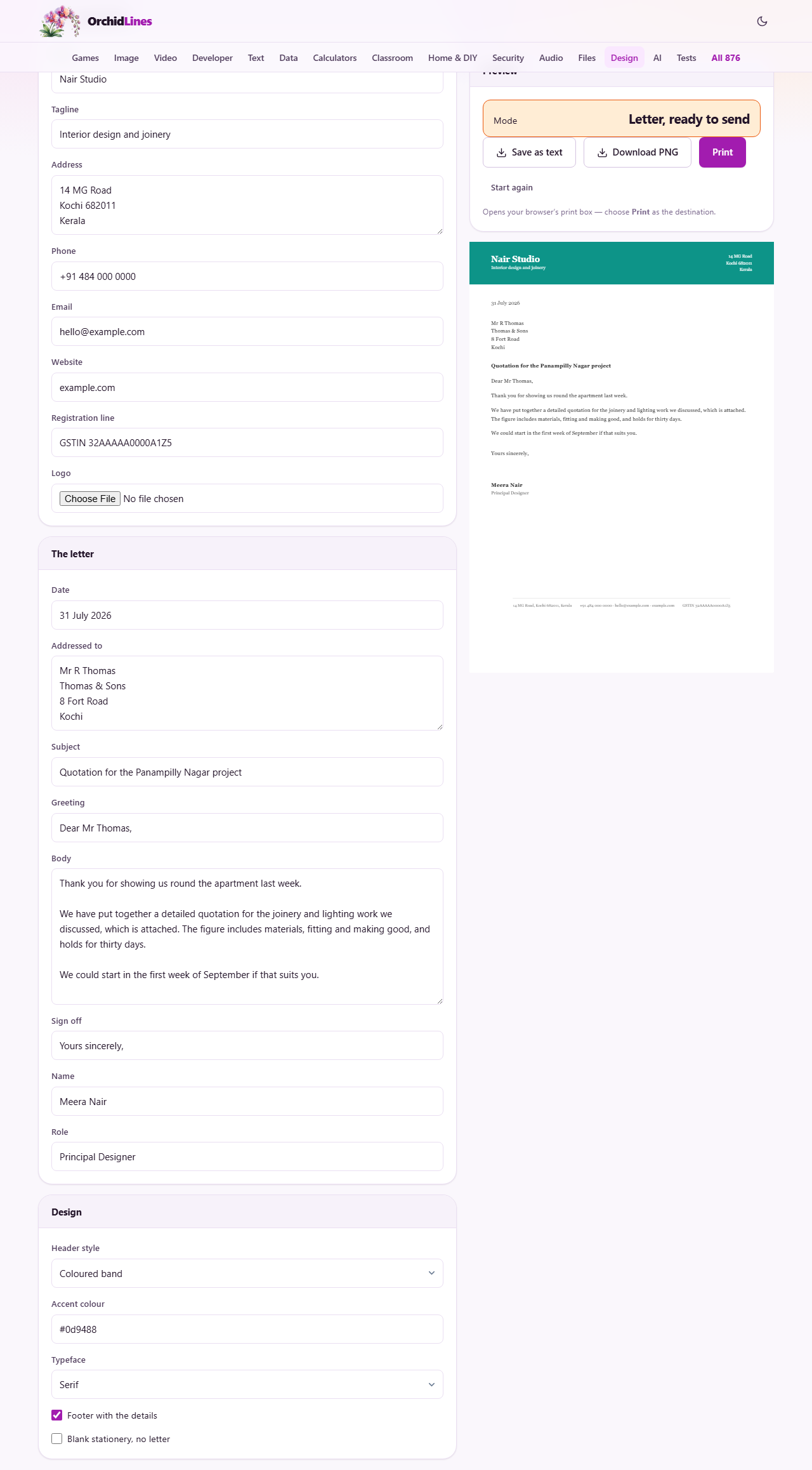
Coloured band prints a solid strip of your accent colour across the very top, running to the edges of the paper. Your name sits in it in white, with the tagline beneath and the address on the right. The logo gets a small white tile so it stays visible against the colour.
Simple rule is quieter. The logo and name sit on the left, the name in your accent colour, with the address on the right and a thin coloured bar under the lot.
Details down the side puts a narrow column at the top left holding the logo, name, tagline, address and contact details, with a coloured vertical line beside it. Minimal is the plainest: the name on one side, the contact details on the other, over a fine grey line.
One thing to watch. The band and rule headers show your address but not your phone, email or website. Those appear in the footer, or in the side and minimal headers. Pick the band and switch the footer off, and your phone number is nowhere on the page.
Colour, type and the two switches
Accent colour takes a hex code, the short code starting with a hash. It colours the band, the rule and the vertical line, depending on which header you chose. One colour is genuinely enough; a letter is not a poster.
Typeface offers serif or sans. Serif letters have small feet on the strokes and are the traditional choice for formal correspondence. Sans is plainer and reads as more modern. Pick one and stay with it, since your reader will see several letters over time.
Footer with the details draws a fine line near the bottom of the page with your address, contact details and registration line along it. It is the tidiest place for all that, because it leaves the top of the sheet for the letter. Blank stationery, no letter removes everything you typed in the letter panel and leaves only the head and foot.
Typing the letter into the same page
The letter panel follows the order a letter is read. Date prints first, as plain text, so write it however your reader expects. Addressed to is a text area for the recipient, one line each. Subject prints in bold above the greeting, and Greeting is the line beginning Dear.
Body is where the letter lives. Leave a completely blank line between paragraphs and each becomes its own paragraph. A single line break inside a paragraph is kept as a line break, which suits a short list of dates or items.
Sign off, Name and Role finish it. A fixed gap is left between the sign off and your printed name, sized so you can sign the page by hand without crashing into the type. Above the buttons a readout tells you which of the two things you are making: a letter ready to send, or blank stationery.
What a formal letter should contain
The layout only carries the words. These are the conventions that make the words land properly.
- Address it to a role if you cannot get a name. The Service Manager beats a bare company name.
- Give the subject line a reference the reader can look up: a contract number, an order number, a flat number, a date.
- Match the greeting to the sign off. A letter opening Dear Sir or Madam closes Yours faithfully. One that opens with a person's name closes Yours sincerely.
- Say what you want in the first paragraph. Background belongs second, not first.
- Keep to one page if you possibly can. A second page for a routine matter reads as a complaint about something else.
- End with what happens next and by when. A letter with no requested action rarely gets one.
Worked example: a contract renewal letter
A residents association needs to write to the firm that services its lifts. In the organisation panel the name is Lakeview Residents Association, the tagline is left empty, and the address is typed over three lines. The phone number, an email address and the society registration number go in their own boxes. There is no logo, which is fine.
In the design panel choose Simple rule, set the accent colour to a deep blue, leave the typeface on serif and keep the footer ticked. The head now prints the association name in blue with the address on the right, a blue bar under it, and the contact details along the bottom.
In the letter panel the date is 14 August 2026. Addressed to holds three lines: The Service Manager, Highrise Lifts, and the street. The subject reads Renewal of lift maintenance contract, reference LM-2419. The greeting is Dear Sir or Madam, and the body has three short paragraphs separated by blank lines: what the contract covers, two slow call-outs last winter, and a request for revised terms by month end.
The sign off is Yours faithfully, the name is S Kurian, and the role is Honorary Secretary. The readout reads letter ready to send. Print it, sign it in the gap left for you, and post it.
Getting the finished sheet out
Print opens your browser's own print box. Only the sheet is sent; the panels and everything else on screen are left behind. What happens next is decided inside that box, where you choose the destination and the paper.
Download PNG writes an image of the page into your downloads with no dialogue. That is a quick way to attach the letter to a message, and a good way to keep an exact copy of what you sent. Save as text pulls out the wording without the design.
On paper, plain white stock a little heavier than everyday printer paper feels right for a formal letter. Check the first sheet before running a stack.
Blank stationery, and why you may not want it
Tick Blank stationery, no letter and you get the head and the footer with an empty middle. There are real uses for that: hand-written notes, forms filled in by pen, and a page passed round a meeting for people to write on.
For an ordinary letter it is the harder road. You print the blank sheets, feed one back through, and hope the second pass lands in the right place. It rarely does.
Things that catch people out
- The logo has gone after reloading the page. Pictures are never stored, only your typed details. Load it again.
- A white box sits behind the logo. The image has a solid background. Remove it before loading the file.
- Paragraphs run together as one block. You used single line breaks. Put a completely empty line between them.
- Contact details are nowhere on the sheet. You chose a header that does not show them and turned the footer off.
- The colour looks weak on paper. Draft printing mode dulls large areas of colour badly.
- There is no room to sign. You typed the sign off and your name into the same box. Use both boxes and the gap appears.
When to use a different page
If you are asking for money rather than writing prose, the Invoice Maker on this site is built for that, with items, tax and a total. A covering letter from here and an invoice from there make a tidy pair.
For a job application, the Resume Builder handles the layout that hiring is used to. If you want a real signature image rather than a blank gap, the Signature Maker draws one you can keep. And when the letter is ready to go, the Envelope Address Printer positions the address for common envelope sizes.
Nothing you write here is sent anywhere
Letters are often private, and this page treats them that way by default. The whole sheet is built inside your browser. Your text, your logo and your contact details are never transmitted, because there is nowhere for them to go.
Your organisation details and design choices are remembered in this browser, so the next letter starts with the stationery set up and only the words to write. The logo is left out of that saved copy, so it is the one thing to re-add. Start again clears the lot.