
See two typefaces working together before you commit to them
This page shows a heading font and a body font side by side on a real block of text, then hands you the CSS to use them. Below you will learn why it shows a whole specimen rather than two words, what every slider does, and how to read the result. A worked example ties it together.
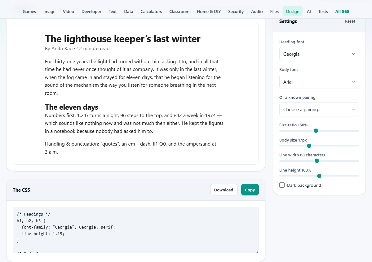
What the font pairing tool does
Picking two fonts that belong together is harder than it sounds. A pair can look fine as two words on a button and then fall apart across a paragraph, where their real shapes and rhythm show. This tool puts a heading face and a body face on a full page of writing, at the sizes and line width you would truly use, so you judge them on the job they will actually do.
It is for anyone setting type for reading. A designer starting a website, a writer laying out a newsletter, a student formatting a report, or a small business owner making a menu. You try faces together, settle on a pair, and leave with a block of CSS ready to drop into a stylesheet. None of it asks for an account or a sign-up.
Only the fonts you already have
The two font menus do not list every typeface in the world. They list the ones installed on the device you are using right now. The tool checks a set of common faces and keeps just the ones your machine can actually draw. That is why the list may be short, and why it differs from one computer to the next.
This keeps the preview honest. Nothing is fetched over the network, so the specimen shows exactly what you will see, with no waiting and no fonts quietly downloaded in the background. What renders on screen is what your system has, drawn with your own font files.
Choosing the two faces
Heading font sets the face for titles and sub-titles. Body font sets the face for the running text, the part that carries almost every word. A good habit is to choose the body first, since it decides how the page reads, and treat the heading as the decoration on top.
Or a known pairing is a third menu of ready-made combinations that are known to work, such as a warm serif under a wide sans. Pick one and it fills both font menus for you at once. Only pairings where your device has both faces are offered, so every option in the list is one you can actually see.
Tuning the specimen
Four sliders and a tick box shape how the sample looks. Each moves the preview the instant you drag it, so you can watch the effect.
- Size ratio decides how much bigger the headings are than the body text. It runs from 110 to 220 percent and starts at 160.
- Body size sets the reading size in pixels, from 13 to 24, starting at 17.
- Line width sets the measure: how many characters fit on a line, from 40 to 100, starting at 68.
- Line height sets the space between lines, from 120 to 200 percent, starting at 160.
- Dark background is a tick box that swaps the specimen to light text on a dark sheet.
Reading the specimen
The preview is a short piece of writing, not a lorem-ipsum block. It has a headline, a byline with a reading time, a couple of body paragraphs, and a sub-heading partway down. That mix lets you see the heading face and the body face at their real jobs, and how they sit together on the page.
One line is packed with tricky characters on purpose: curly quotes, a dash, an ampersand, plus the pairs that trip fonts up, such as a capital I next to a lowercase l and the digit 1, or a capital O next to a zero. If those are hard to tell apart in the body font, the font will frustrate readers, and better to learn that here than after you publish.
The CSS you can copy
Below the specimen sits the generated CSS in a read-only box. It names the heading face for h1, h2 and h3, sets the body face, size and line height on the body, and gives a class for the reading column with your chosen measure. It also spells out the two heading sizes in pixels.
Two buttons act on that box. Copy places the whole rule on your clipboard, ready to paste into a stylesheet. Download saves it as a file named typography.css. Each font is written as a small stack with a fallback after it, so a reader whose device lacks your first choice still lands on a close match rather than a plain default. A Reset button up in the settings returns every slider and menu to its starting value.
How to work through a pairing
A simple order keeps the choosing short. Start from the reading text and work outward, since that is where nearly all the words live and where a bad choice hurts the most. Working this way also stops a striking headline from talking you into a body face that is tiring to read. A headline is seen for a second, but the body is lived with for minutes.
- Set the body font and body size first, then read the paragraphs the way a real reader would.
- Pull the line width down until the measure feels easy, somewhere near 65 characters.
- Only then try headings against it, one at a time, keeping the body fixed so you compare fairly.
- Lean on the known pairings when you are stuck, since every one of them is a safe place to start.
A worked example
Say your device has Georgia and a plain sans-serif such as Arial. Set Body font to Georgia and Heading font to the sans, giving a clean sans headline over a readable serif body. Then drag Body size to 18 and Line width to 66 characters, a comfortable measure for long reading.
The specimen redraws at once, and the small note under the preview reads 66 character measure, 46px headings, because at size 18 and the default ratio the headline works out to 46 pixels. If instead you set both menus to the same face, the note changes to say one family at two weights, always looks deliberate. Happy with it, press Copy and paste the rule straight into your site's stylesheet. The whole trial took under a minute and cost nothing but a few drags of a slider.
The idea behind a good pair
The safest pairings are either plainly different or exactly the same. A serif headline over a sans body reads as a clear decision, because the eye sees two distinct jobs being done. The pairs that jar are the near misses: two sans faces that differ only a little look like a mistake, since a reader senses the change without a reason for it.
When no strong pair jumps out, reach for one family used at two weights, a bold heading over a regular body. That always looks intentional, and it is what a great many well-made sites quietly do. Contrast on purpose, or none at all, is the rule that keeps you out of trouble.
Common mistakes and how to fix them
The first mistake is chasing the perfect typeface while ignoring the line width. A fine font set at 110 characters a line reads worse than a plain one at 65, because the eye loses its place on the long trip back to the next line. Fix the measure before you fuss over the faces.
The second is expecting a font that is not on your device. If a face you want is missing from the menu, your system does not have it installed, and the tool will not pretend otherwise. The third is forgetting a fallback, which this tool handles for you by writing a stack, so the worry is already taken off your plate.
When another tool suits better
This tool previews faces your own machine holds. If you have your heart set on a specific web font that is not installed locally, it cannot show that face, because it does not download anything. To trial a font you do not own yet, you would install it first, or use the type maker's own preview.
It is also not a page layout tool. It settles the typography, the fonts and their sizes and spacing, and stops there. For arranging columns, images and full pages, a design or document editor is the right next step, and you can carry the CSS from here into it.
Nothing leaves your browser
This is one of the few design tools that reaches for your own fonts, and it does so without moving anything off your machine. The specimen is drawn in the page from faces your device already holds. No font is downloaded, no text is uploaded, and the CSS is written in front of you.
Your last choices are remembered in this browser, so the tool opens where you left it. That memory stays on this one device and does not travel to another. Since the output is just a short block of CSS, the simplest backup is to paste it into your project the moment you are happy with it.