
Certificates that look like they mean something
The help panel above runs through the basics. This guide goes deeper: what each box prints, how the type dropdown drives the heading, the way one name list turns into a stack of pages, and what separates a real certificate from a name typed in the middle of a page. A worked example with real values sits near the end, then the slips to avoid.
What makes a certificate feel official
The difference between a certificate and a plain letter is almost all presentation. Three things carry it. The page is landscape, turned on its side. A border frames the whole sheet. And the name is set much larger than anything around it, with plenty of space to breathe.
Get those three right and even simple wording reads as formal. Get them wrong, a portrait page, no border, every line the same size, and no amount of gold clip art will rescue it. This page is built around those three, so the result looks earned rather than knocked together.
It is worth knowing what the page does for you here. It sets a clear order of sizes, from the small organisation line at the top down to the large name in the middle, and it holds a generous margin around the whole thing. You do not have to judge any of that by eye.
The wording, line by line
The first panel holds the words. Type is a menu of the common kinds: completion, achievement, appreciation, participation, and an award of excellence, plus a free choice. Pick one and it fills the Heading for you. If you would rather write your own heading, just type over it, and changing the type after that leaves your version alone.
Line above the name is the small phrase that leads in, such as this is to certify that. Name is the star of the page and is set largest. What it is for is a sentence or two saying why, the course finished or the service given. Date and Place print small at the foot, and either can be left empty.
Signatures, seal and the issuing body
A certificate needs someone standing behind it. The second panel handles that. You can name two people who sign, each with their role under the line. Two is the usual number, a director and a head, say. The lines are printed empty for a real signature by hand, which carries more weight than a pasted image and takes only a moment.
Seal text is the short line inside the round seal, often a founding year or a motto. Organisation prints across the top as the body giving the award. Show the seal turns the seal on or off. With it on, a round stamp sits between the two signatures, which is a small thing that does a lot of the official-looking work.
Border, colour, type and page turn
The design panel sets the frame. Border offers a classic double rule, ornate corners, a modern block down two sides, a laurel style, or none at all. The double rule is the safe pick for almost anything. Accent colour takes a hex code, the short code starting with a hash, and it tints the border, the heading and the seal.
Typeface gives three choices. A traditional serif reads as formal. A modern sans is plainer. Script for the name keeps the body text readable but sets the name itself in a flowing hand, which suits a prize. Orientation switches the page between landscape and portrait; landscape is the one that looks like a certificate, and it is the starting point.
A whole class in one go
Making thirty certificates one at a time is the slow way, and this page skips it. The Batch box near the bottom takes one name per line. Fill it in and the tool builds a separate page for every name, each with a page break so they print on their own sheets. Everything else, the heading, the reason, the signatures, stays the same across the set.
A small readout above the buttons tells you where you stand. It reads one certificate when the batch box is empty, and the number of certificates when it is not. Leave the box blank and it falls back to the single Name from the first panel, so you can design one and print one without touching the batch at all.
Getting it out: paper, image, or text
Three buttons sit by the preview. Press Print to send the certificate, and nothing else on screen, to your browser's print box. If the preview is landscape, choose landscape in that box too, then send it to the printer or pick Save as PDF to keep a file. For a batch, Print is the button to use, since the page breaks put each name on its own sheet.
Download PNG saves the certificate as an image file without opening a print box, ready to email or attach. Save as text keeps the wording alone, with none of the border or colour, for pasting into a record. Start again clears every box and reloads a fresh certificate.
A worked example
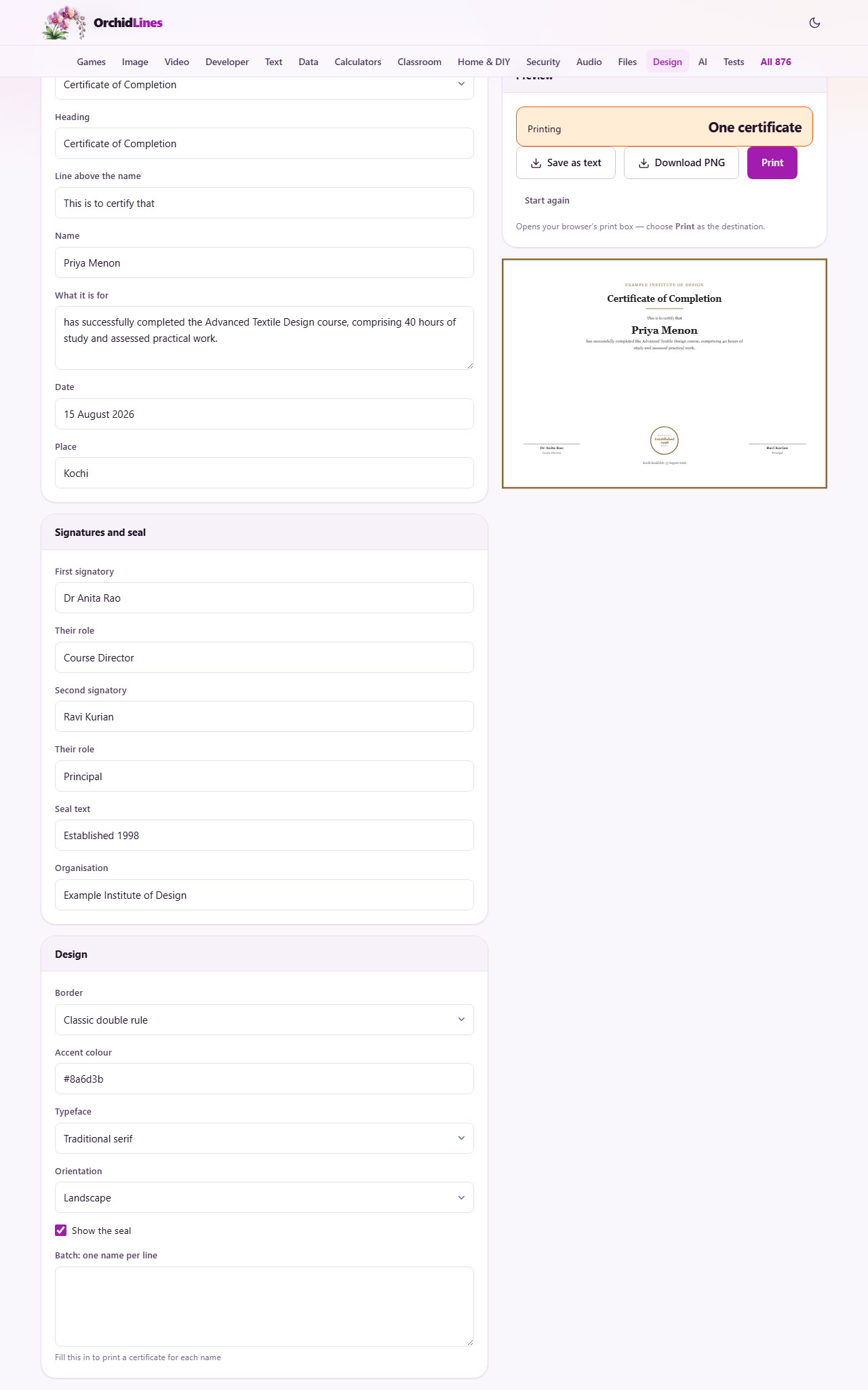
A design school has finished a short course and wants certificates for it. In the first panel the type is set to completion, which fills the heading with certificate of completion. The line above the name reads this is to certify that. The name is Priya Menon. The reason says she has completed the Advanced Textile Design course, with the hours and the assessment. The date is the fifteenth of August, and the place is the city.
In the second panel the first signer is the course director and the second is the principal, each with their role. The seal text is the founding year, and the organisation is the institute's name, with the seal switched on. In the design panel the border is the classic double rule, the accent is a warm gold, the typeface is the serif, and the page is landscape.
That prints one certificate. To do the rest of the class, the school pastes the register into the batch box, one name a line. The readout jumps to thirty certificates, the preview shows the first of them, and Print sends all thirty, each on its own page, with the right name on every one.
Getting the wording right
The design handles the presentation; a few plain habits make the words themselves land.
- Spell the name exactly as the person wants it to appear, since this is the copy they will keep for years.
- Make the reason specific. Name the course or the act, and add the hours or the result where there is one.
- Keep the heading to the standard form unless there is a real reason to change it.
- Match the date to the event, not to the day you happened to print the sheet.
- Use the true names and roles of the people signing, so the award is backed by someone the reader can place.
What a good certificate contains
A certificate that people keep says a few things clearly. It names the person in large type. It says exactly what they did, in a line anyone can read. It shows who is giving the award, and it carries a date. Two signatures and a seal tell the reader it is backed by real people, not run off on a whim.
For a clean result, print in landscape on heavier paper. Anything above about a hundred and sixty grams feels like a certificate in the hand; ordinary printer paper feels like a printout however good the design. Sign each one by hand over the printed line. If you need a digital copy as well, Download PNG gives you a sharp image to send.
Slips that let a certificate down
Most disappointing certificates come from one of a short list, and each is easy to put right.
- It looks like a plain document. The border was set to none or the page left portrait. Turn on a border and switch to landscape.
- The heading is stuck on the old wording. You edited it once by hand, so the type menu no longer rewrites it. Retype the heading you want.
- The batch printed one page. The batch box was empty, so only the single name was used. Paste the list, one name per line.
- The reason runs long and crowds the name. Trim it to a sentence or two so the name stays the biggest thing on the page.
- The colour looks weak on paper. A draft print mode dulls the border and seal. Print in normal quality on heavier stock.
When another page fits, and where it runs
This maker draws certificates and awards. If you want a contact card, the business card maker on this site is the right tool, and for a formal letter, the letterhead maker lays out the page and holds the words. A certificate is a poor stand-in for either.
Whatever you make, the certificate is built inside your own browser. The names, the wording and the whole batch list stay on your machine and are sent to no server. That matters, because you are usually printing real names for real people, and none of them ever leaves the device you are working on.