
Business cards that come out the right size
The help panel above gets you a card. This guide covers the parts around it: which box feeds which line, how the layouts differ, why the size on paper matters so much, and what a good card leaves off. A full worked example with real values comes near the end, followed by the faults that quietly spoil a whole sheet.
Why the exact size is the whole point
A business card is a physical object with a size everyone agrees on. It slides into a wallet, a card holder, a slot in a diary. Get that size even a little wrong and it stops fitting, and a card that does not fit reads as amateur before anyone has looked at the name.
That is the thing this page fixes. It lays your card out at its true measured size on a sheet of paper, so what leaves the printer is the size a card is meant to be. Everything else, the words and the colour, is easy. The size is the part most home-printed cards get wrong, and it is the part this is built to get right.
Your details, and the empty boxes
The first panel holds what goes on the card. Name and Job title sit together as the person. Company is the business. Phone, Email and Website are the ways to reach you. Address is a small box where each line you type stays its own line. Tagline is the short phrase that says what you do.
Every box is optional, and an empty one is simply left off the card rather than printed as a gap. This is worth leaning on. A card carrying four clean lines looks far better than one crammed with eight. Fill in only what a new contact truly needs, and let the rest go.
Layout, size, colour and type
The design panel sets the look. Layout offers five arrangements: the name on the left over a coloured top edge, a centred card with a short rule, a coloured band down one side, a stripped-back minimal card, and one that sets the name large and bold. Each moves your details around a different frame, so try a few and see which suits the name.
Card size lists the standards. Eighty-five by fifty-five millimetres is used across most of the world; the United States runs a little wider and shorter; there are sizes for other regions too. Accent colour takes a colour written as a hex code, the short code beginning with a hash that the box already shows, and one colour is plenty. Typeface picks the letters: a clean sans, a traditional serif, or a technical monospace.
Which layout to choose
The five layouts are not just different looks; each puts the weight in a different place. A short guide helps you land on one quickly.
- Name on the left leads with the company along a coloured top edge, then the name and the contact lines below. It reads as steady and professional.
- Centred stacks everything down the middle with a short rule under the name, which feels formal and calm.
- Coloured band runs your accent colour down one side with the company in it, and the details beside it, for a card with more colour.
- Minimal keeps just the name, the role and the contact lines on plain white, for a quiet, modern card.
- Large name sets the name big and bold with the details tucked along the foot, for when the name is the thing to remember.
How many to a sheet, cut lines, and a back
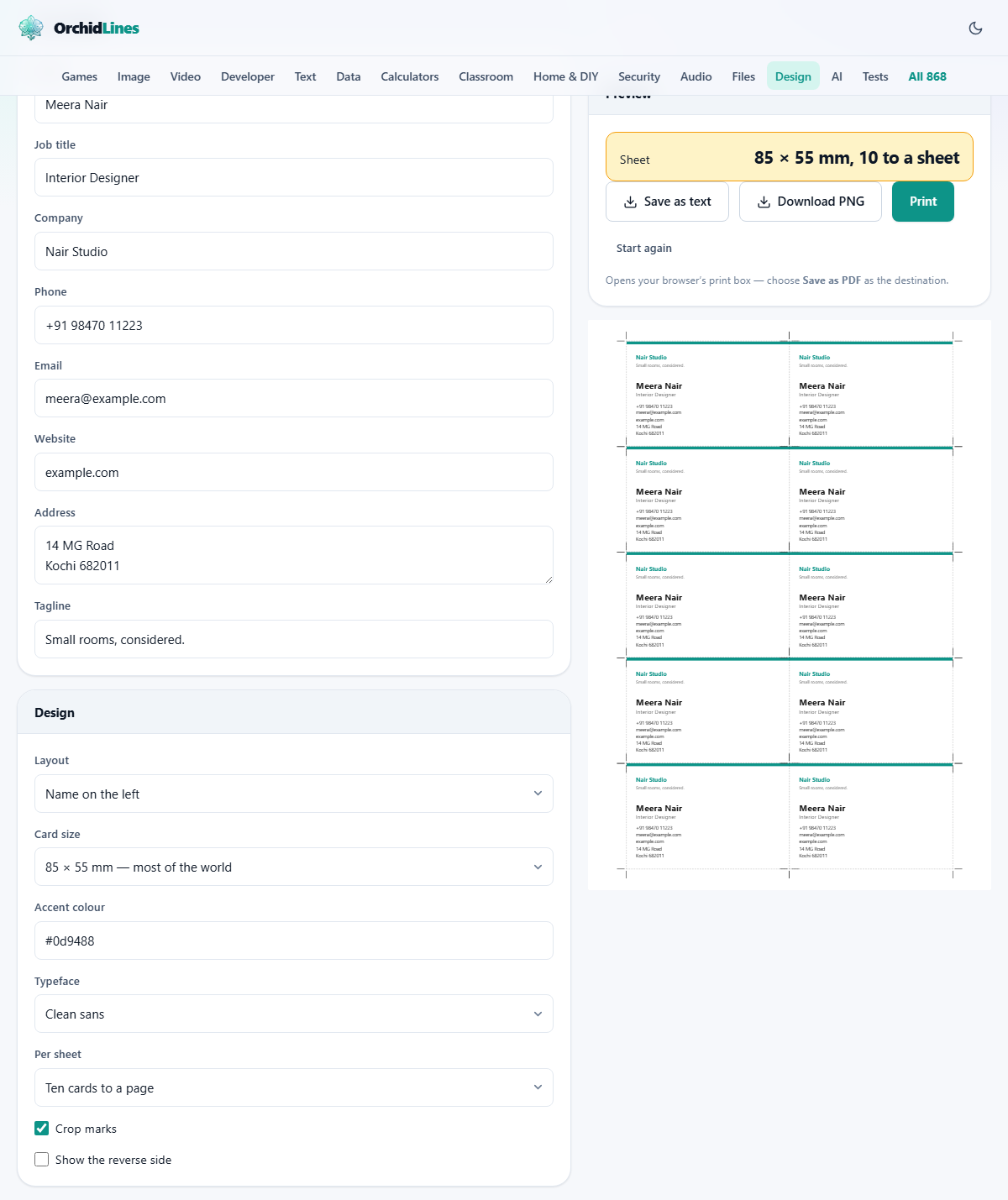
Per sheet decides how the page is filled. Ten to a page is the everyday choice and packs the cards two across and five down. Four to a page gives bigger gaps, and one at actual size prints a single card, handy for checking. A small readout above the buttons shows the card size and how many are on the sheet.
Crop marks adds fine hairlines just outside each card for your blade to follow, and it is on to start with. Show the reverse side turns on a back for the card, which fills the spare positions on the sheet with a coloured panel carrying the company name, the tagline and the website. Print that second sheet on the back of the first for a double-sided card.
Printing at true size
This is the step that makes or breaks the job. Browsers like to shrink a page a fraction so nothing is clipped by the printer's own margins. A card printed at ninety-six per cent is a card that no longer fits a holder, and the shrink is small enough that it looks fine on screen.
So when you print, set the scale to a hundred per cent, or actual size, and set the margins to none. A reminder to do exactly that appears when you press the button. The proof is simple: if a cut card measures eighty-five millimetres across, everything else is right, and if it does not, nothing else you change will fix it.
Getting it out: paper, image, or text
Three buttons sit by the preview. Press Print and the sheet alone goes to your browser's print box, with everything else on screen left behind. From there you send it to a printer, or pick Save as PDF as the destination to keep a file. That PDF is the thing to hand a print shop, who will run it on proper card stock for less than a home printer costs in ink.
Download PNG saves a picture of the laid-out sheet to your device, with no print box in the way, which suits working on a phone. Save as text writes the card's wording out as plain text, with no design, for pasting into a message. Start again clears the fields and reloads a blank card.
A worked example
Meera Nair is an interior designer and wants a first run of cards. In the details panel her name is Meera Nair, the job title is Interior Designer, and the company is Nair Studio. She adds one phone number, one email, and the website. The address is two short lines, and the tagline reads small rooms, considered.
In the design panel she chooses the name on the left layout, keeps the size at eighty-five by fifty-five, sets the accent colour to a deep teal, and leaves the typeface on the clean sans. Per sheet stays at ten, and crop marks stay on. The readout now reads the card size and ten to a sheet, and the preview shows ten identical cards with hairline marks at their corners.
She prints one sheet on plain paper first, at a hundred per cent scale with no margins, cuts one card out and holds it to check the size. It fits. Then she runs the real stock. To change a detail later, she edits a box, prints again, and the next sheet is ready.
What a good card carries, and what it leaves off
A card is read in a couple of seconds by someone who has just met you. That should shape what goes on it. Four to six lines do the real work: your name, what you do, one phone number and one email, and often the website. The rest is clutter that hides the parts that matter.
For a clean result on paper, use card stock a little heavier than everyday printer paper, print the plain-paper proof first, and cut with a knife against a metal ruler rather than scissors, which wander. Keep to one accent colour, give the card plenty of empty space, and let the website carry anything that does not fit.
Faults that spoil a sheet
Nearly every wasted sheet comes from one of a short list, and each is quick to undo.
- The printed cards are slightly too small. Page scaling was left on. Force a hundred per cent and measure a cut card with a ruler before running more.
- A line has vanished. Its box was empty, so it was left off. Fill the box if you want the line.
- The card feels busy. Too many lines were filled in. Cut it back to the few that a new contact needs.
- The back is blank when you wanted it. The reverse side box was off. Turn it on and print the second sheet.
- The colour looks weak on paper. A draft print mode dulls it. Print in normal quality on proper stock.
When another page fits, and where it runs
This maker draws contact cards. If you need a staff pass with a photo and a scannable code, the ID badge maker on this site is built for that, back included. For a letter on headed paper, use the letterhead maker, and for an award, the certificate maker.
Whichever you pick, the card is put together inside your own browser. Your name, your number and your address are drawn into the preview right there on your machine and sent nowhere. There is no upload and no account, so the only copies of your card are the ones you print or save yourself.