
Small buttons and stickers you can build in the browser
The help panel above shows the quick path. This guide goes deeper: what each control on the right actually changes, the three files you can take away, and why some styles come with code and some do not. There is a step by step example with real settings near the end, and a short list of the traps that catch people.
Made for the small pieces on a page
This is a tool for the little bits of a web page, not for posters. A button that says buy now. A pill that pulls the eye to a sign-up. A round chip with a number on it. A die-cut sticker for a sheet you will print and peel. A sticky note graphic. A short word set as a logo.
The canvas is capped at nine hundred by six hundred pixels on purpose. Keeping it small keeps the picture sharp and the tool quick. If you need a full poster or a page-sized layout, the design editor on this site is the right place, and this is not.
Start from a style, then adjust
The fastest way in is the Styles panel at the bottom of the settings. There are a hundred and forty-seven ready styles, sorted into families. Click one and every control jumps to match it, so you land on something close and tweak from there rather than build from a blank box.
The families run from plain and gradient through glass, depth and glow, then the interface looks of common design systems, shaped tags and ribbons, icon buttons, the glossy raised look of older web pages, banners, textures, panels, vouchers, award medals, retro styles, tabs and chips, a set of newer soft and bold surfaces, interface states like a toggle or a progress bar, framed stickers, and plain text logos. Between them they cover most of what a small graphic on a page is ever asked to be.
The words and the size
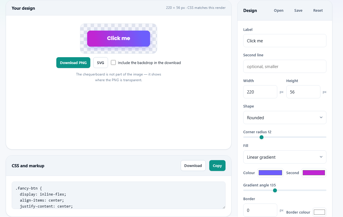
Label is the main text on the button. Second line is a smaller line under it, for the it is free or the file size that download buttons like to carry; leave it empty and it simply does not show. Width and Height set the size in pixels, from twenty-four wide and up, to the nine hundred by six hundred ceiling.
Shape picks the outline: rounded, square, pill, circle, and on through squircle, hexagon, shield, heart, cloud, price tag, ribbon, notched banner, ticket, speech bubble, starburst, sticky note, torn paper and more, ending in a text-only option with no shape at all. Corner radius drives the corners of the rounded outline and of the shapes built on it, such as the tag, the ticket, the tab and the speech bubble. Most of the others set their own corners and always have: a circle has none, a pill is always rounded by half its height, a hexagon has angles rather than curves. Choose one of those and the slider switches itself off and says what is deciding instead, rather than sitting there doing nothing.
Fill, colour and edge
Fill decides how the inside is painted. Solid is one flat colour. Linear and radial gradients blend two. Then there are glossy, bevelled, candy, brushed metal, clay, aurora, mesh, liquid glass, and a run of textures like stripes, dots, chequerboard and carbon weave. Colour is the main colour, and Second is the partner colour a gradient or a split needs. Gradient angle turns the blend around when you use one.
Border sets the width of an outline in pixels, with its own Border colour beside it, and Border style offers solid, dashed, dotted, a double rule, a stitched line, or a raised bezel. Shadow drops the button off the page: a soft drop, a glow, a hard offset, a three-dimensional lip, a soft neumorphic pair, a pressed-in look, or a die-cut sticker edge, again with its own colour.
Setting the type
Text size and Weight control how big and how heavy the label is, from a light regular up to a heavy. Text colour sets the ink. Letter spacing opens or tightens the gap between letters, and Capitals forces the main label to upper case while leaving any second line as it was, so the small print stays readable.
Text effect is the fun row. Plain leaves the letters alone. The rest add an outline, a hollow inside, a sticker keyline, a drop or long shadow, a raised or engraved look, a neon glow, a glitch split, chrome, gold foil, a rainbow, a gradient fill, or a curve that bends the word up or down. One effect at a time, and less is usually more.
Icons and badges
Icon adds a small symbol from a set of a hundred, drawn from Google's open Material Symbols. They are grouped by what they are for, so an arrow, a cart or a download mark is easy to find. Because they ship with the site, choosing one sends no request anywhere. What you will not find is a company logo, since those are trademarks rather than free icons.
Icon position drops the symbol before the text, after it, above it, or on its own. Icon size and Icon gap set how big it is and how far it sits from the words. Icon backing turns a bare symbol into a badge: a round disc, an overlapping ring, or a tile at one end, with its own Backing colour. Below that, Extras adds a working detail to some looks: a split action with a caret, a progress fill, a count badge, a toggle knob, or a blinking terminal cursor.
Two files, and why the code is honest
There are two ways to take your work away. Download PNG saves the design as a picture, at three times the size on screen so it stays crisp and survives being printed on a sticker sheet. That picture is transparent by default, so it drops onto any background. Tick Include the backdrop in the download to bake a colour in instead. The chequerboard you see behind the design is only there to show the see-through parts; it is never in the file.
Under the preview, the CSS and markup panel holds ready-made code you can paste into a page, with its own Download and Copy buttons. Here is the careful part. Where a style can be written as real CSS, the code is there and matches the picture exactly. Where it cannot, a starburst edge, extruded letters, a die-cut cut line, the tool says so and points you to the PNG rather than hand you code that would look wrong on the page. That rule is why there is no vector export here any more: a drawing that kept the words and the colours but quietly flattened a starburst into a plain box was the one file the tool shipped that did not match what you had made.
What makes a small button work
A button earns its keep by being read at a glance. Keep the label to a word or three. Leave enough height that the text is not squeezed against the edges. Pick one shape and one fill, not three.
Make sure the text colour has real contrast against the fill, or the label disappears at small sizes. Add an icon only when it says something the word does not. Then, if the style allows it, take the CSS, because a coded button scales with the reader's own text size and costs no download. Save the PNG for the shapes and effects that only a picture can carry.
A worked example
Suppose you want a download button with a badge on it. Start from the icon pill style so the layout is right. Set Label to Download and Second line to it is free. Make the Width two hundred and sixty and the Height sixty, with Shape on pill.
Set Fill to a linear gradient, Colour to a deep violet and Second to a bright magenta, with the Gradient angle across the button. For the icon, choose the download symbol, set Icon position to before the text, and set Icon backing to a round disc with a white backing colour. You now have a white disc holding the arrow, on a two-tone pill, with a small it is free under the word.
Press Download PNG and a transparent image lands in your downloads. Because a gradient pill can be written as CSS, the panel below also holds working code you could paste straight into a page. Switch the Shape to starburst, though, and the tool drops the code and tells you to use the PNG, because a burst is not something the box model can draw.
Common traps
The glass styles are see-through by design. Work on one over a plain page and it can look like nothing is there. Turn Show a backdrop on while you build it, so you can see the frosted effect against a colour.
If the CSS panel says a style cannot be written as code, that is not a fault to fix; it is the tool being straight with you. Take the PNG for that one. And if a design looks cramped, the usual cause is a height set too low for the text size, so give it more room rather than shrinking the words.
Keeping a design, and where it all runs
In the Design panel head, Save writes your current settings to a small project file you can reopen later or pass to someone else, and Open loads one back in. Reset returns every control to its starting value. These are for the design itself, not the exported picture, so keep both if a button took real effort.
The whole thing is drawn on your own machine. The fonts and icons are served from the site and run in the page, and the picture is built there too. Nothing you type or design is uploaded, and there is no account to make, so a button you build stays yours alone unless you choose to share the file.